26 Photography Portfolio Examples for Inspiration
As a photography portfolio designer, I have designed quite many portfolio websites over the years. I’ve studied other, much more talented and experienced designer works and seen websites that are beautifully executed and many that just don’t work. Sometimes it’s hard to pinpoint what exactly makes a portfolio website work, but when you see it you just know that it’s right, that all of the little details come together nicely giving you a pleasant browsing experience.
When it comes to photography portfolio websites, there are so many possibilities to make it just right but because of this, there are so many things that can go wrong.
I decided to write this compilation post as a tribute to photographers who, in my opinion, have managed to create truly beautiful websites for themselves because I know first hand how much work, thought and time goes into this.
While looking for examples for this post, I ended up browsing through more than 400 photography portfolio websites and ended up choosing the ones that passed through my photography portfolio criteria.
As you will see, most of the portfolios chosen here are quite simple and draw the visitors attention to the work it holds, which is the most important goal of any good portfolio site. All of these websites have clear goals to them, they don’t confuse the visitor with complex layouts and dead ends. What I like most in these examples is that they manage to guide the site visitor to the most important parts of each site, they have a clear path to them and don’t make you guess where to find the images, where is the information about the photographer or what are you looking at exactly.
I took the opportunity to write some personal comments below each website screenshot so that you can see my thought process behind each choice.
So here they are.
Hope this post gives you some fresh ideas for your own portfolio website and if you’re planning to create a portfolio website of your own, check out our premium photography WordPress themes. But if you are on a budget, see how you can create a free portfolio website all by yourself!
1. Olya Kobruseva
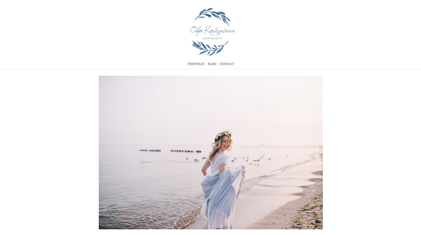
Olya’s photography portfolio is brilliantly simple, fast loading and very easy to navigate. I really appreciate that there is a clear path for the site visitor – open the site, there’s a little slider to set the mood and 15 galleries to choose from. When you open a gallery, all images are nicely curated in 1 column and at the end of the gallery you get to choose other galleries to visit or go back to the top of the page by using the conveniently placed “back to the top button”.
The only minor thing that I would change is to create a separate “About me” page instead of using the “Contact” page for your personal introduction. Firstly because I was looking for the “About” page and couldn’t find it until I decided to check out the contact form and secondly, I think that it would make this site a bit more personal, it would tell the visitor: “Here I am! Get to know me even before you click on the contact page.” Plus another page with written content is a good way to make friends with Google!
2. Aralani Photography
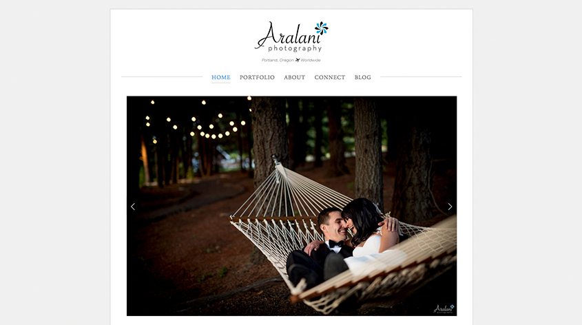
Ara’s website is simple and minimalist from the looks of it but when you start to navigate through it, you realize how much information it actually holds. There are multiple portfolio categories, pricing, testimonials, blog, about page and more but because everything is so nicely organized it’s very easy to find everything you might need there. Each page on this site has a clear purpose to it and each piece of relevant information has its own place. This makes the website a joy to browse.
3. Kartsie Photography
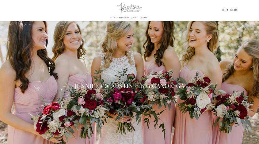
This one is something a bit different! Kaila’s portfolio website makes use of something called “blog-folio” when you display your work in your blog posts as individual stories. Sometimes blog-folios are a bit hard to pull off, but this website nails it in my opinion because of those beautiful fullscreen blog thumbnails that look really nice and manage to set the mood for each post you click on.
4. Caitlin Worthington Photography
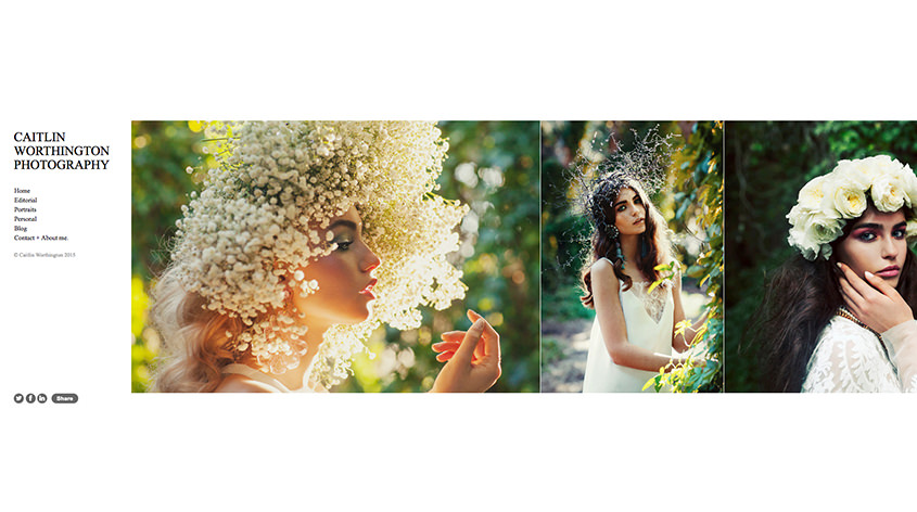
Horizontal portfolio layouts are a kind of weakness for me. You will see that in this post and in our own designs as well. When designed properly, a horizontal portfolio layout is a very convenient and beautiful way to showcase your work. I chose Caitlin’s portfolio for this list because of the portfolio page and navigation design. This example shows that you don’t necessarily need large images or full-screen views to make the portfolio enjoyable. Smaller images will work especially well for people who are concerned with image theft since smaller images are less likely to be stolen straight from your own portfolio.
If it would be up to me, I would increase the font size a bit since it is quite hard to read right now.
5. Lauren Naylor
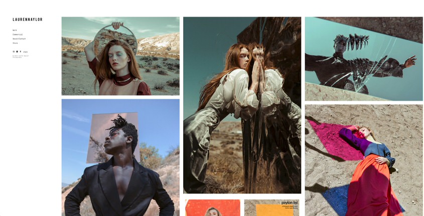
Laurens’ photography portfolio makes uses vertical grid layouts to showcase her work. The first page introduces the viewer with a collection of her most recent work in a beautiful fullscreen layout with large images and if the viewer wants to see more of her work, there is plenty to choose from from the navigation.
6. Carlos Hernandez
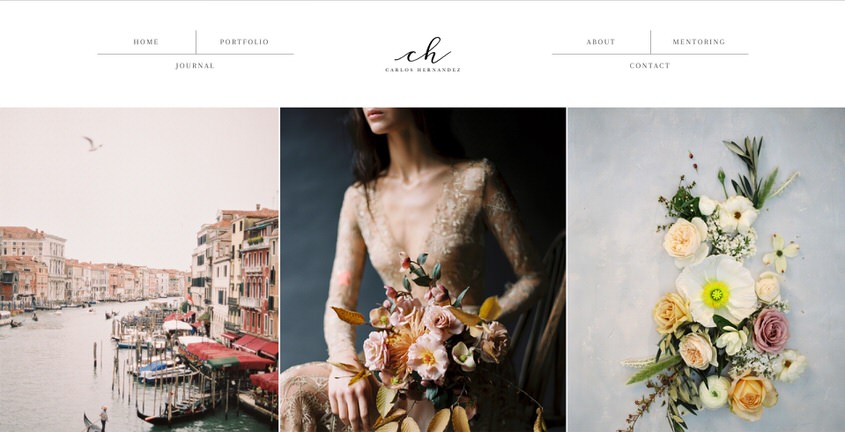
A beautiful photography website example. Carlos’ website loads fast, the browsing experience is smooth and the mood of this portfolio is excellent in my opinion. It’s clean, light and compliments the photography work beautifully. There is nothing I can add, visit this portfolio and see for yourself!
7. Anchor & Lace
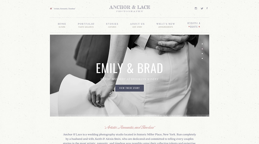
Anchor & Lace is a great example of how a custom website should look. you can clearly see that a professional web designer was at work here. Each page is its own masterpiece but it ties together with the overall design perfectly and you never have to wonder if you’re still looking at the same website. I especially loved the “Stories” section of this website – they are actual visual wedding stories beautifully divided into sections or chapters, just like a proper story should be told.
8. Chris Zielecki
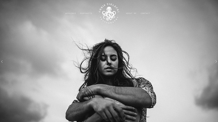
A modern, laid back portfolio website with clean, straightforward navigation that shows you everything you might need to find in this website.I really like that the Contact page with an option to choose whether you want to contact the photographer about a wedding shoot or you have another reason for reaching out. This is a very clever way to solve the contact form issue that I’ve seen many photographers having. If you do weddings and portraits like Chris, you might need to know different information depending on the project (like dates and location for weddings). Chris solves this by asking the visitor about the contact purpose and then directs the visitor to the appropriate contact form.
9. Hardy Klahold
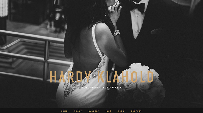
If you like one-page designs, you might enjoy Hardy’s portfolio website. Without clicking anywhere you can find a couple of lines of text about the photographer, his galleries, services he provides, posts from the blog and a contact form. One-page layouts are a good option when you don’t have (or don’t want to show) many image galleries and want to keep everything short and to the point.
The only thing that bothered me design wise here is that the single blog post design doesn’t look half as good as the home page. It could be easily fixed by giving a bit more room to the post text and instead of center aligning text and categories in the sidebar, align them to the left side, this would give a more orderly feeling to the page.
10. Amy Deputy
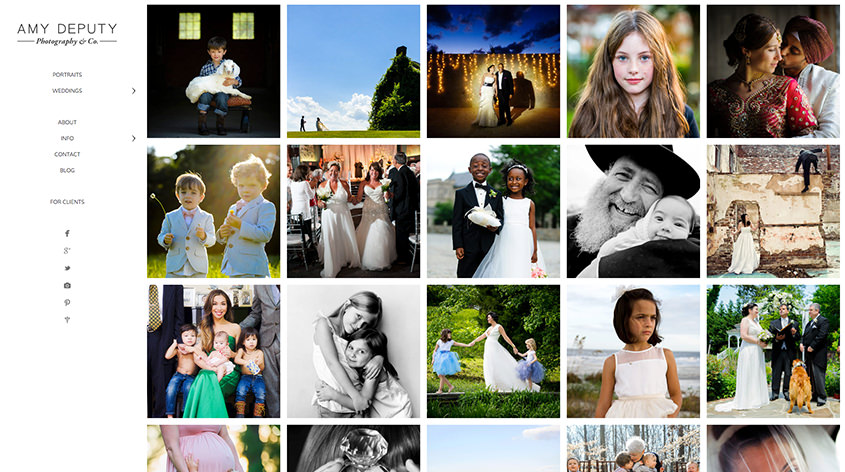
When you have loads of separate images to show, grid layouts are a great way to do that. That is why I chose Amy’s website. The portfolio has quite many images that are not part of galleries like in many previous examples. Amy uploaded all of her images on her portfolio and the visitor can either quickly scroll through them or click on any of the images and browse through them one by one.
11. Eric Ryan Anderson

Mr. Anderson’s portfolio is modern and fast loading. This is a great portfolio example in my opinion, but it definitely would not work for everyone. As a photographer, you need to know your audience and their technical skill level because for some people a website such as this might be a bit too confusing. Since Eric is a commercial photographer who deals with campaigns and agencies, it suits his business well!
12. Evaan Kheraj
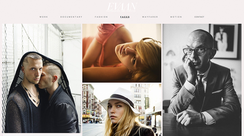
A bold photography portfolio design by Evaan. I chose this website to show you how good photography can look in wide two and three column layout. The work fills the screen nicely and every detail is visible.
If I had any say in this, instead of the menu and logo following the screen when you scroll down the page, I would make only the navigation “stick” to the top of the screen and give it a semi-transparent background, and leave the logo at the top of the page. It would free up more screen to view the images properly and the menu items would be more visible.
13. Lena Sanz
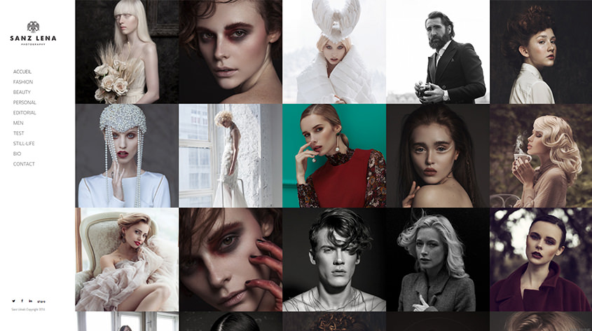
Another simple grid portfolio design example with a clean navigation area. Simple, usable and clean!
14. Ryan Michael Kelly
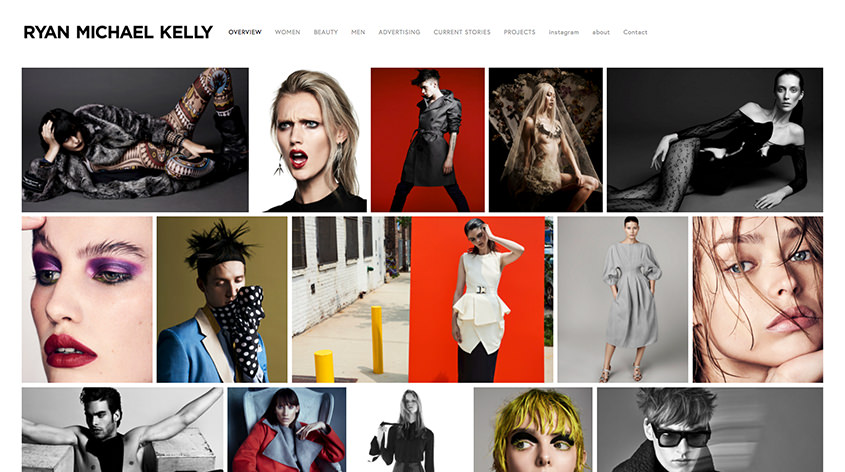
Ryan’s portfolio is another example of a clean, minimal portfolio that works. While browsing this portfolio, mentally take out the colorful images. See how clean and simple the website design really is. This proves that sometimes you don’t need colorful backgrounds, slider, accent colors and all that fluff. Good typography, white space, clear navigation and your photography can add up to a great personal website.
15. Tim Flach
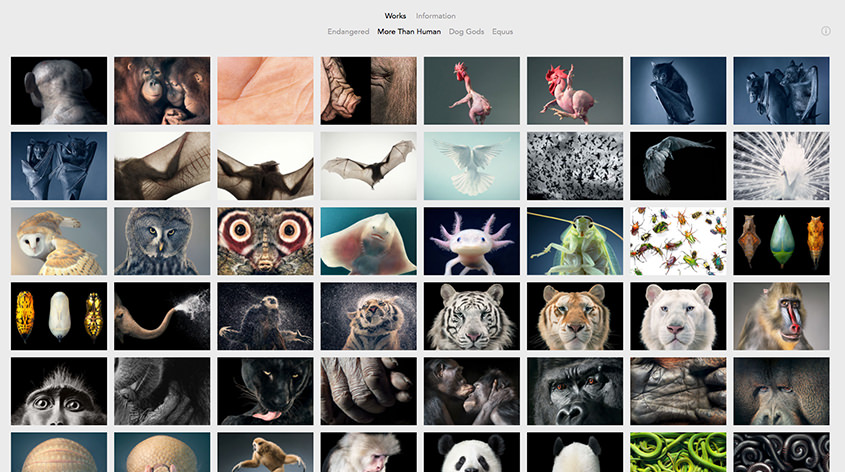
A portfolio website that belongs to a big name – Tim Flach. But I didn’t choose this portfolio just because of the amazing photography, but because of the website design as well. First off, it catches your attention! I mean, just look at that video background when you first visit the site. The portfolio itself is neatly organized in a grid, click on any image and it opens in a full-screen slider that beautifully fades from one image to the other. All of this creates a great browsing experience.
16. Ravi Vora
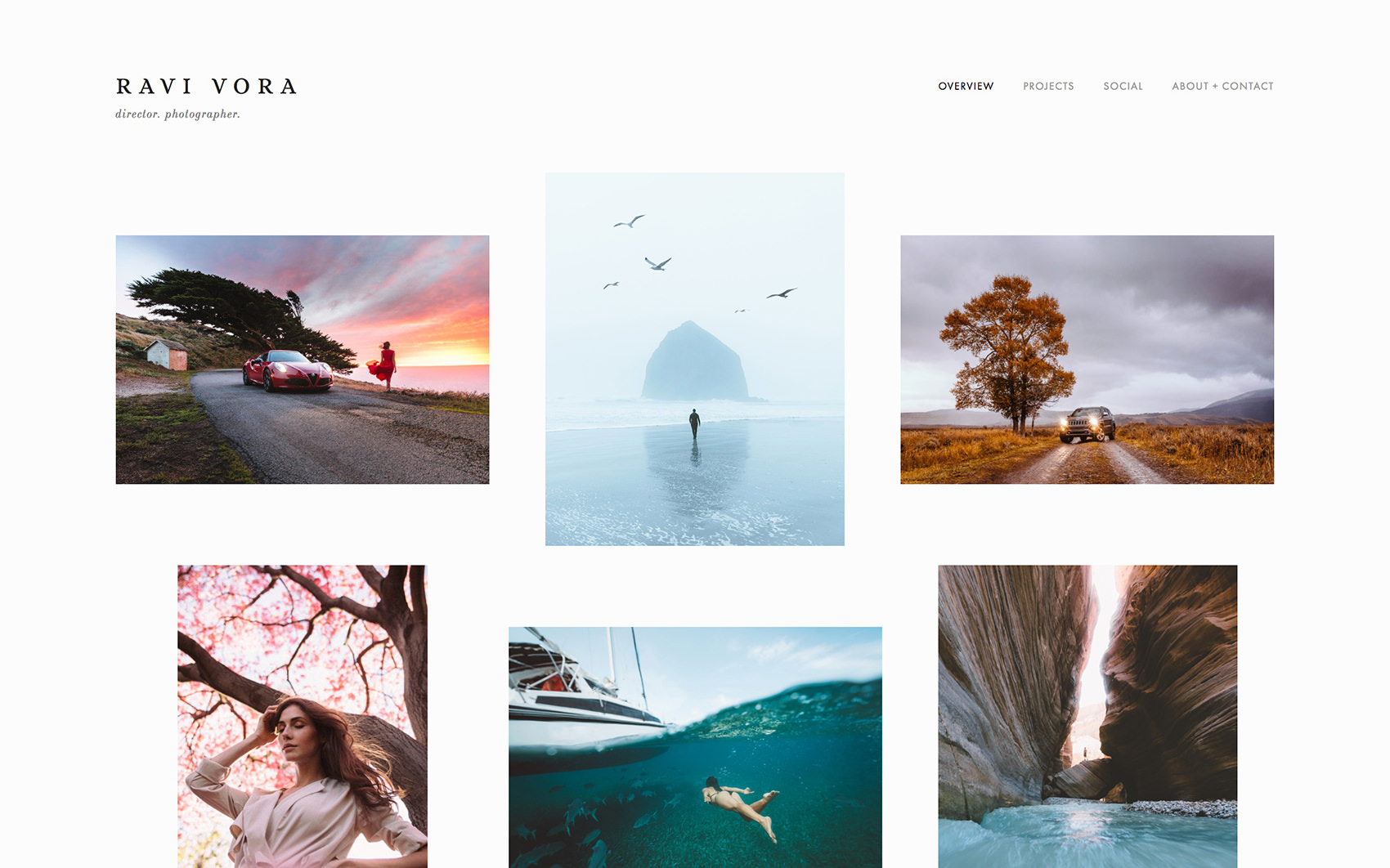
Ravi’s portfolio is a perfect minimalist example. The home page consists of beautifully coordinated three column grid. Pay attention to the layout, although it looks freestyle at first see how the images are arranged – landscape, portrait, landscape orientation in the first row. Portrait, landscape, portrait orientation in the second and so on.
The “project” page consists of albums that can be viewed in a simple, classic one column layout. The simplistic approach with special attention to the details makes for a beautiful browsing experience.
17. Love + Water
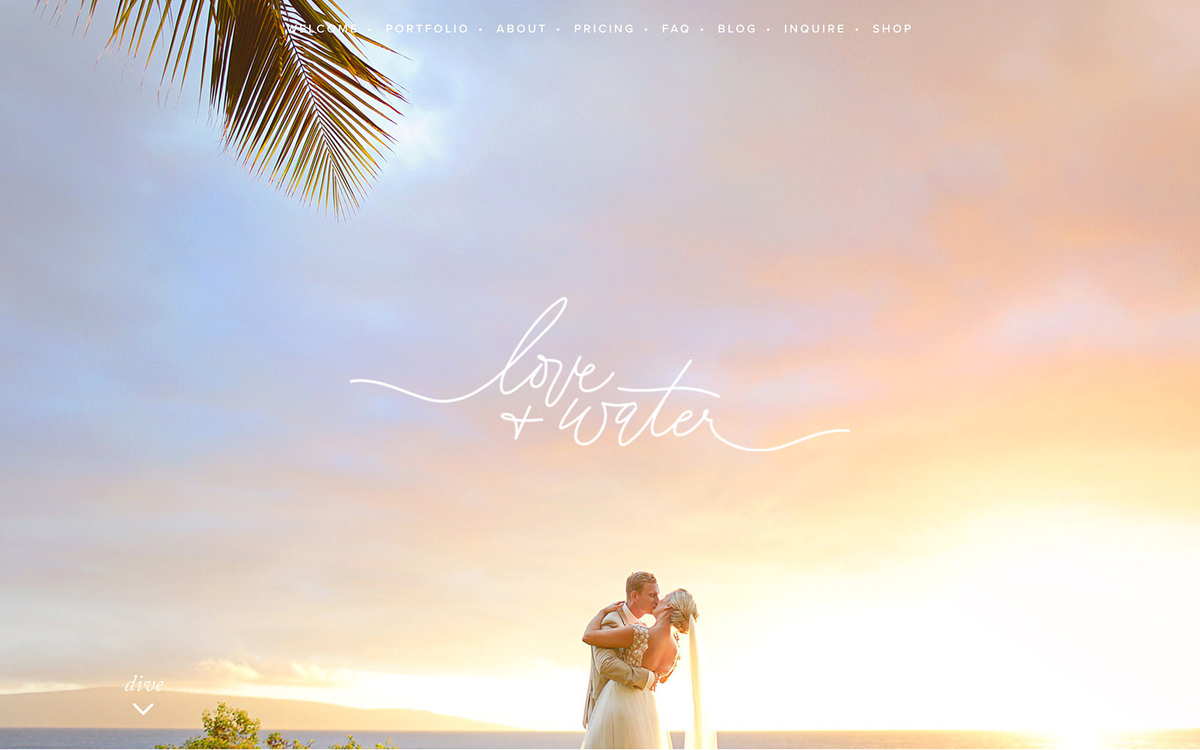
Love + Water portfolio website creates a professional business feeling. All important information can be found right there on the front page of the website. From services and pricing to galleries and information about the photographers it’s all there plus it’s presented in a romantic, beautiful layout. Beautiful!
18. Oana Foto
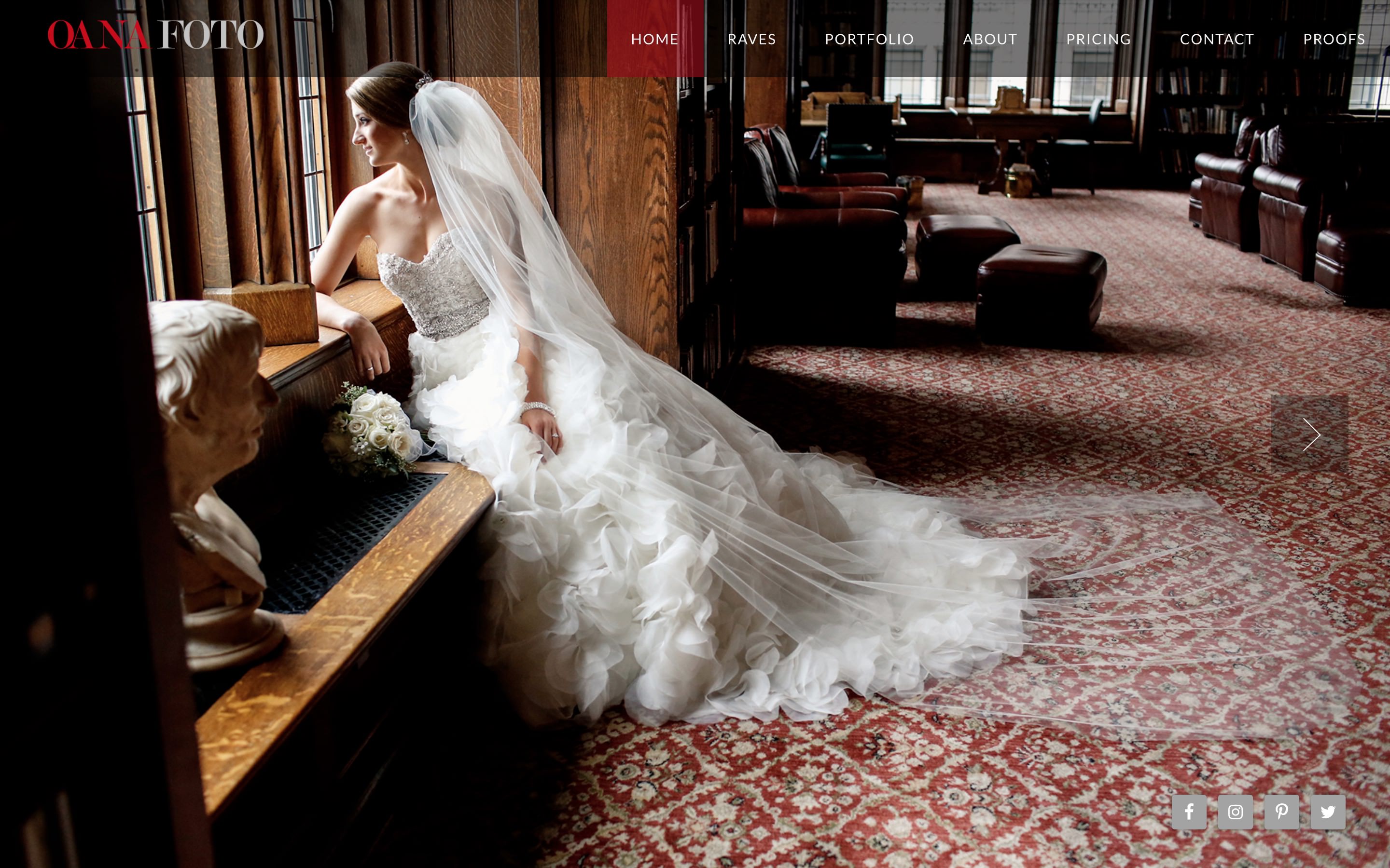
Oana Foto portfolio website was created using a WordPress portfolio template called Camilla. This photography portfolio website has an unusual yet intuitive browsing experience. The page-to-page navigation has an interesting overlap effect and the portfolio page consists of multiple horizontally scrolling galleries that open up in a fullscreen pop-up gallery. A great little extra is the page background image that you can see in the “About” and “Contact” pages.
19. Adam Von Mack
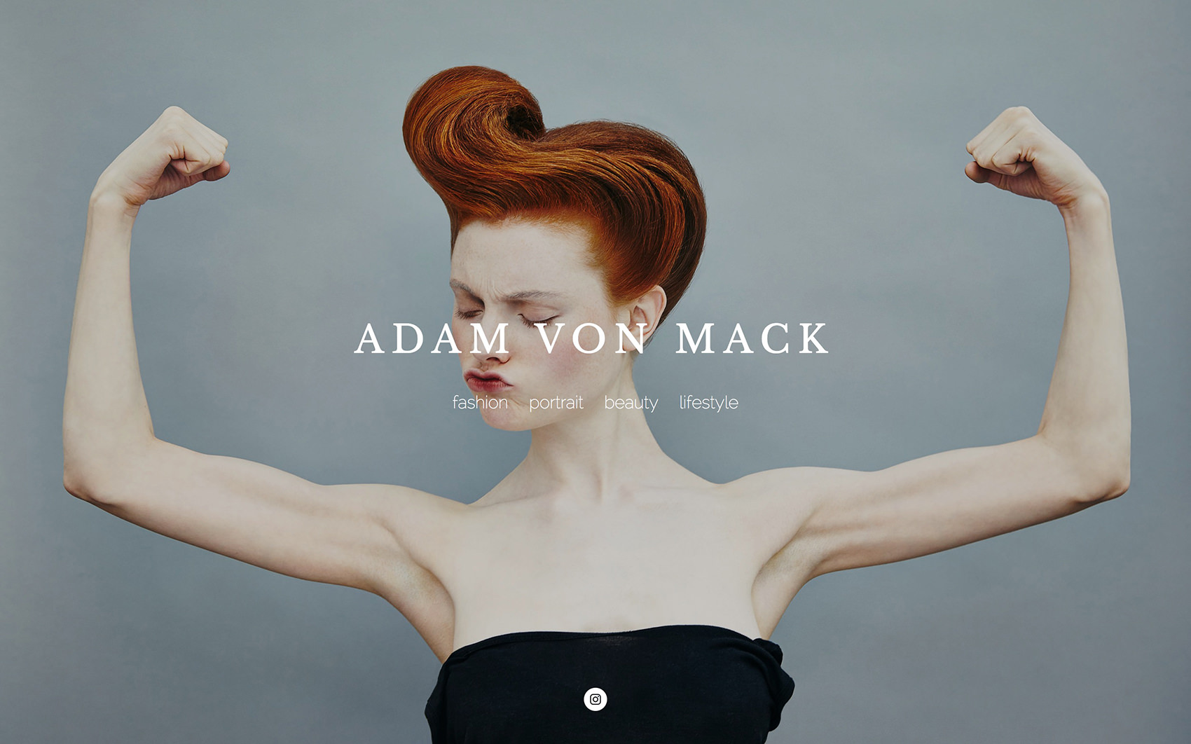
Adam Von Mack’s portfolio is simple, straightforward and its main goal is to showcase his work. A great eye-catcher welcome screen lets you choose one of five portfolio categories that lead you straight to an image slider. Thanks to its simplicity, the images load very fast and the browsing experience is a pleasure.
20. Laura Makabresku
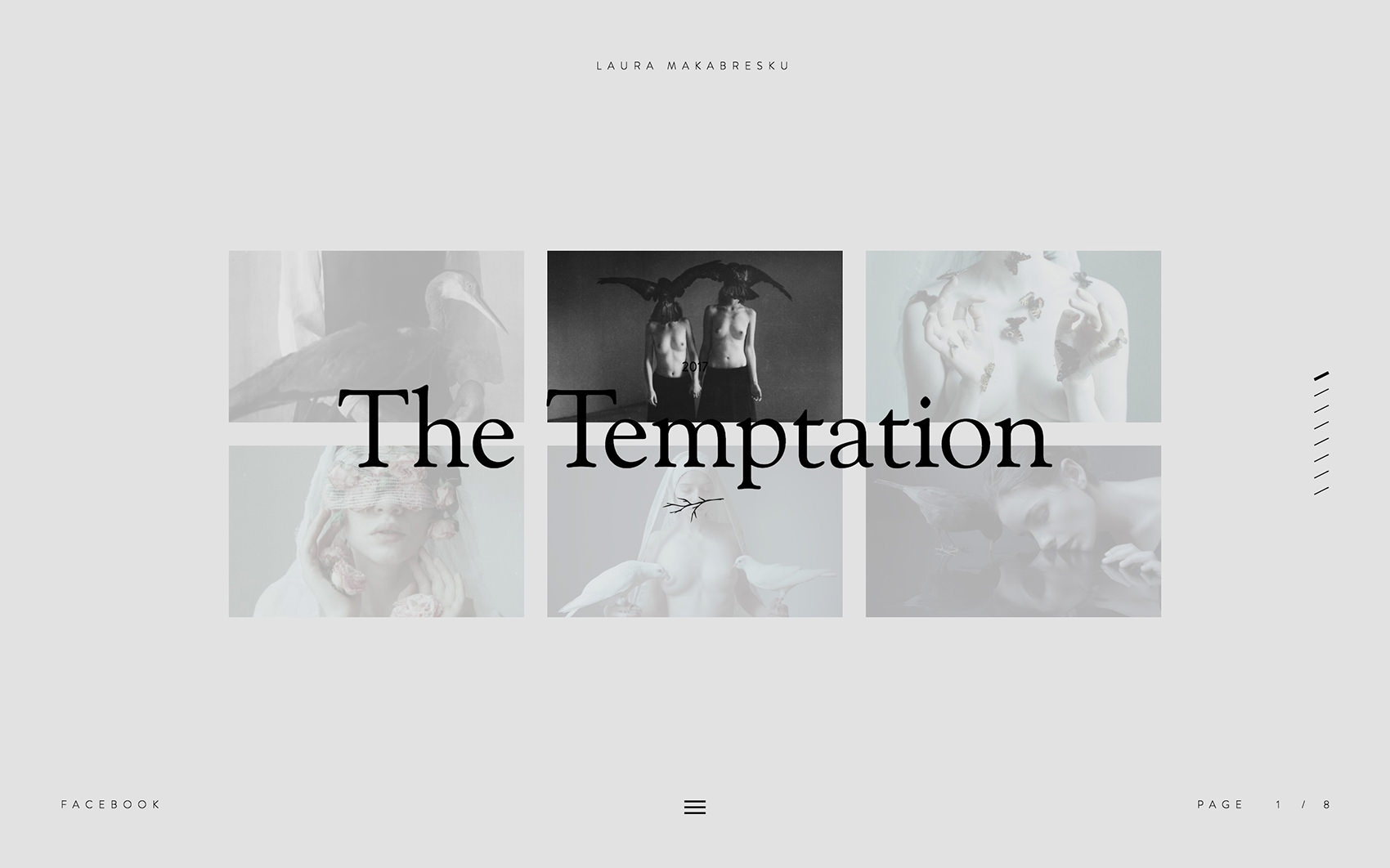
Laura’s portfolio is something different. It’s not as intuitive as other examples in this list but it definitely very interesting. Rather than being a place for showcasing Laura’s photography, the website is like an art installation in itself and in my opinion, suits the photography style very well. Take a moment to browse this example and see how much is possible in the web of today.
21. Anna Morisini
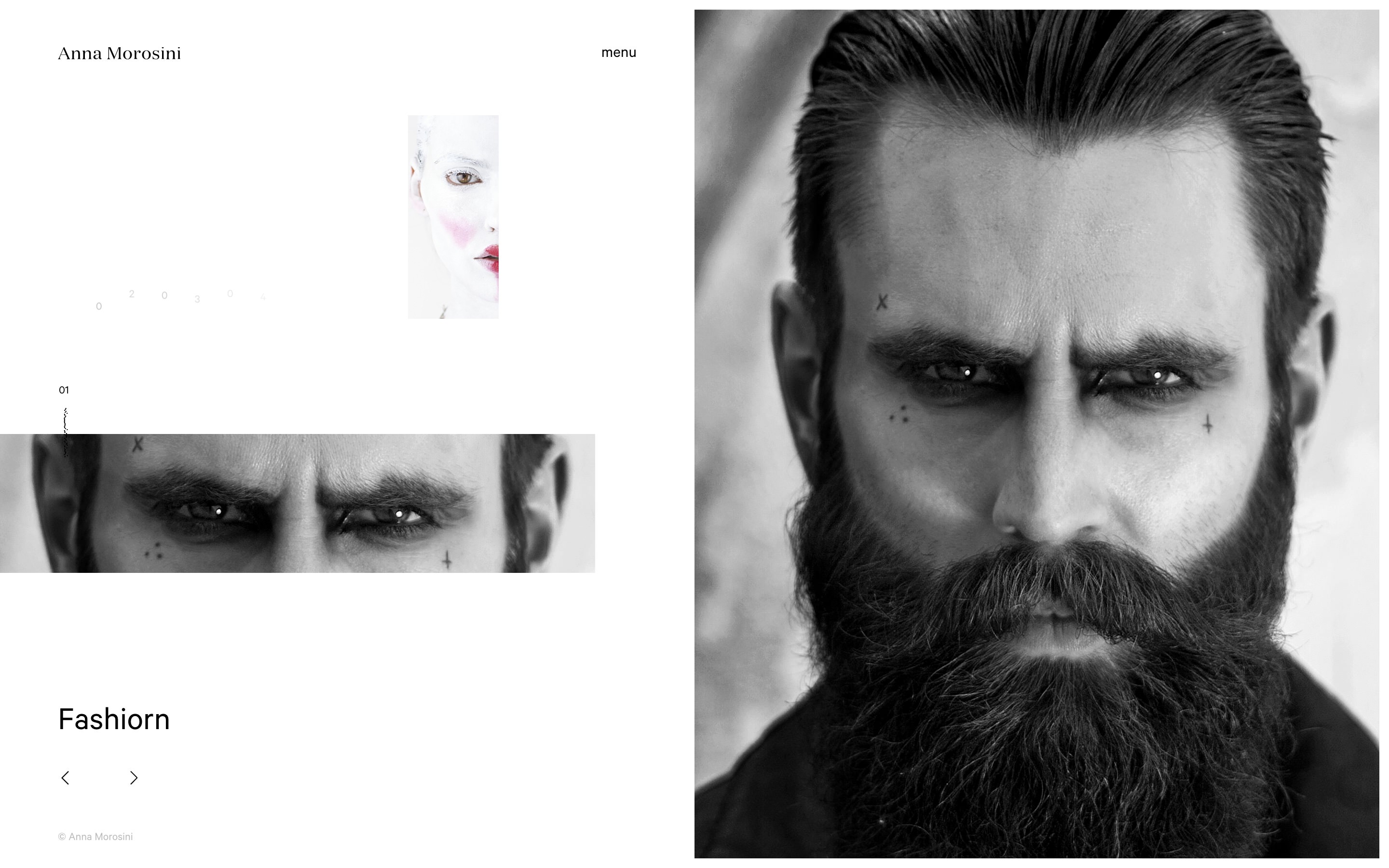
Another highly creative and fascinating example of how much can be done when you think outside the box. Anna’s photography portfolio reminded me of a puzzle that needs solving – but in a good, fun way. You catch yourself thinking things like “What if I click here?” and “What happens if I scroll now?”
22. Rachel Rowland Photography
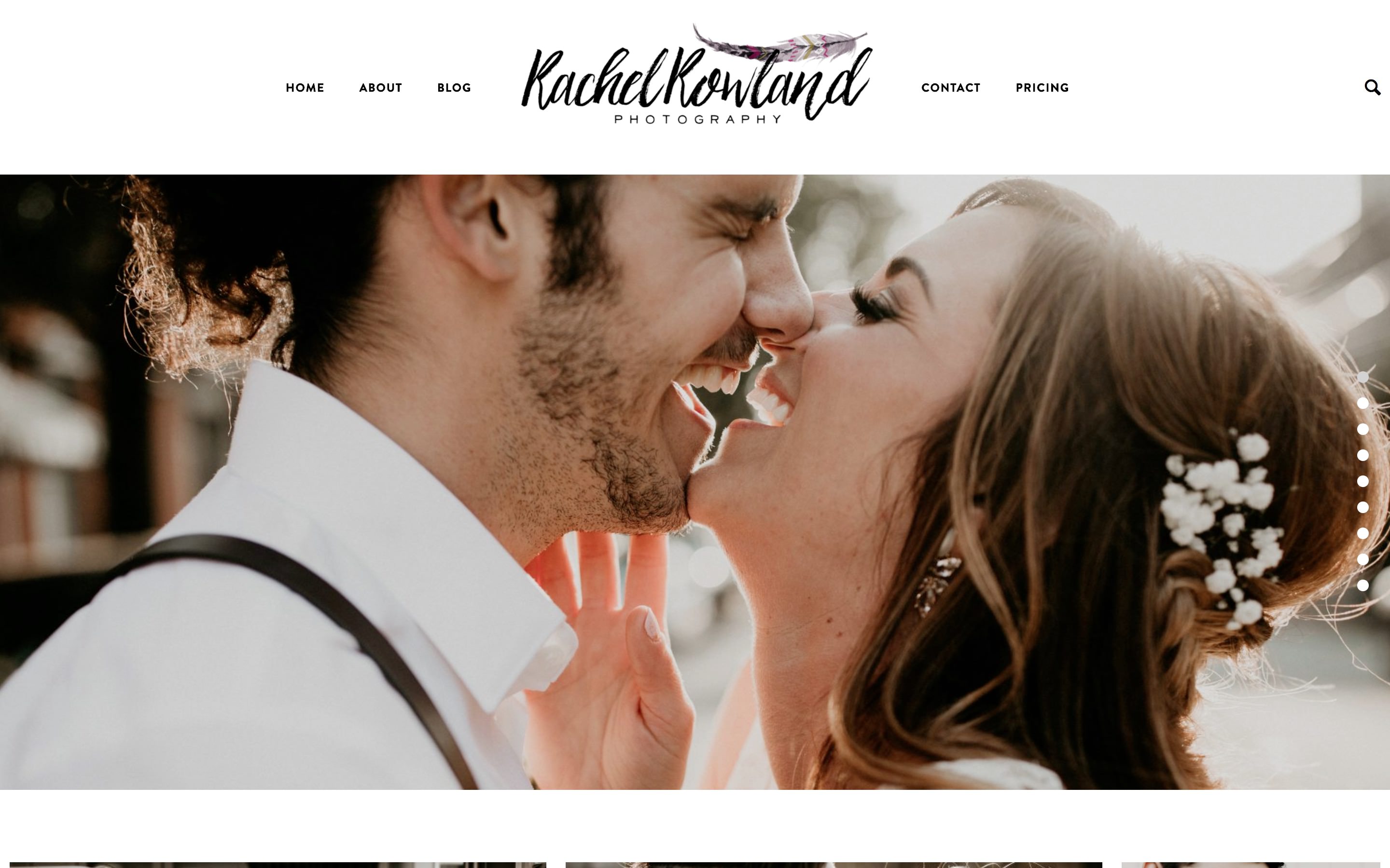
Rachel Rowland’a photography portfolio is another example of a simple, straightforward portfolio website. Instead of a portfolio page, she is using her blog to tell about the stories she’s captured.
23. Urban Photography
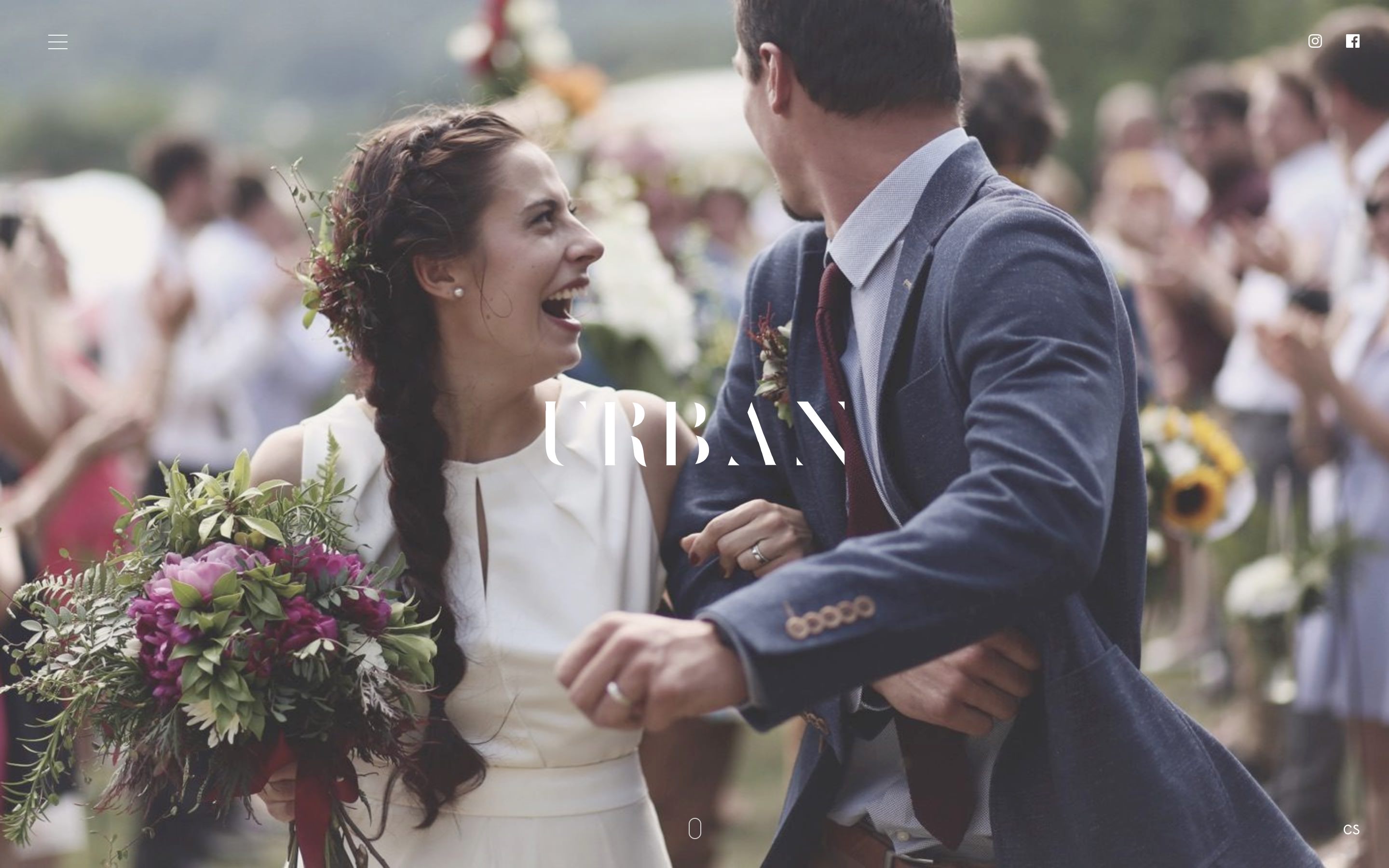
Urban Photography by Lucie is a fantastic portfolio example that shows you how to tell a story – honestly, after browsing Lucie’s website I feel like I have talked to her in person! Little, personal comments fill the site and tell you what you’re about to see. It’s great and sincere!
24. Our Love Is Loud
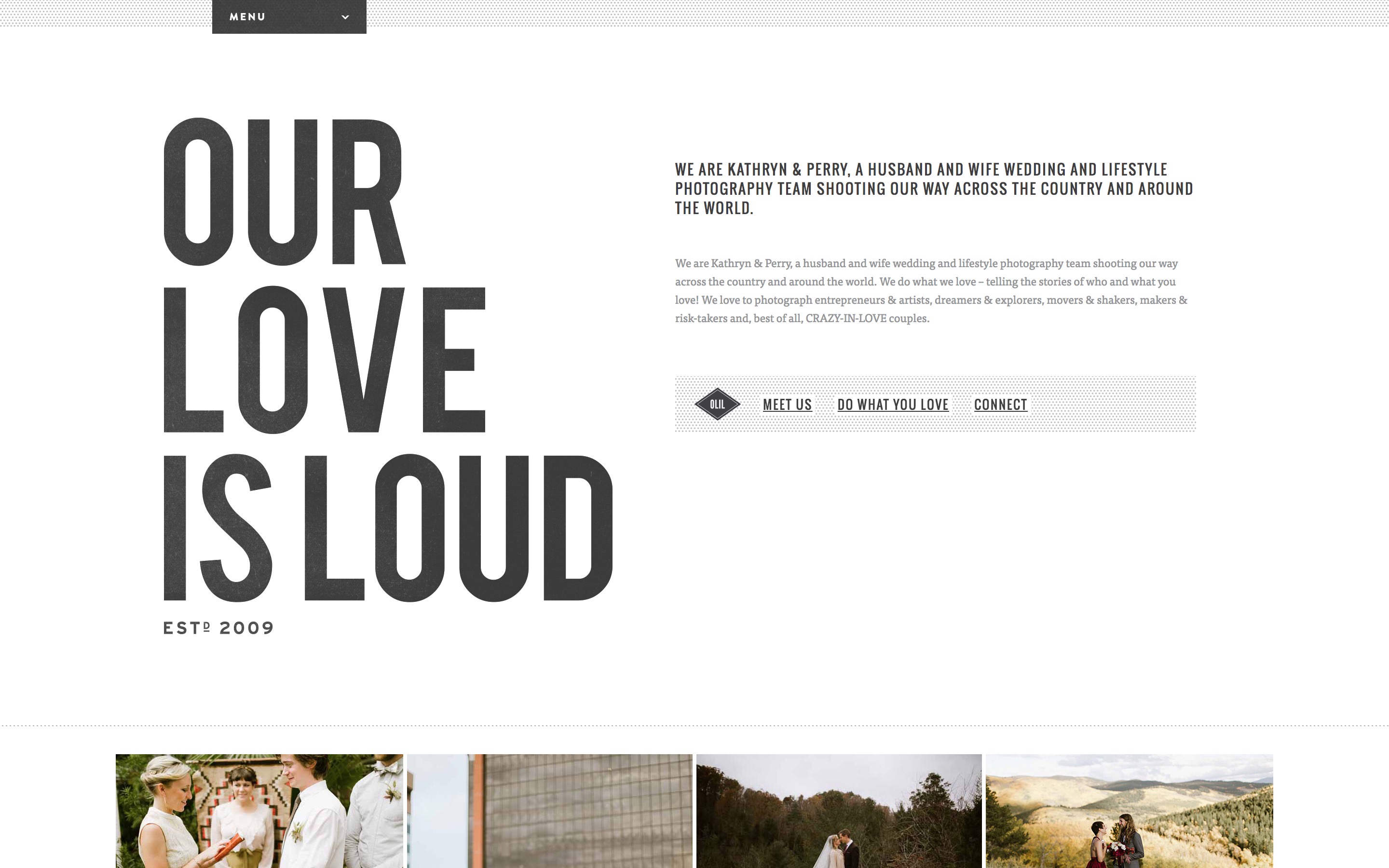
Fun little portfolio website belonging to a husband and wife duo. Who said that your logo has to be small and on the left side of the screen?!
25. Nordica Photography
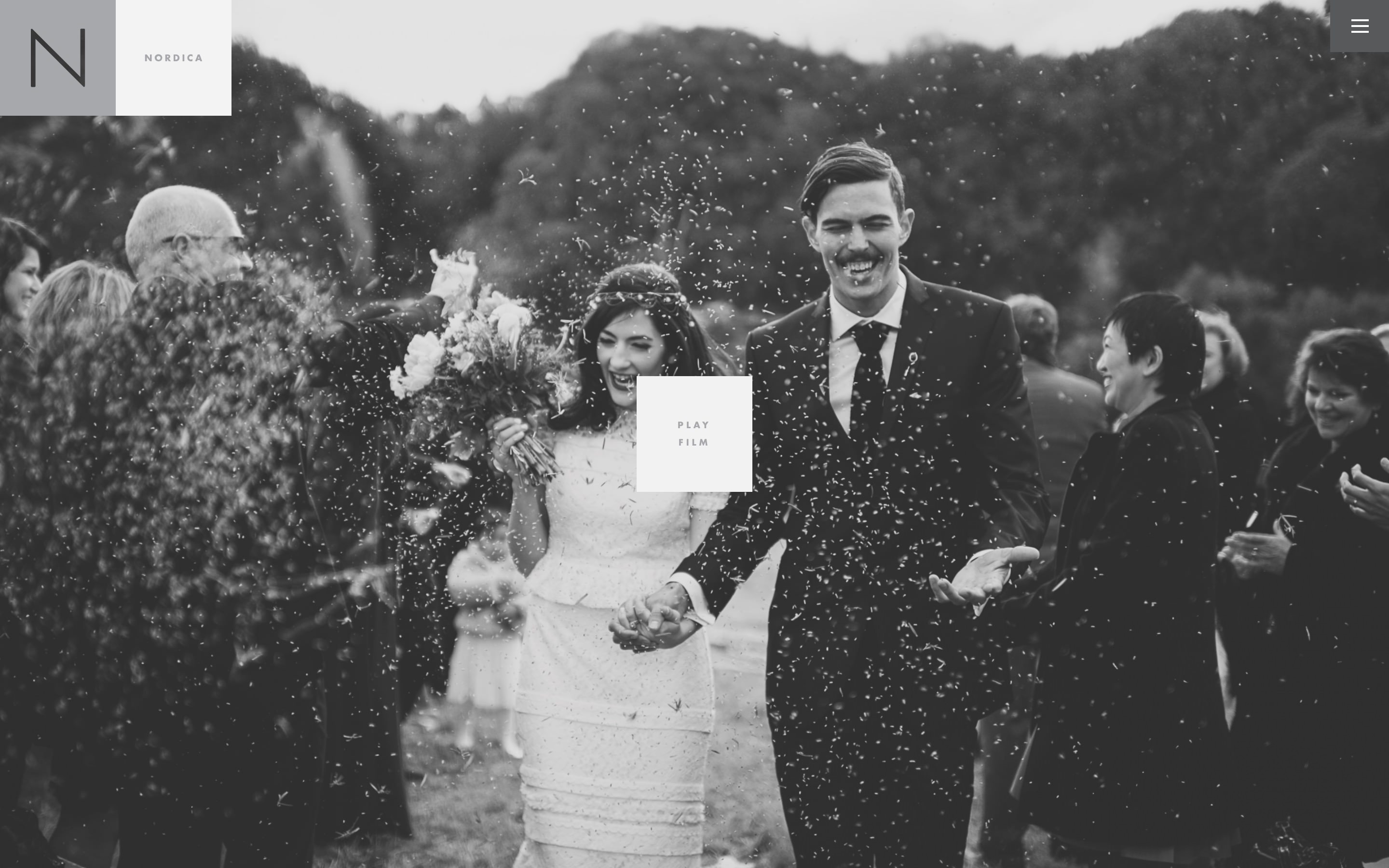
Nordica photography is a very creative photography portfolio example. Although not one of the most intuitive sites out there, it has a strong personality and keeps to its style which is boxed! All important elements are square – from the logo to gallery thumbnails.
26. Love Made Visible
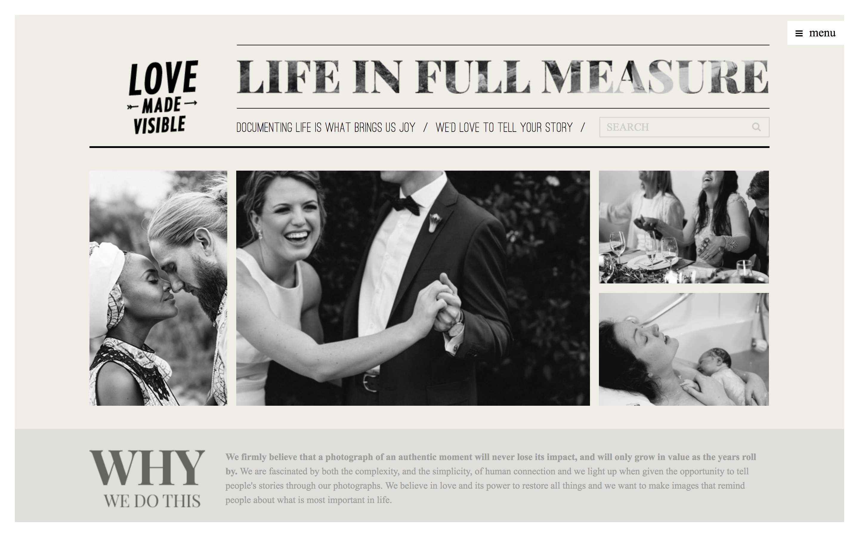
Just like the previous example, Love Made Visible portfolio website has a distinctive style as well – it resembles a printed newspaper! A creative approach in order to stand out from the crowd.
This piece of writing will help the internet people
for setting up new website or even a weblog from start to end.
Do you have any recommendations for a portfolio website with photographs with very different aspect ratios?
If your photos have different aspect ratios, a portfolio with a “masonry” gallery layout would probably work best. Have a look at Aventine portfolio for example. It’s a WordPress theme with who types of galleries – horizontal and masonry. If Aventine doesn’t match your style, Pixelgrade has some high-quality designs as well.
Great collection of portfolios! [Another great one](https://www.danqing.co) with a dark theme for inspiration.
Hi there,
Thanks for the link! It’s an interesting portfolio design, although some areas could be improved in order to make it truly great. Here are some things that caught my eye after a quick browse:
1. The website has three different navigation placements. Bottom left when you first visit the site, right side vertical for the portfolio page and top right in the about page. It is not a good idea to be so random, it almost feels like you visited 3 different websites instead of one. The user is forced to look for the navigation every time she clicks on a new page. That can lead to confusion and frustration. Stick to a single navigation placement for better usability.
2. Always make sure you give your site visitors an option to return to the home page. Make sure that your logo can be clicked on to return to the main/home page. This particular website has a great fullscreen image that is shown when you first visit the website. There was also an option to go visit the authors Facebook page there. BUT right now there is no option to visit that page again (what if I wanted to go to that Facebook page?) There is no “home” link anywhere on the site.
3. What is the purpose of this portfolio website? Is it to just show off the images? Or is it to show off the images AND get new clients? If the purpose of your website is to get more clients, make sure that getting in touch with you is super easy. The easiest way for a website visitor to get in touch with the website owner is by contacting them. Where is the Contact page on this website? It is hidden in the About page. Never hide your contact info, you might lose potential clients.
All of these are pretty common website mistakes and luckily they are pretty easy to fix! We have a blog post called “Do’s and Don’ts for your photography website” that covers these and a bunch of other common portfolio mistakes and how to fix them, so check it out!
great inspiration. thanks for sharing
Great collection of portfolios!