
This guide is for photographers who are about to either make a photography portfolio website for the first time or remake/redesign their existing website.
With the rise of DIY website tools and builders, It’s easier than ever to build your own photography portfolio website than ever. There are dozens of platforms and thousands of design templates to choose from. At the same time, I’ve seen a sharp decline in the overall quality of portfolio websites. And of course – it makes sense. You’re a photographer, not a web designer. You spend your days practicing your photography, not web design.
Making a portfolio is extremely easy, however, making a ton of mistakes is equally easy. That’s what inspired me to write this article.
Note
While I am writing this as a guide to creating a good photography portfolio, I think that the principles I’m laying out here apply to all sorts of portfolio websites – graphic designer, architect, fine art, etc.
I’ve learned a lot over the past 4 years of crafting web designs for photographers and after browsing thousands of portfolios I’m going to try to condense as much as I can in this single article.
This is not a guide on how to use any of the website builder tools. Before you touch any of the tools, you have to learn the principles of a good photography portfolio and how to think about building your portfolio, then you’ll be able to apply that knowledge in any platform you decide to use. It doesn’t matter whether you use WordPress, SquareSpace, WIX, Format, Dreamweaver or Adobe Portfolio to build your own website – if you’re doing it yourself, there are a few things you have to consider. Please do yourself a huge favor and set aside time to read every single word in this “un-technical” tutorial.
The principles I’m laying out in this article are for the web, not a specific platform. I just want to see better photography portfolio websites out there. I hope you’ll learn something valuable from all this.
The Definition
Opinions may differ when it comes to portfolio websites because different websites have different goals. I want to establish what makes a great photography portfolio first.
In my opinion, a great photography portfolio is one that will help you display your work and your style. So that’s what I’m going to focus most on in this article. If you have a different definition in mind – share it with me in the comments!
Every photographer has their own look and feel and your portfolio has to convey that feeling to the visitor. You have to help your visitor understand whether you are the kind of photographer they’d like to work with.
Define the purpose for your portfolio
If you would hire a professional web agency or a knowledgeable freelancer, it’s quite likely you’d have to fill out a Creative Brief.
Apart from the questions about your business, your audience (all important questions of course), one of the questions in a creative brief that you’ll have to fill is simply – what’s the goal of your portfolio website.
If you’re making your own photography portfolio – this is super important. You must, you absolutely must clearly define this before you even touch your mouse or trackpad. Write it out on a paper if you have to, but you have to have a singular purpose before you start.
Why do I need a goal?
When faced with a decision – you’ll come back to this point each time and ask yourself – does this help my website with the objective, or am I just doing this because I think it would be cool to do. Stop and think about that at each step. Should you add an Instagram feed in your sidebar? Well – does that help the objective? If so – add it, if not, – don’t.
Should you show your abstract photography art in your portfolio? If that helps convey your message, sure, if not – don’t.
More than 1 goal
This is extra important if you have Photography as a hobby and enjoy it so much, that you might want to land a gig as a photographer some day.
I’ve seen questions like “I’m a web developer, but I also love photography. How do I build a website where I can show off both?” – the answer to that is that you don’t.
If you’re an experienced designer you can probably make the correct design decisions and sacrifices that are involved in making multiple objectives work, but then again – you probably wouldn’t even be reading this article.
However, if you’re not an experienced web designer – you must have a singular goal for your portfolio.
The goal for a portfolio in this guide
In this guide, I’m going to assume that the purpose of your portfolio is to showcase your work to potential clients so that they can get a feeling of what kind of photographer you are. If they decide that they like your style, they will then proceed to contact you to see if you’re available.
Simplicity is key. The purpose of a good portfolio is to show your stunning work, so you can do more of it.
Prepare your pictures
Your photography is the most important part of your portfolio

There are different photographers, different styles, different clients, many, many variables. When I was looking for my wedding photographer, the number 1 criteria that I used when sorting the photography portfolios – were the pictures. Ultimately your pictures are the most important part of your portfolio. There is no SEO tactic, no website design, no A/B split test, no magical ointment that you can use – nothing is more important than your photography!
What to put in your photography portfolio is beyond the scope of this article. There are tons of tutorials that can help you with that. I’ll assume that you’ve already selected the images you want to present in your online portfolio.
Don’t focus on the pictures
“Wait, what? You just said that my photography is the most important….“.
Yes, I did and it is. Let me explain.
You probably want to put your best foot forward and show the most amazing shots you’ve ever taken, you know – the ones that you’re really proud of. Not really…
When sorting your pictures, keep in mind that you are a photographer. When you look at a picture – you see the composition, the crop, the noise, the shutter speed and so on. For example, you instantly see a blurry head somewhere in the background or a finger that’s cropped on a joint.
However, most people don’t see photography the way you see it, just as you don’t see websites the way I do.
If we both (you and me) took a look at a painting of Salvador Dali, we might focus on very different things of the painting, interpret the thought in different ways, and come to completely different conclusions. I will probably love it (after all – the man is a genius, in my opinion), and you will come to a conclusion of your own. That’s okay. We don’t see the world through our eyes, we see it through our brains. We all have our own lens through which we look at everything. Your “brain-lens” is educated in Photography, so you see things that others might not.
While you might be sorting by image quality or showing pictures that you’re the proudest of first – it’s extremely likely that your visitors won’t see it that way at all.
Tell a story
Instead, focus on the story.
Take your visitor by their hand and guide them through a gallery – tell them that story, trigger their imagination! An obvious example would be wedding portfolio – start with the pre-wedding shots (makeup, preparation, etc.), then move on to pictures of the weddings, then the party, and then the conclusion of the night.
That’s what I mean when I say don’t focus on your pictures.
If the shot where the sun and the stars aligned perfectly was a groom giving a speech was the best image you ever took – sticking it in the beginning of your gallery is just going to break the logical flow. And while your family, friends and some photographers will appreciate that perfect shot they probably aren’t your target audience. Your focus is getting more clients, and to do so – you want to tell them a story of a beautiful wedding.
This doesn’t apply just to wedding photographers. If you have a cake smash gallery, don’t just dump all your cake smash pictures in a gallery. Tell a story! Show the preparation, build trust by showing the care you put in that session, then show the amazing shots you’ve taken.
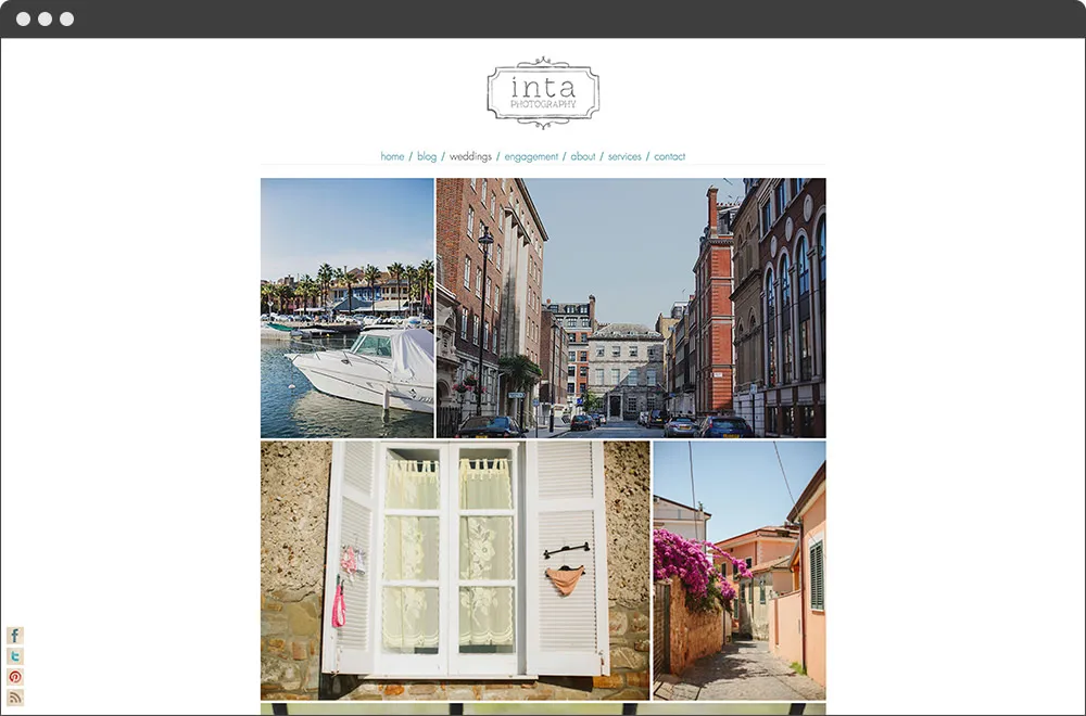
Example of storytelling with wedding photography shots by Inta Photography
Series of shots used to tell a story can be anything from two or three shots arranged in a frame or collage through to hundreds of shots arranged in an album (online or printed).
A common multiple image story that many of us will be familiar with will be the photography we do on a vacation. Whether we consider it or not – such a series of shots documents the experiences that we have over a period of days/weeks or even months. I’ve included a few photos (right) from one of my recent trips that tells the story of a night a group of us had smoking apple tobacco at a Turkish cafe.
Other multiple shot stories might include weddings, parties, conferences etc.
Telling a story in a portfolio doesn’t mean just posting pictures from a single photo shoot. In fact, I would probably avoid that if possible. Sort them in such an order that is going to tell a story.
Know your audience
Knowing your audience is key. Image quality not being the focus of your pictures might be completely false for some. For example, if you’re working with other professionals like creative directors who also have a keen eye and are judging photography from a professional perspective. If that’s the case you can take the advice above with a grain of salt, however, I’d still argue that we’re all story consumers, so it might be worth exploring the idea even in the professional-to-professional field.
Create your site structure first
Before you create your site, it’s a good idea just to figure out the structure you need for your portfolio. You can browse around and look at some good photography portfolio examples, or search for some top photographers in your region and/or field. Imagine you’re just a regular joe (definitely not a photographer) looking to hire them, and then just browse their portfolio. Take notes about the thoughts flying through your head while pretending.
On each page that you visit ask yourself: “what’s the purpose of this page” and “why is it there”, and most importantly “is there something I could do better?”.
The most common photography portfolio structure
Making the structure of your site isn’t the place to get creative. Use something that works and people are familiar with. Building out that structure is as simple as just building a list.
The most common structure I’ve seen is this:
- Home
- Portfolio
- Weddings
- Portraits
- Engagements
- About Me
- Contact Me
- Blog
It’s really that simple. Simple is clean, simple is good. You want your site to be simple and easy to use.
The bare bones structure
Some photographers even go as far as simplifying the site even further. And it works!
- Home
- Weddings
- Portraits
- About Me
- Contact
And when you think about it – it has everything that your clients are looking for. Your portfolio and about you. If they like what they see – they proceed to contact you. That’s it, no need to complicate things.
The simpler your site – the easier it becomes for your visitors to understand what they’re supposed to do there.
Define a purpose for each page
Building the structure becomes more complicated only if you want to add a lot of pages to it.
Make sure that every page has its purpose. “I want to show a video I like” is not a good enough purpose for it to be placed in the site structure. If there is a deeper reason for something – go ahead.
For example – I’ve seen a few photographers make a kind of “about me” video. Don’t create a separate page for that video – instead – place it in your “About me” page. That’s going to improve your about me page overall and take a little bit of complexity away from the site.
Don’t create a page just because the content you’re about to write is a little bit different from everything else.
For example – testimonials and reviews. Some people might open your about me page, but never even consider looking at your “Testimonials” page. Instead – you can add the testimonials to your “About Me” page. That’s where people are going to look for whether they like you or not anyway – show those testimonials where the people are.
The point of this exercise is to really consider whether you need a separate page in your site structure for every bit of content, or do maybe some pieces of content work really well together. If they work together – you don’t have to separate them.
A few examples off the top of my head are:
- About me + Testimonials
- About me + FAQ (depending on the FAQ)
- About me + Services
Be careful. Each piece of content you add might subtract from the final outcome. For example “About Me + Testimonials + FAQ + Services” is going to be difficult to pull off. Especially if you’re going for a more personal feeling.
Don’t use broad or generic words
For example – “Info”. Information is your about page, your blog content is information as well. FAQ, pricing, reviews, testimonials, events – all of that is information. Don’t use “Info” for any of these. Be specific. If it’s a pricing page – call it that. Save your copywriting creativity for your content, keep the structure easy to understand.
Time to create your photography portfolio!
With all that planning done, It’s finally time to work on the meat and potatoes of your portfolio.
Whatever platform you decide to use – there are a couple things you should and shouldn’t do, so I’m going to go over all that in this section.
If you skipped down just to get this part, scroll back up and read every single word up there.
Do not build a portfolio without a clear goal and structure in mind, or you will easily fall into “aww, this looks pretty” trap.
Pick a design you like
I can’t choose the look and feel of your website for you. Even if you’d hire someone to design a site for you – you still have to show them what you like, because it’s your portfolio – Your look and feel. How to choose a starting template is a topic for another blog post, but here are a few key pointers.
Make sure the design is up to date
Design trends change around every 1.5 – 2.5 years. If you pick a modern design today, you can keep it for another 3 years or so without a worry. I’m not saying you must change your design every 3 years. But keep an eye out for whether your design looks up-to-date with the rest of the internet.
I think it took too long for a lot of Photographers to switch to responsive design when it became popular. These are the kinds of major trends you have to pay attention to (you can do that by following our Facebook page – we’ll keep you posted).
When you do change the design, make sure you don’t change the look and feel of your brand too much.
Update your footer
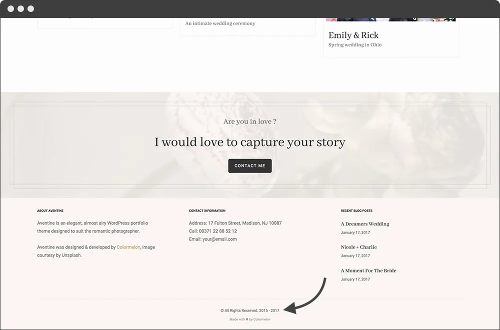
Make sure that your copyright doesn’t say “Jane Doe Photography 1999 – 2014”. Unless you’ve passed away recently, I suggest keeping that footer year up to date every year. People pick up on that, and it just makes your site look unprofessional if your copyright is not the current year. Professional websites change this automatically and if you’re using some website builder service, set a reminder for yourself on repeat each 1st of January and update that year, even if you have a little hangover from the new years eve.
A word of caution about DIY Design
If you’ve ever taken a “quick design course” or “design bootcamp”, the following few paragraphs might sound a little harsh, but I mean it in the nicest way possible and for your own good.
Please, please, do yourself a favor – forget everything you think you might have learned about graphic or web design.
Web Designers plan and draw (not code) web designs in their software of choice. Then “Web Developers” take that image and program it in HTML, and then make it work with some CMS (Content Management System) with some more code.
Just like photographers, web designers study and practice their craft every day for years before they become good at it.
Taking a graphic or web design class for a couple of days or weeks doesn’t really teach you everything you need to know to make a successful design.
Saying that you can use “Platform X” to design your own photography portfolio, is like saying “I took a 3-day photography course, so I don’t need to use stock photography and hire photographers anymore because I can take my own pictures with my Canon 7D Mark II on auto”. I think you know exactly how far from the truth that is.
Most providers (website builders and WordPress themes alike) pride themselves on providing the tools needed so that their customers can do anything. “Unlimited layouts, unlimited fonts, customize everything” they say. However, every uneducated customization has at least a 50% chance to subtract from the overall quality of the design, instead of improving it.
I know you’re probably not going to feel that way, but psychology research says that it’s true – we like things more when we’ve customized them or they come personalized for us. It’s the same reason why Starbucks writes your name on that cup when you order coffee.
Give me 5 minutes in Google (just by searching “photographers near London” ), and I’ll come up with a list of 25 websites where either some design principle is unknowingly broken in a bad way, or the whole site is completely messed up. I’ve seen it way too many times. It’s exactly the reason I stubbornly refuse to add “do anything” features in our theme designs.
Okay, I hope I have convinced you to be extremely careful when working with the design side of your website.
Moving on to a brighter tone….
You can leverage the pre-made designs!
Whichever platform you chose to go with – they all have plenty of ready made designs that you can use. My advice is that at least in the realm of visual design – customize as little as possible. That means that you don’t touch font size, line height, font-family, background color, spacing (margin/padding) etc.
I know, you might be thinking – my site will look boring if I don’t make the navigation color my favorite color. After all – I want to show my personality.
And you’re right – you should show your personality. And you can do that! You’re a professional visual communicator after all! You’re a photographer!
Tell your story by filling that design with your pictures. Leverage the knowledge and experience of the designer who made that design. Let your work be the focus of your website, not the website itself.
Busyness is the enemy of clarity
I just recently saw this video – “How to Tell A Story with a Picture with Joe McNally on Chase Jarvis RAW”.
Joe McNally said “Busyness is the enemy of clarity”, and it’s as true for your photography portfolio design as it is for photography itself.
There is absolutely no shame in keeping it simple and clean and it’s only going to emphasize your photography that much more! That way it’s going to make you look a lot more professional than customizing your site! Keeping your design clean and simple is a small price to pay to make your site look that much more professional.
The worst possible argument for making changes to a design is to make things “interesting” or “different”. I understand the fear of looking generic or boring, but “playing designer” isn’t going to make things look interesting. That line of thought is going to quickly lead you to trouble. Nip in the bud.
How to design the navigation?
The navigation is the most important part of your site because that’s how your visitors are going to interact with it.
Keep it clean, use clear labels
Your navigation should be clear and easily understandable.
Menus are not the place to get cute with made-up words and internal jargon. Stick to terminology that clearly describes your content and features.
An example of confusing navigation labeling.
At the bare minimum, make sure that at the top level you have Portfolio, Contact Me, About Me. Do not hide them away. They are the most important links in your site navigation.
If you must use menu dropdowns – use them sparingly
I can’t keep track of all the times I’ve seen dropdowns being misused.
Dropdowns hide content. You can’t just stick menu items in dropdowns and pray that the visitor is going to know that your contact information is in a dropdown underneath “About Me”.
If you decide to use dropdowns, don’t just come up with what you think would be good and call it a day. At least ask someone you know (who hasn’t participated in your site creation process) to interact with your site. Preferably ask a couple of people.
For example,
If you put “Pet Photography” under “Portfolio” – sit down with a real person and ask them to find “Pet Photography” on your site. Then observe. This might sound silly, but it’s the easiest way that you can validate that what you think is a logical menu structure is what others think too.
Make the menu consistent
Your menu should be consistent across all pages. That includes the whole header layout. This is an especially big problem for people who are using multiple web services to make their site.
For example – if your portfolio is using “Service X” and client area is “Service Y”, and you also have a shop in the mix from “Service Z” – you have to make sure the menu stays consistent across them all. If you can’t keep a consistent menu – do not link to your “other sites” through your menu.
If your design lacks consistency, you’re risking confusing your visitors. Remember, people close tabs when they’re confused, and you definitely don’t want that! On top of that, an inconsistent design experience is just going to look plainly unprofessional.
Make a good “About Me” page
As far as the content goes, this is almost completely up to you. Most importantly – show your personality – write about yourself as much as you like.
Think of your About page as a way to introduce yourself. It doesn’t need to be exhaustive, and you don’t have to say anything that makes you uncomfortable. Find a balance between being personal and professional, and try to have some fun. This is a great time to step away from the computer, put your self-critic aside, and do some exploratory writing to take the pressure off.
You must include a picture of yourself
People want to see who they’re dealing with before they will contact you. Some anonymous entity on the internet isn’t trustworthy. Nothing is a substitute for a real human face.
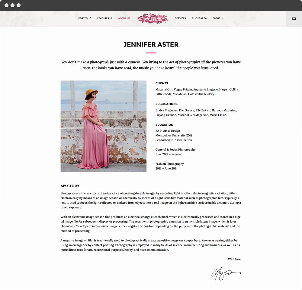
Our take on an “About Me” page. A screenshot from one of our themes.
Don’t use group photos. If you’re a photographer couple – sure, why not. But if you’re a solo photographer, a photography of your recent trip to mountains with – a group shot from that isn’t going to work.
Avoid mirrors and selfies. Yes, I know – a shoemaker has no shoes, a web designer has no website and a photographer never has any photos of him/her. Either buy a tripod and a timer or go out and hire a professional photographer.
Keep the photography style consistent. When you get your photo taken, make sure it resembles your style of photography. Your style is your brand, even if someone else took the shot, it still has to look like you did. It’s a minor detail so don’t worry too much, but keep it mind.
Use your own voice. It might be uncomfortable writing about yourself. Whatever you do, don’t write your “about me” page in 3rd person. Just don’t do it. It takes the connection away. Talk directly to your visitors. Eventually, you will talk to them anyway, if they contact you. Show yourself, your personality.
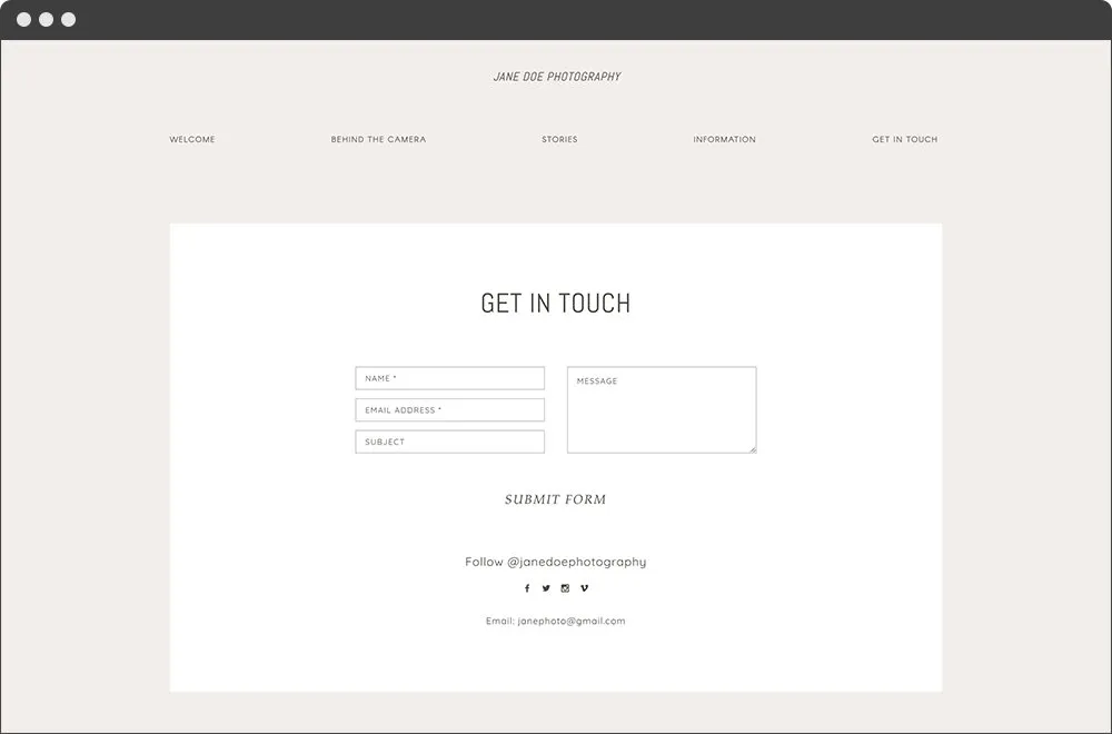
Create your “Contact Me” page
Include your email
And don’t do any trickery like “john.doe [at] gmail [dot] com”. It’s unreadable, it doesn’t look nice. Gmail is very good at detecting spam, I think that these days all the other emails services are just as good at it too. It’s automatically going to go directly to your spam-box anyway. If you don’t believe me – create a new email address just for your contact page, but don’t forget to check it too.
Include your phone number
This depends on your exact business, but generally – if you have nothing to hide and you’re working with local clients, I recommend adding your phone number too. And don’t hide it somewhere in the corner.
Contact Form
If you’re busy all the time, booked years ahead, and if you want to decrease the number of people that contact you – then you should make a complicated contact form with dates, additional questions ( like phone number, the venue, your age, how did you hear about me etc. etc. ).
However, if you want to communicate with your potential customers more – don’t complicate that contact form. Ask for their name and an email to which you can respond. That’s it.
If you still think that you must use at least a date field – don’t make that field required. Some people might not know precise dates, or their intention might not be date related – maybe an author in a large magazine wants to feature you – why should they fill in that date?
Don’t use the storyteller form
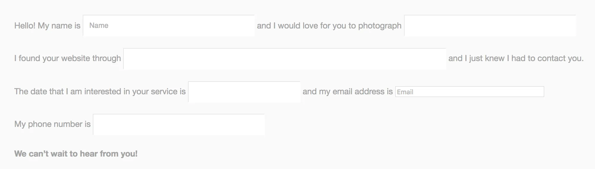
An actual example of a contact form I once found.
This was popular a few years back and has naturally died off since then.
It might look “interesting”, but you already know that “interesting” is not a good argument for good design.
It’s confusing for the visitor, they have to parse your site, read content and based on the context they have to figure out exactly what you’re asking them to fill in there. And I have no idea how well this works for people with disabilities, but my guess is that it doesn’t look that well when compared to a regular “boring” contact form.
Don’t ever make things this interesting for your visitors, unless the goal of your portfolio is to entertain people in a weird way.
Contact information throughout the site
If you have a clear and direct contact me page in the top menu, it’s not necessary to clutter the rest of your site header and footer with your contact information. You can add it if you want to, and if you footer has the space for it – it’s a good idea to add your contact information and your address as well. However, don’t try to force the contact information in everywhere you can. If you have a good contact me page – you can add the extra contact information only if there is room for it.
Display your photography portfolio
Because you’ve already picked and sorted the images that you will show in your portfolio – this step is the easiest. Upload your images, create your galleries and that’s it.
If you still haven’t picked the theme/template that you’re going to use for your portfolio – here are a few tips for things to look for:
Don’t auto-crop the portfolio, when you can
Make sure you have control over your images. You’re the photographer, you should be the one deciding how the images are cropped when they’re shown.
An exception can be made for “portfolio archive” if there is one. I call “portfolio archive” a layout that lists out the albums you have inside a portfolio. For more creative layouts – sometimes those albums might crop the cover image. That’s okay. By controlling your images I mean the images that are there after your album is opened.
And if crop happens, make sure on all screen sizes that you’re not cutting heads off. You don’t have to use any fancy tools to do that. Just resize your browser window and have a look.
Make it easy to browse
You must make your portfolio galleries easy to use. People visit your portfolio because
a) they forgot your contact information
b) they’re looking for a photographer, and they probably want to see pictures
You already know that your photography is the most important content of your site, so you have to make sure that the portfolio galleries are easy to browse. That’s what people are visiting your site for!
Don’t combine the portfolio page with call-to-action elements, multiple paragraphs of text or a lengthy sales pitch.
I don’t believe that there is a “sales pitch” you can give your visitors that will suddenly make them fall in love with your photos and hire you instantly. When hiring – people consider lots of variables. In my opinion, one of the most underestimated variables is the price-performance ratio.
Price-Performance Ratio
People visit your site – they look at your photos, decide if they like your photography style, they have a look at the information you’ve put on the site to decide whether you’re agreeable and whether they would feel comfortable with you, and then they consider the price.
If they love your photography, and you’re within their price range – they’re going to hire you. That’s it. You don’t need a fancy sales pitch or call to action to enter an email address. People visit your portfolio mostly because they already know that they need a photographer. Don’t complicate the path to purchase for them.
And if they can’t afford you – I don’t think that a sales pitch is going to help you solve their budget problem.
Your Blog
It’s completely up to you whether you want to write a blog or not.
If you do decide to write a blog, make sure that you actually set a regular and specific time when you do your writing. An inactive blog is going to make you look inactive.
The Blogfolio Pattern
A common theme I’ve seen among photographers is to use their blog as their secondary portfolio.
The idea is that you show only your absolute best in your portfolio galleries, and use your blog to display some of your individual shoots.
For example, if you’re a portrait photographer – you show all the best portrait work you’ve made over time in your portfolio. Then in your blog, you might post a kind of a “case study” of how a recent shoot went with a couple images.
If you decide to go the “blogfolio” route and your blog is picture focused, make sure your blog layout isn’t “open blog style”.
When people first open your blog page, they should see a list of all your blog posts with tiny excerpts of what that post is about. Then when they open a particular shoot – they’d see the full post and all the images. This will keep the page load time reasonable and is a common good UX practice for a blog.
Final Thoughts
Building a portfolio is as easy or as complicated as you want it to be. If you follow the few guidelines in this article, you should be able to build a solid portfolio website for yourself.
If you take only 1 thing away from this article (although I hope you’ve picked up a few things) – please don’t try to complicate things or make them “look interesting” to separate yourself from others. Most of the time when I see a poor quality portfolio designs, it’s because someone tried to make things interesting.
The real honest truth is that without hiring someone to really design a portfolio for you – you have only 2 viable options.
Your first option is to pick a template, don’t complicate things for yourself and your visitors and just have a nice looking portfolio.
The second option I see too many photographers pursuing – pick a template, add in your favorite fonts, make everything jump around with “smooth animations”, and make your own unique site. But the end result from that is almost always: Unique – a little bit; Well designed and professional – no.
At first, I was very optimistic that I’ll be able to squeeze everything I know in here with tons of examples. More than 5500 words later I’ve barely scratched the surface. It appears that I will have to keep creating more blog posts with more examples and portfolio ideas. If you want to keep up – either subscribe to our mailing list or follow us on Facebook.
I hope you found this post helpful, and let me know in the comments if you have any questions. If I can’t answer with a short paragraph, I’ll consider it a future blog post idea.