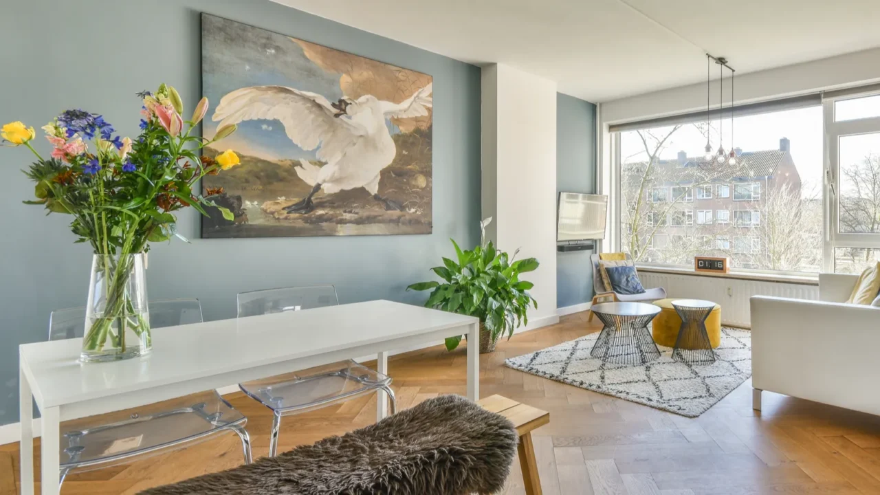
Say Goodbye to Yesterday’s Hues
Hey there, color enthusiasts. Ready to ditch those outdated shades and give your space a fresh, modern vibe? In this slideshow, we’re diving into the colors designers are moving away from in 2025.
From overused neutrals to once-trendy tones that have lost their luster, we’ll explore what’s out and why. So, if you’re planning a makeover or just curious about the latest in color trends, stick around. Let’s ensure your palette is as stylish as you are.
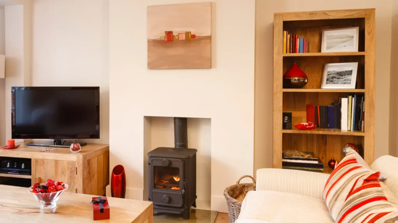
The Decline of Stark White
Remember when stark white walls were the epitome of chic minimalism? Well, times are changing. Designers now feel that pure white can make spaces feel cold and impersonal.
Instead, there’s a shift towards warmer neutrals that add coziness and character. Think soft beiges or creamy tones that make a room feel inviting. So, if your walls are blindingly white, it might be time to warm things up a bit.
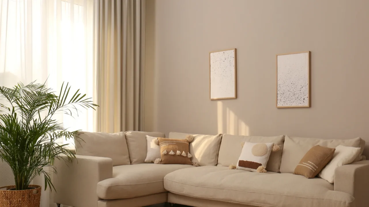
Moving Away from Cool Grays
Cool grays were once everywhere, creating sleek, modern vibes. But now? They’re being traded for something warmer. Designers are saying that these tones can feel sterile and flat, which doesn’t work for cozy, inviting spaces.
Enter greige, a mix of gray and beige that adds warmth without sacrificing sophistication. It’s perfect for those who want a modern look with a bit more heart. If your home feels too icy, this could be the perfect update.
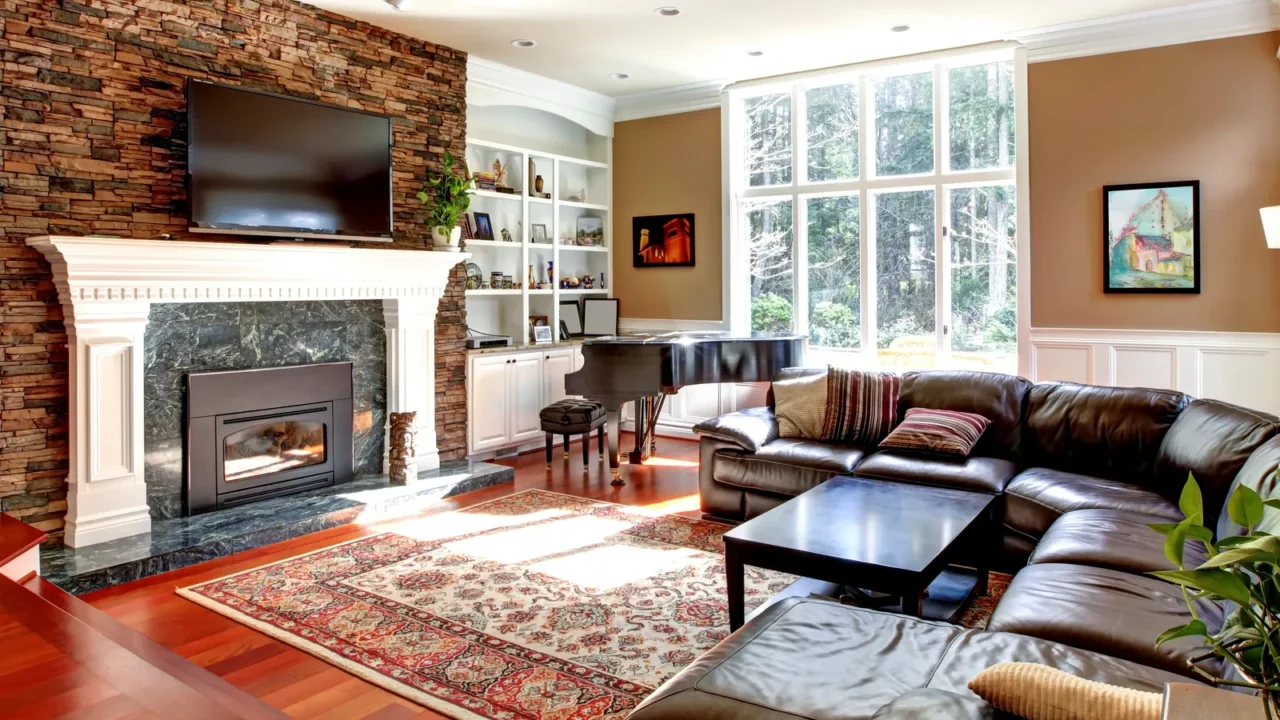
Bye-Bye to Overused Navy Blue
Navy blue had its moment as a bold, sophisticated choice, but now it’s feeling a little tired. Designers are steering towards rich greens and browns that connect us more deeply to nature.
These earthy hues are versatile and refreshing, offering a sense of balance that the navy can sometimes miss. If your home is full of navy accents, consider swapping them for these grounding alternatives.
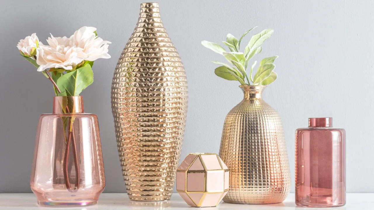
Phasing Out Pastel Overload
Pastels were cute, airy, and fun, but when overdone, they can make a space feel overly whimsical or even childish. Designers are now leaning toward richer, more saturated colors that add depth and sophistication.
You don’t have to ditch pastels entirely, just use them sparingly as accents rather than the main attraction. Adding bold, contrasting tones can bring balance and elevate the overall look of your space.
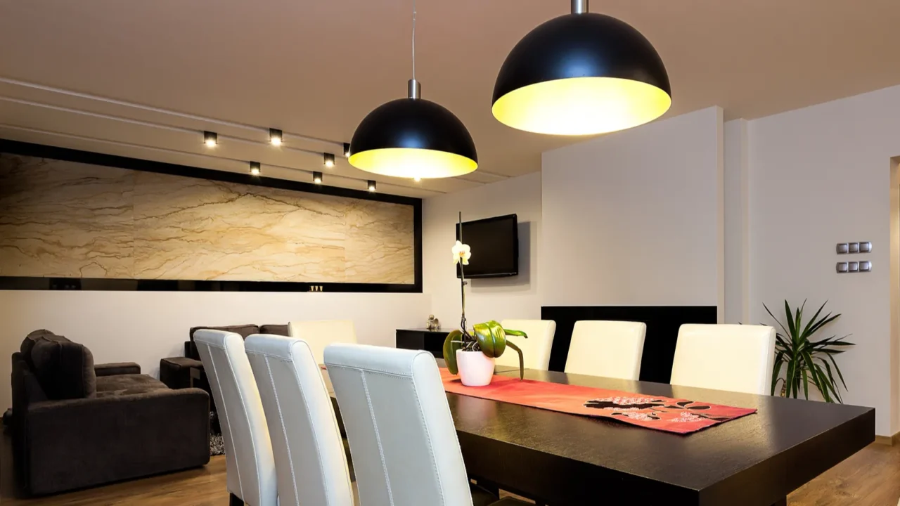
The End of All-Black Everything
Black was once the epitome of drama and elegance, but going all-in can leave a space feeling dark and heavy. Designers are now opting for a balanced approach, using black sparingly as an accent color.
Pair black with lighter hues like warm neutrals or soft pastels to create contrast and harmony. It’s all about keeping the drama while adding some brightness and life to your home.
Saying No to Neon Bright
Neon colors had their fun, bold moment, but they’re officially being dimmed. These ultra-bright shades can overwhelm a room and feel jarring over time.
Instead, designers are turning to earthy tones and jewel shades that bring richness without the visual overload. If your space feels like a highlighter set, dialing it back can create a more relaxing vibe.
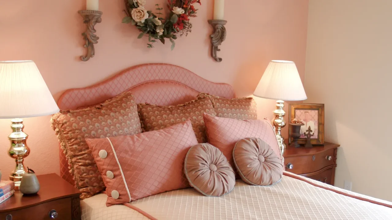
Moving Past Millennial Pink
Millennial pink was once everywhere on walls, furniture, you name it. But now? It’s time to give this trendy shade a rest. Designers are favoring more timeless and versatile colors that have staying power.
If your home is drenched in this pastel pink, consider transitioning to muted corals or soft peaches. These tones feel fresh and modern while offering a more updated take on warm, rosy hues.
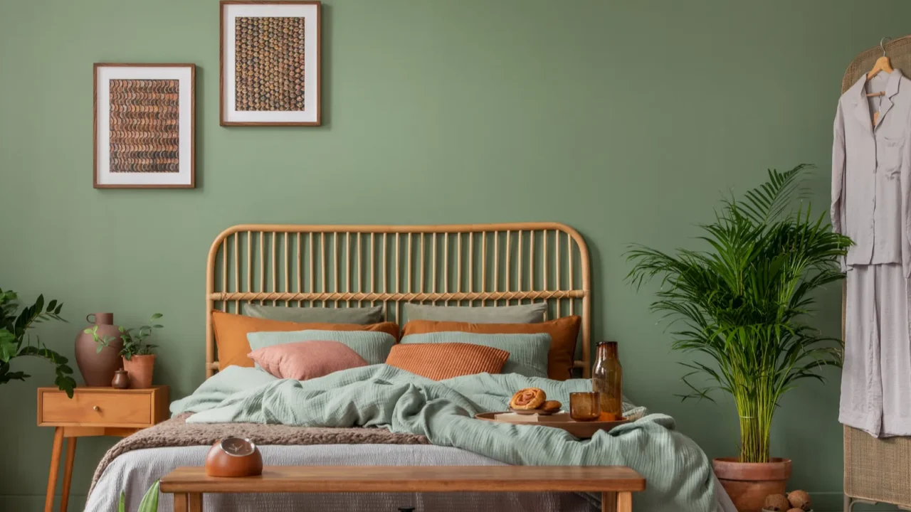
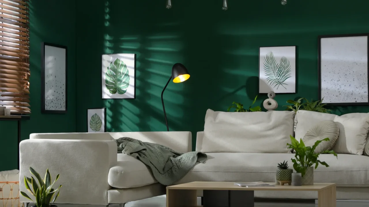
The Fall of Forest Green
Forest green had its time, bringing a bold, natural vibe to interiors. But in 2025, designers are leaning toward softer greens like sage and moss for a lighter, fresher feel.
These shades still connect to nature but offer a more modern, airy aesthetic. If your decor feels like a deep forest, lightening it up with these muted tones can refresh your space beautifully.
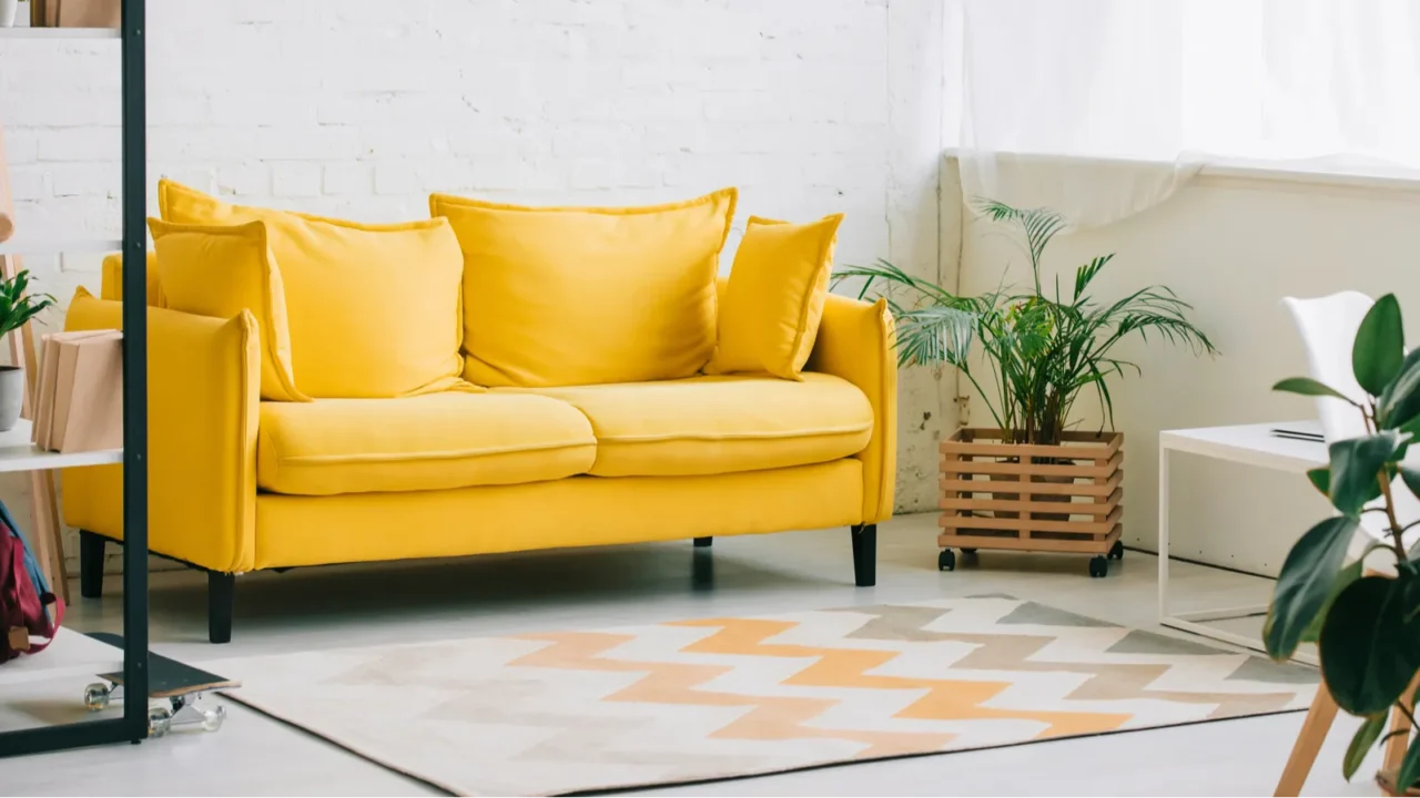
Steering Away from Mustard Yellow
Mustard yellow brought retro vibes to decor, but it’s starting to feel dated. Designers are pivoting to brighter, sunnier yellows that bring energy and optimism without the heaviness.
If your space leans heavily on mustard tones, swapping in lighter, fresher yellows can breathe new life into your decor while keeping things cheerful and inviting.
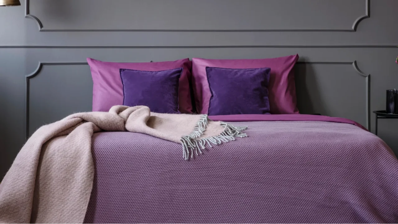
Moving On from Mauve
Mauve had its moment as a muted, sophisticated choice, but designers are now turning away from this dusty purple. It can sometimes feel too dull or outdated, lacking the vibrancy needed to refresh a space.
In 2025, richer purples like plum or aubergine are taking center stage. These deeper tones add drama and depth without overpowering a room. If mauve dominates your decor, consider swapping it out for these more dynamic and luxurious alternatives.
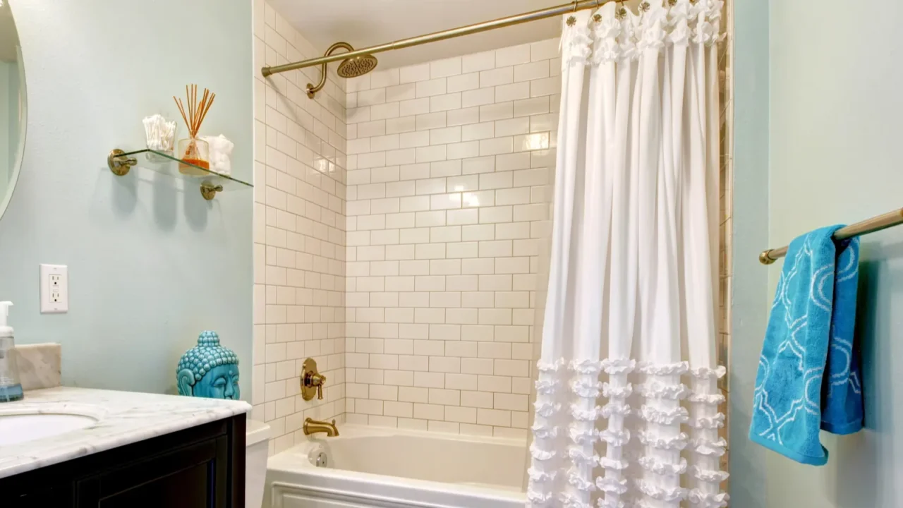
The Decline of Teal
Teal has been a favorite for its versatility, but its overuse has designers looking elsewhere. While it was once a bold accent color, teal is being replaced by shades that feel more unique and grounded.
Soft aqua or muted turquoise are stepping in to provide a fresher look without losing the calming vibe teal once offered. If your space is feeling stuck in the past, these lighter shades can offer a modern twist.
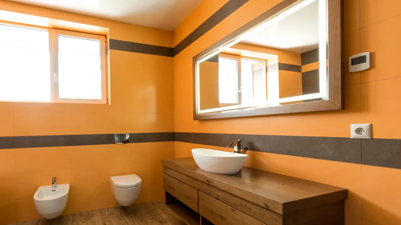
Moving Past Peach
Peach brought a vintage charm, but it’s starting to feel dated. Designers in 2025 are favoring vibrant oranges or burnt sienna that offer a more modern, dynamic energy.
These updated tones provide warmth without feeling overly nostalgic, making them a perfect fit for living rooms or kitchens. If peach feels a little stale, these brighter options can give your space a fresh perspective.
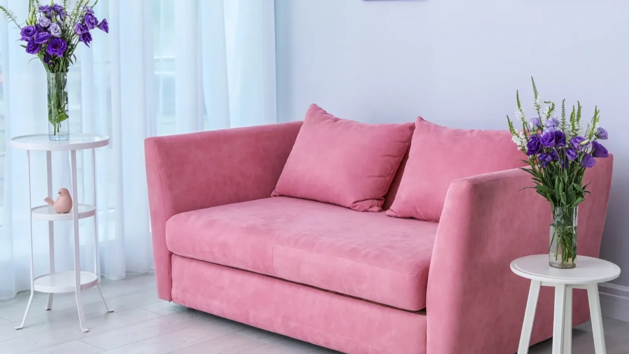
The Decline of Dusty Rose
Dusty Rose was a chic, muted option, but it’s losing ground to brighter, more optimistic pinks. These bolder shades bring life and energy to spaces without feeling overwhelming.
Try pairing a vibrant pink with warm neutrals or metallic accents for a balanced, contemporary look. If the dusty rose is your staple, consider adding some brighter shades to modernize your space.
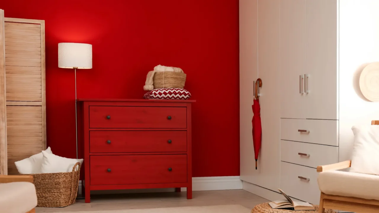
Moving On from Burgundy
Burgundy brought richness and warmth, but it’s being replaced by more adaptable reds like brick or cranberry. These shades maintain the warmth of burgundy while offering a fresher, more contemporary vibe.
Pair them with earthy tones or neutral accents to create a stylish, balanced space. If burgundy feels too heavy, these lighter reds can bring energy and freshness to your decor. Looking to experiment with red in your dining room?
Add bold charm to your space with Striking Red Accents to Transform Your Dining Room, making every meal a stylish affair.
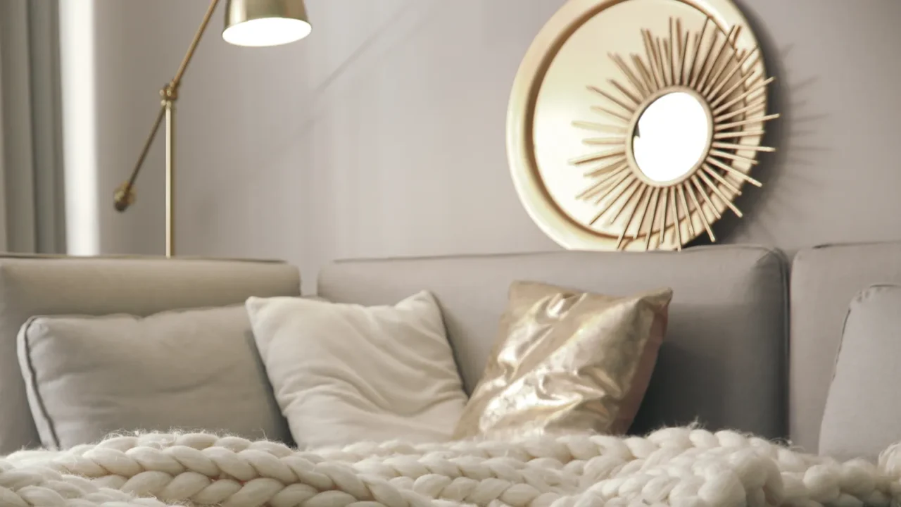
The End of Overused Taupe
Taupe was a favorite for its neutrality, but its overuse has made it feel uninspired. Designers are embracing warmer or cooler tones that offer more personality.
For a fresh update, try pairing taupe with pops of color or switching to a warm gray or sandy beige. These subtle changes can make a big difference in keeping your home on trend. Getting confused about which colors to really go for?
Discover how Color Trends That Instantly Modernize Any Room can give your space a fresh, stylish update today.
Read Next: