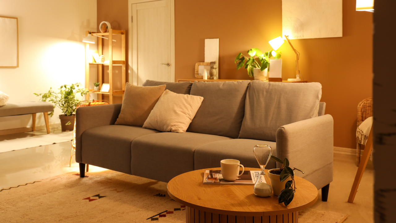
Interior and Decoration Mistakes
A home is the reflection of the people living in it. If your space doesn’t reflect your personality, it might be due to critical design missteps.
The interior and decor are more than just aesthetics, they set the overall tone of your home. If elements like flooring, furniture, color, storage, and walls are out of proportion or poorly executed, they can make your home look cheap and uninviting.
Swipe through to discover key mistakes that you might be making and find out how to avoid them to make your home look and feel like yours.
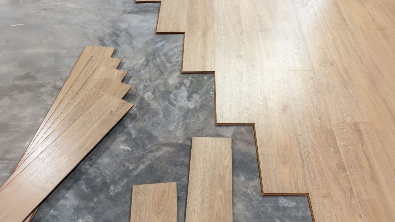
Bad Flooring
Cheap laminate, carpets, or vinyl may seem like budget-friendly flooring options. However, they wear down quickly, giving your space a run-down appearance.
Similarly, choosing the wrong flooring, like hardwood in water-exposed zones like bathrooms or carpets in high-traffic areas, can degrade rapidly.
Invest in good quality flooring and choose materials that are specifically designed for the demands of each space to ensure durability.
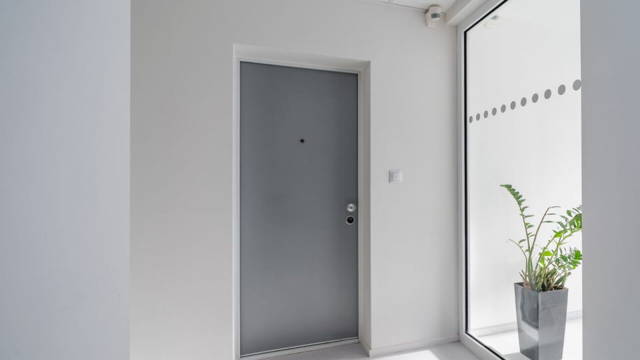
Unattractive Front Door
First impressions are everything, whether they concern you or your house. Neglecting the front door can undermine the overall impression of your home, even if the interior is beautifully decorated.
Investing in a stylish, modern front door enhances the home’s appearance and adds a touch of sophistication.
Add planters, outdoor lighting, a statement doormat, a house number display, and a welcome sign to create a more welcoming entryway.
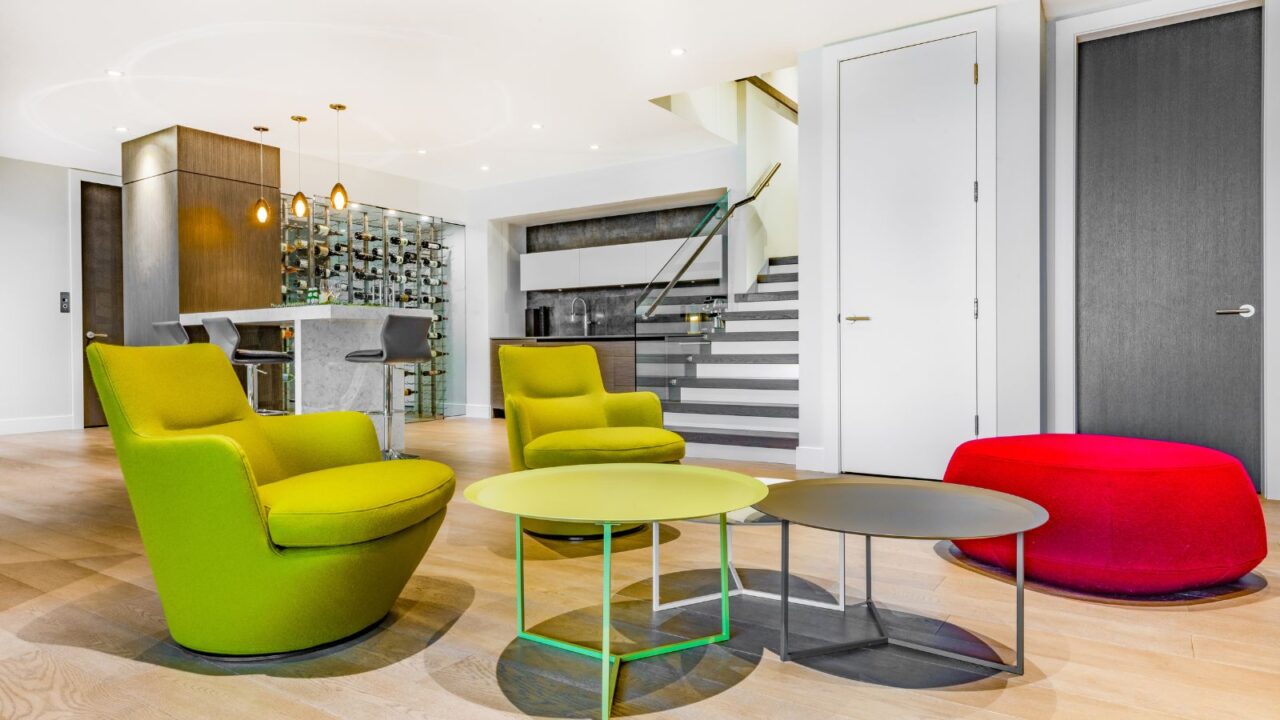
Mismatched Furniture
Your home should have a coordinated interior and decor in style, color, and scale. Having mismatched furniture can throw off that harmony.
Have a unified color and style theme. Decorate your home with thoughtfully curated items to avoid it looking like a collection of mismatched clutter.
Renovating old furniture can be a more sustainable and cost-effective option than replacing individual pieces.
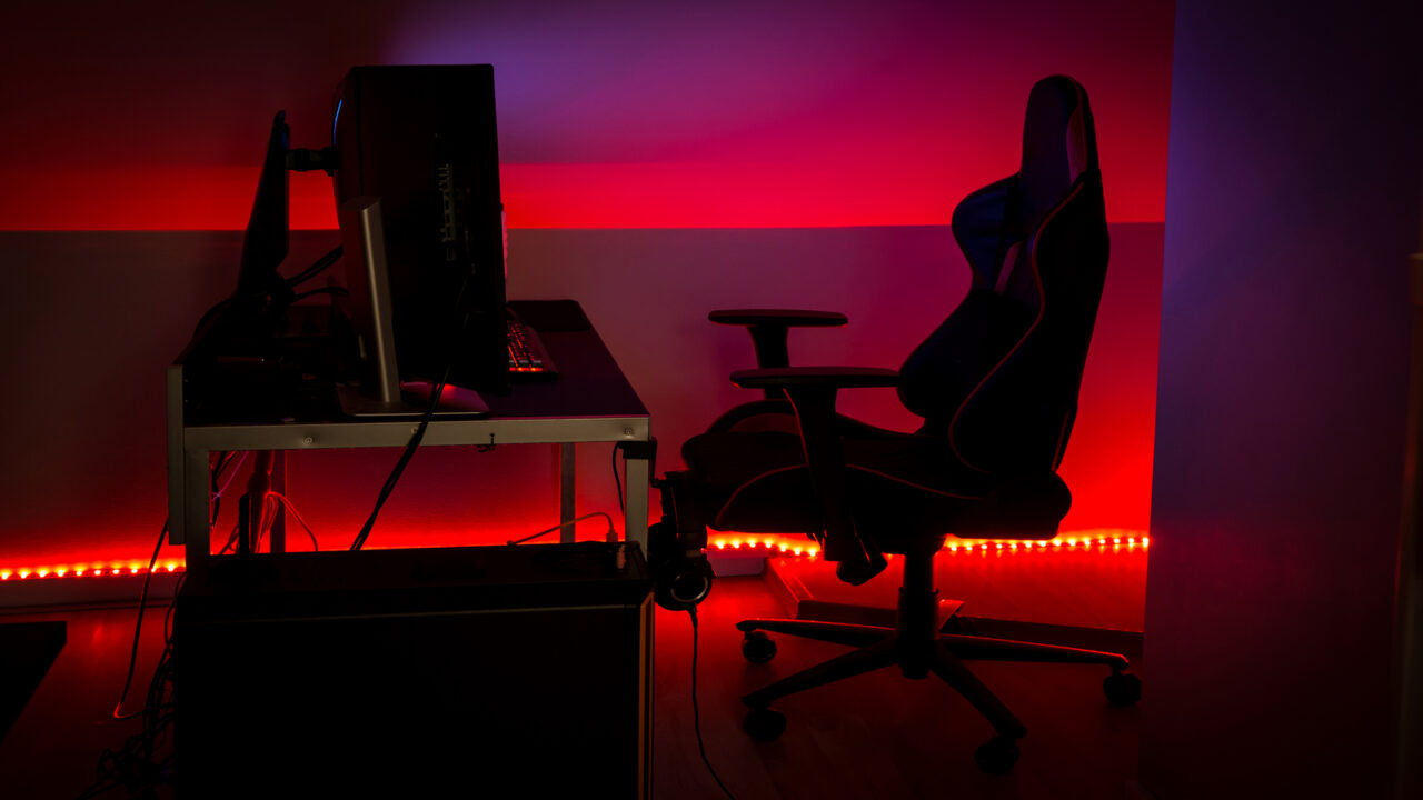
Poor Lighting
No matter how good your house furniture or decor is, bad lighting can make everything look cheap and uninviting. Improper lighting can cast harsh shadows and dull the color scheme of your home.
To add depth and dimension to your space use layer lighting; a mix of accent, task, and ambient. Further, the natural light in the house should be increased using sheer curtains and mirrors that reflect the sunlight.
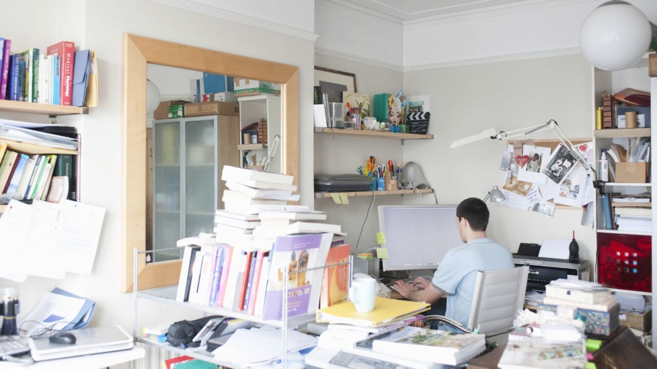
Clutter Everywhere
Life gets busy and things get piled up. However, the clutter can make your home look cheap and neglected.
Get rid of items that are just lying around your house aimlessly. Donate or sell unwanted items like furniture or electronics not in use. Have proper storage for each category of items. When not in use, store them in their designated places.
Ensure you add built-in storage cupboards in all rooms while designing and renovating your home for better and more storage.
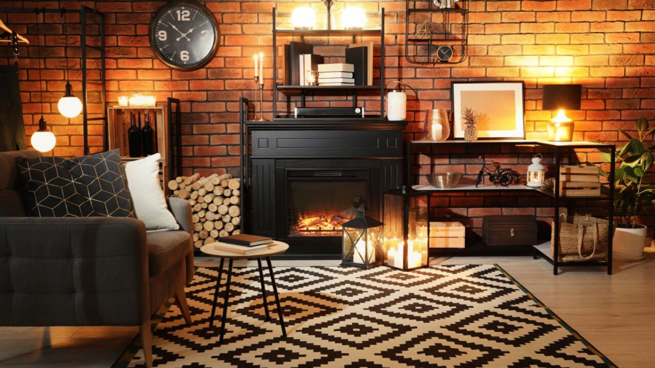
Wrong-Size Rugs
Don’t buy the rugs just because they look beautiful. Measure and determine first if that rug is ideal for the room or not. For example, a small rug in the living area throws off the room’s balance.
The right-sized rugs make the room furniture look arranged and organized. A large rug is more beneficial for living and dining while a small one goes well in the kitchen and hallway.
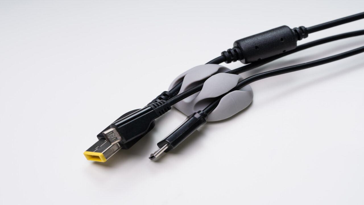
Tangled Cables
Cables everywhere in the home dangling from work tables and from the TV consoles just ruin the overall aesthetic of your home.
Keep everything tidy and out of sight. Use cable management solutions to hide the large cables to maintain a polished look. Plus have a destined storage area for all the charges and cables to go in when they are not in use.
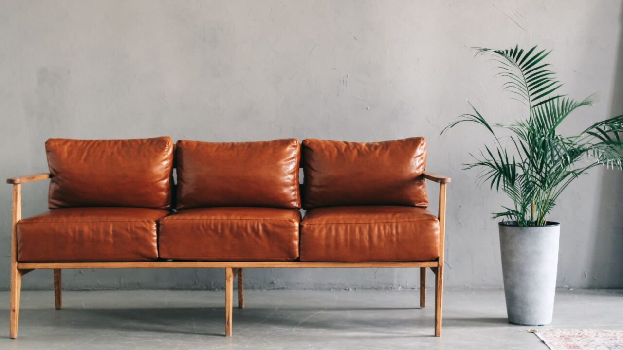
Out-of-Scale Design
Always buy furniture according to your room size. When your furniture and decor don’t match the architectural proportions of your space, it creates an unbalanced and awkward finish.
For example, big furniture can overwhelm the small rooms, while small ones can leave the large spaces looking empty and unfinished.
To avoid this, opt for the right size of furniture and decor that matches the room’s scale and aesthetics. It will create a more harmonious and well-proportioned finish.
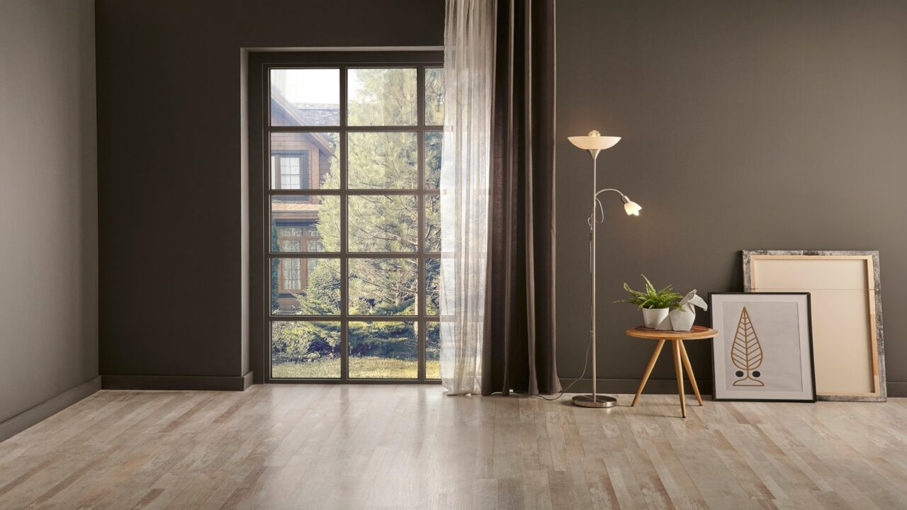
Bare and Ignored Windows
Just like doors, bare and neglected windows create an unwelcoming atmosphere in the house. Moreover, it causes a lack of privacy. The window exposure can create an uncomfortable feeling and ruin your personal space.
Adding blinds, or curtains provides privacy and light control. Additionally, it also adds texture and color creating a more cohesive and polished look for the space.
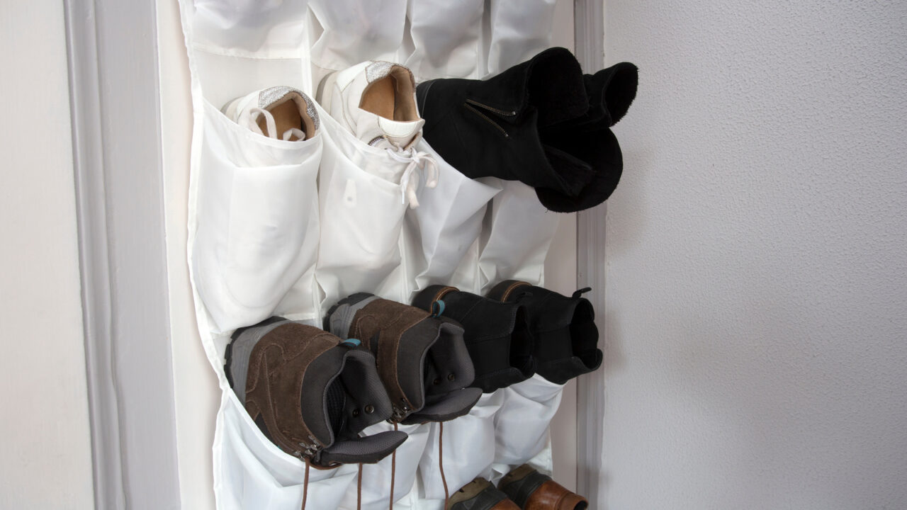
A Pile Near The Front Door
Piles of shoes right near the door just do not give a very good first impression to your guest. Even if you have a very attractive and elegant entryway, the disorganization can warn off all the visual aesthetics.
You need multiple storage options right in your entryway to not only store shoes but also everything from keys to bags. For shoes, there are different types of storage options available in the market like a dedicated shoe rack, entryway bench with storage, or wall-mounted hooks.
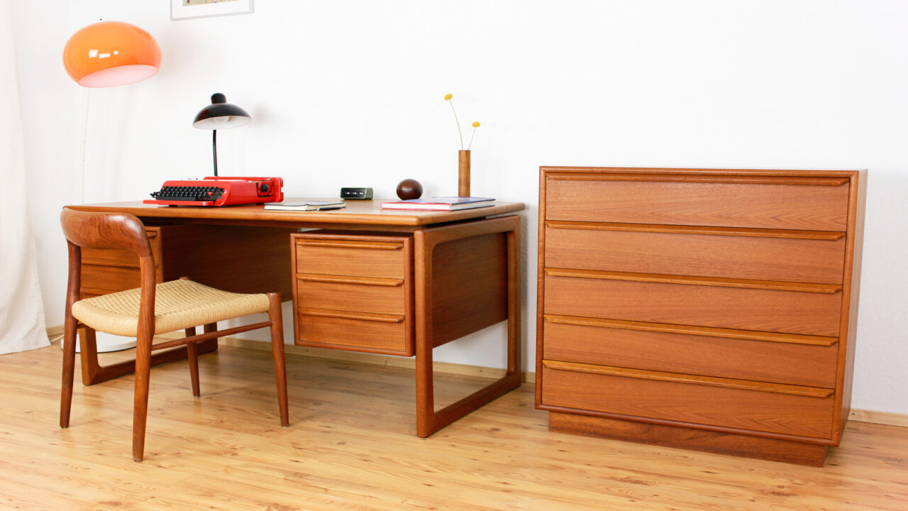
Scrapes & Scuffs On Wooden Furniture
Wood furniture looks good, but not the one with lots of scrapes and scratches. Worn-out pieces can make a home look poorly maintained.
Anything wood can be easily fixed through polishing or painting whether it’s a sofa or a showcase. Also, regular cleaning, furniture touch-up markers, or repair kits come in handy to give old wooden furniture a quick makeup and pristine look.
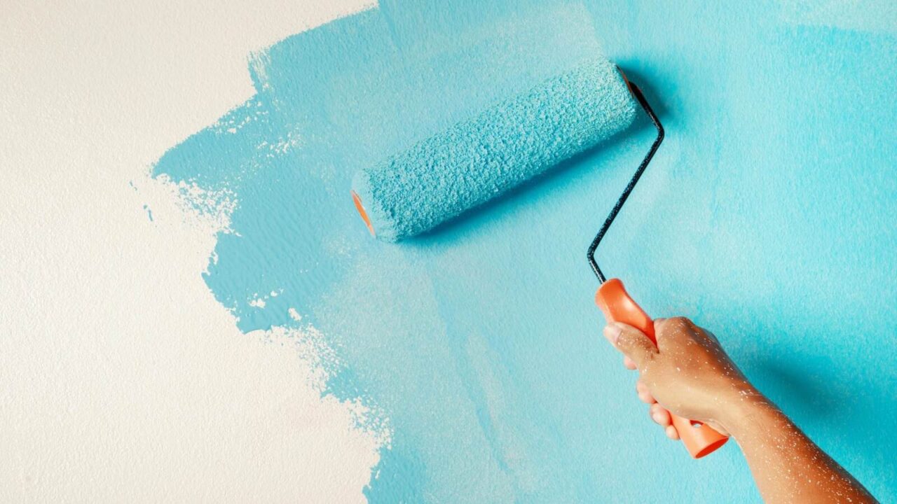
Chipped Paint or Wallpaper
Walls are the first thing people usually notice when they enter your house. If your wall has peeled or chipped paint, it can cast a disheveled appearance and diminish the overall curb appeal of your house.
Make sure you have a proper repair of the peeled-off paints and wallpaper to create a cohesive look. Plus, regular maintenance can prevent future damage and keep your space looking fresh and well cared for.
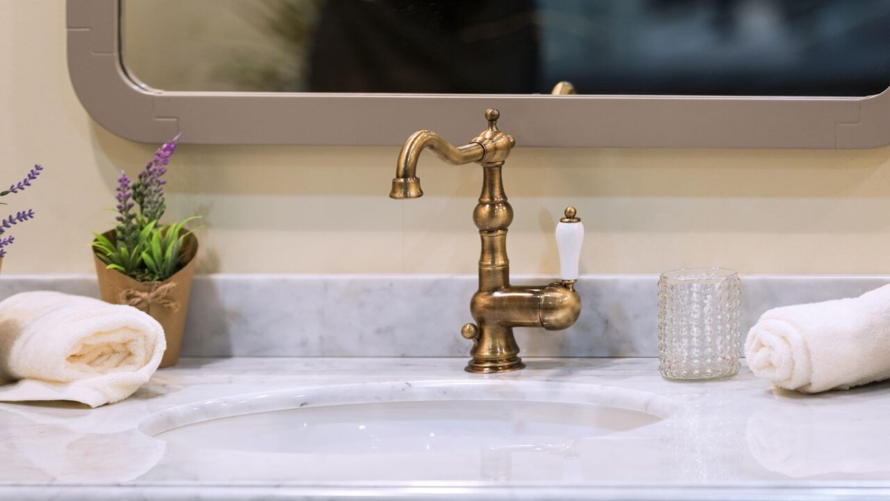
Leaky faucets or Plumbing Issues
One of the reasons why you have chipped wall paint is due to poor plumbing in your house. Plumbing issues can make a home look poorly maintained and less inviting.
Additionally, leaky faucets add to the damage and poor aesthetic. You need a professional plumber to fix these issues. Make sure to have regular maintenance of leaky faucets and plumbing from time to time.
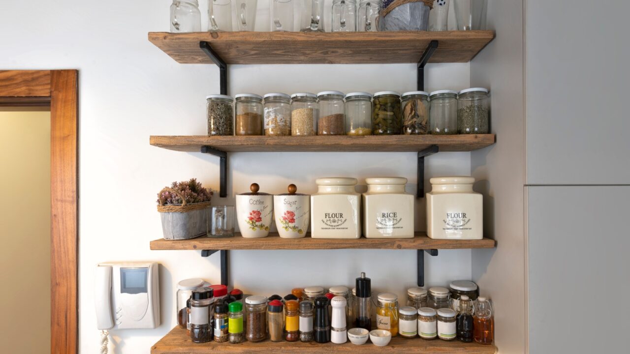
Open Shelf Pantry
You might have given in to the open shelving trend in your kitchen. However, the trend is now outdated, and open shelves in your home can look cluttered and less aesthetically pleasing.
Trends go out of style quickly, leaving your space looking outdated. Prefer timeless materials over trendy ones. In this case, cabinets are more reliable partners for your kitchen items than open shelves.
If you want to know more about why open shelving is not trending anymore, check out the key reasons in this post: Why Open Shelving is Out – 2024 Kitchen Trends Ahead.
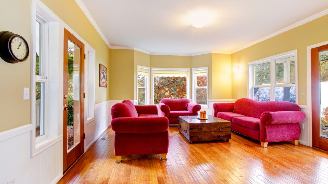
Too Many Colors
Using too many colors can make a home look chaotic and visually overwhelming. A cluttered color scheme can disrupt the sense of harmony and make the space feel disorganized.
To create a more cohesive and sophisticated look, limit your palette to a few complementary colors and use them consistently throughout the space. This approach helps achieve a balanced and aesthetically pleasing environment.
Need some more inspiration? This guide on accent wall ideas can help you create elevated and aesthetic spaces with bold colors.