Your Pastel Playground
Pastels are super pretty, but let’s be honest if you go overboard, your home can start looking like a giant frosted cupcake. Nobody wants to live in a candy-colored swirl (unless you’re Barbie, maybe). The trick is to balance, contrast, and some serious layering skills.
This isn’t your average “paint it blush and hope for the best” guide. We’re talking about creative ways to make pastels work without turning your space into a sugar rush. Ready to pastel like a pro?
Neutrals Are Your Best Friend
Wanna make pastels feel more grown-up? Pair them with neutrals, such as soft pinks, pale blues, or mellow lilacs, set against warm grays, creams, or cozy beiges. It keeps everything looking fresh, but not like a baby shower exploded in your space.
Say you’ve got a mint couch, add a sand-colored rug and some ivory throw pillows, and boom, instant chicness. Neutrals help your pastels pop without screaming “Candy aisle.” It’s all about keeping the sweet stuff in check with calm, cool companions.
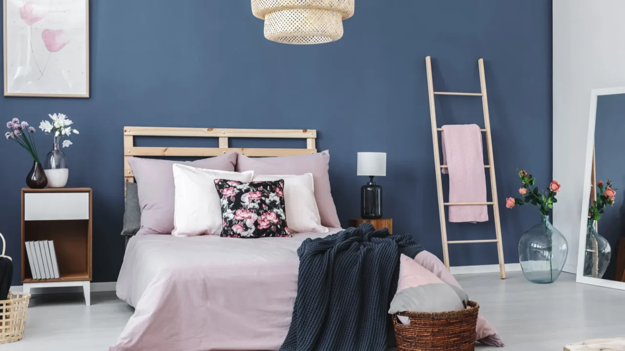
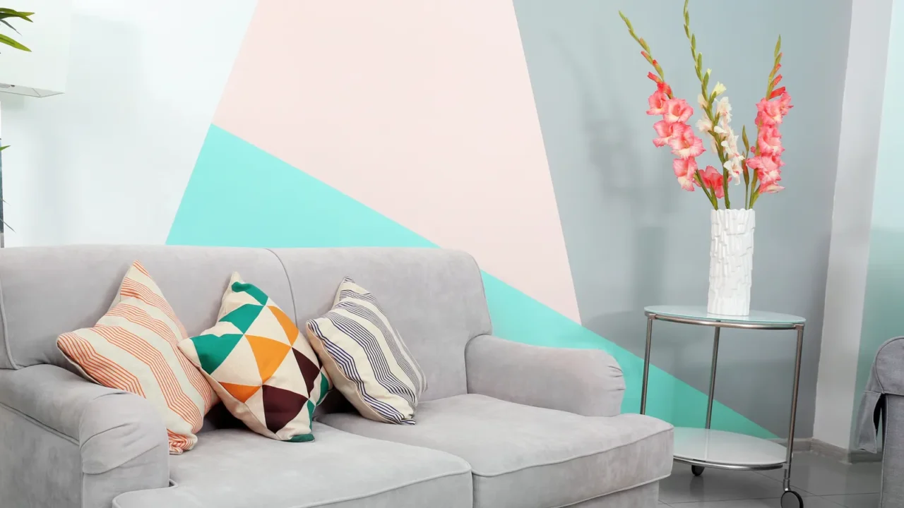
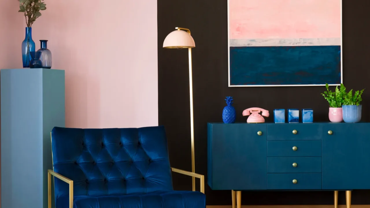
A Dark Wild Card
Here’s a little design magic, pastels look amazing next to dark tones. Navy blue, charcoal, and deep forest green these shades cut through the sweetness and give your space some edge. It’s like pairing a cupcake with black coffee.
Got a pale yellow armchair? Throw in a dark wood coffee table. You’re adding contrast and creating visual drama but in a super tasteful way.
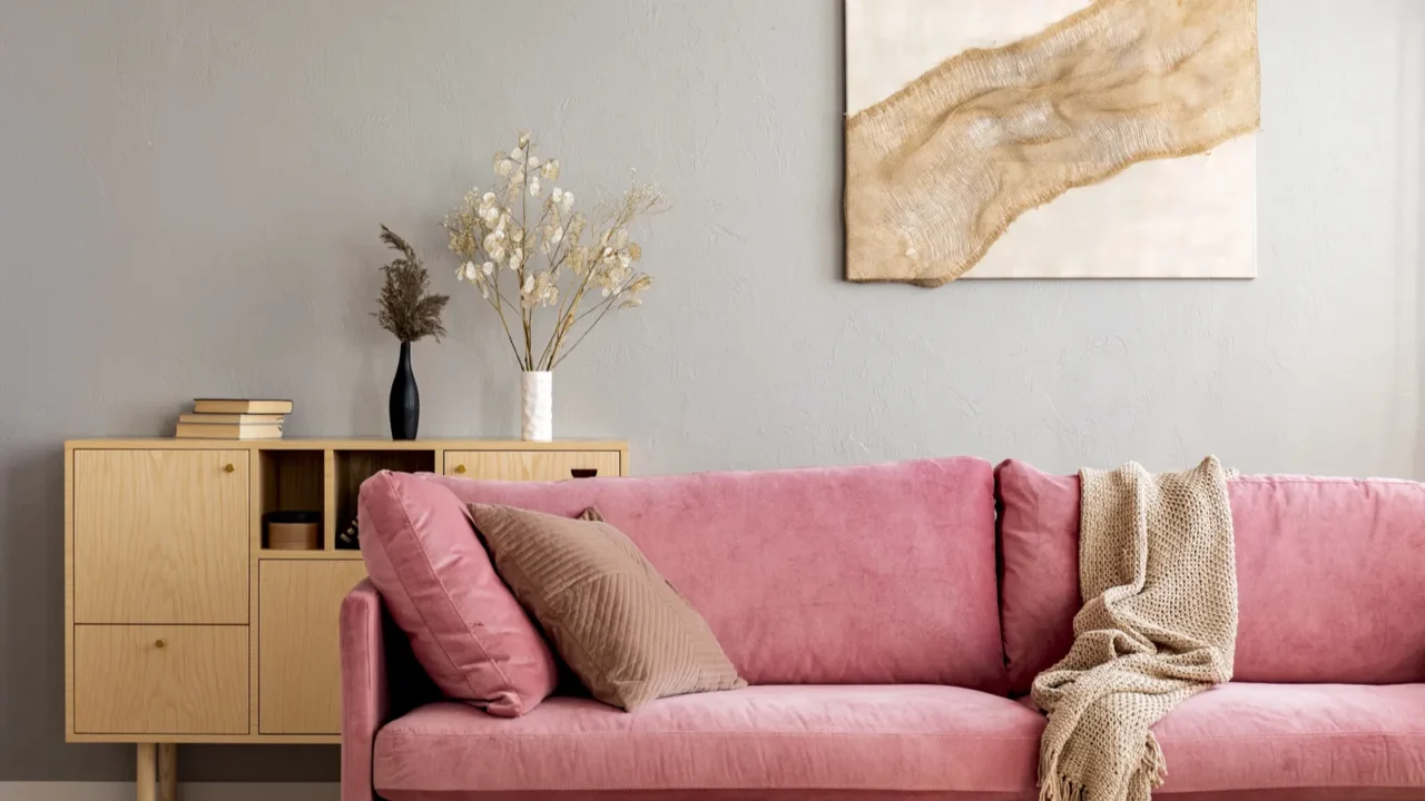
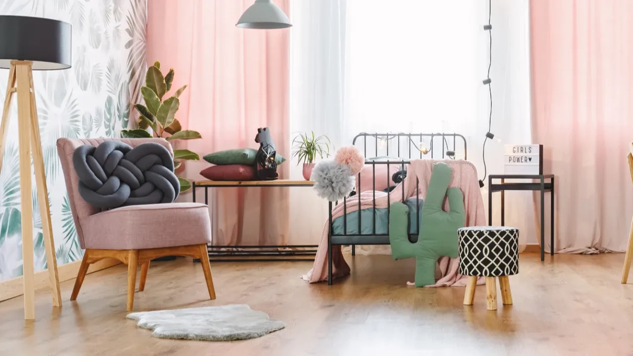
Go Natural with Materials
If your pastels are feeling too light and airy, bring in some natural texture. Wood, rattan, stone, or even woven baskets help tone things down and add cozy, earthy vibes. It’s like giving your pastels a down-to-earth buddy.
Picture a blush-pink couch sitting next to a rustic oak side table. Or a powder-blue rug underneath a jute pouf. Those natural materials add texture and personality to your room, while also averting it from feeling like a dollhouse.
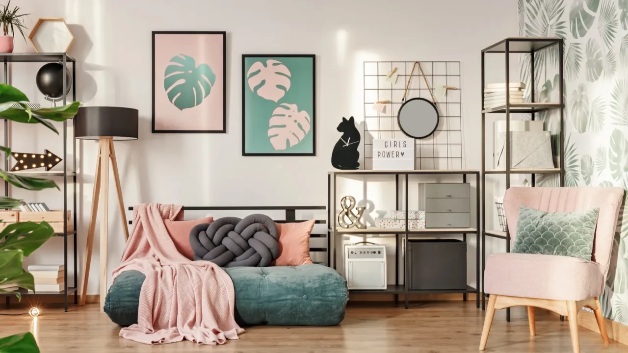
Bold Patterns
Tired of your pastel wall feeling a little too pastel? Spice it up with bold patterns through stripes, chevrons, polka dots, whatever makes your heart happy. Patterns break up the monotony and bring the fun without going full bubblegum.
Try a blush pink wall with a bold patterned rug in deeper tones. Or pastel bedding mixed with a statement-print throw pillow. You’ll still get those soft color vibes but with a little personality punch.
Two Pastels Max
Here’s a hot tip: don’t pastel the whole rainbow. Stick to one or two key pastel shades so your space doesn’t end up looking like an Easter basket. Less is more when you’re aiming for cool, not cutesy.
Keep your picks tight, and your room will feel intentional instead of accidental. The goal is to look styled, not like you let your six-year-old niece pick the paint colors.
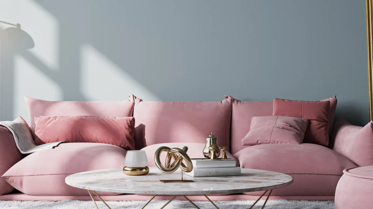
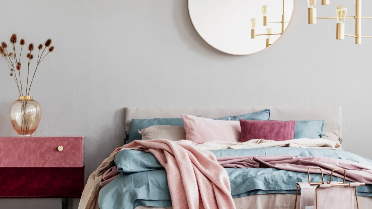
Dash of Metallic Glam
Want your pastels to feel a little less nursery, a little more “I’ve got my life together?” Toss in some metallics. Gold, brass, copper, they all add a splash of glam and give pastels a grown-up twist.
A soft pink wall with brass sconces? So chic and powder blue pillows on a couch with a gold-accented coffee table? Instant upgrade because it’s like adding a pair of gold hoops to a simple outfit.
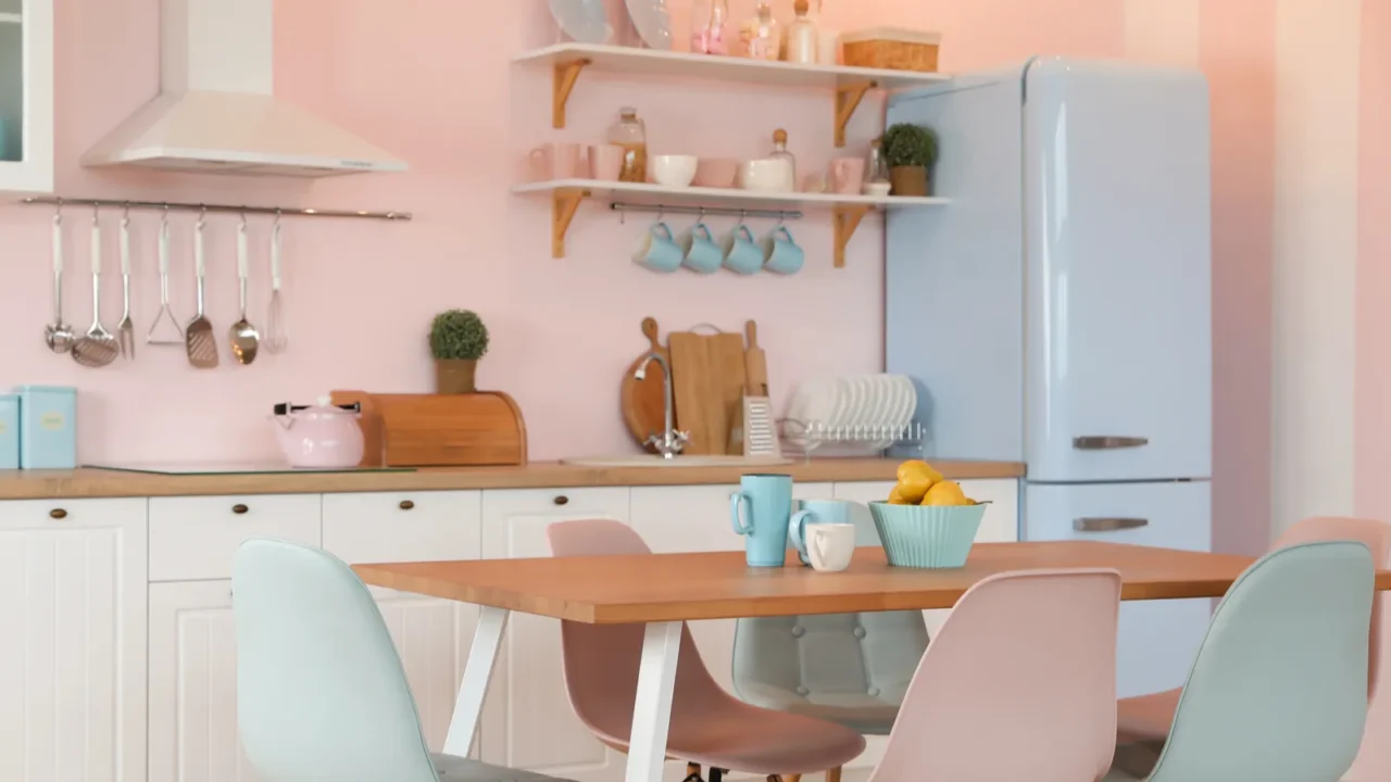
Take Pastels to the Kitchen
Why should living rooms have all the pastel fun? Take those soft shades into your kitchen. Pale cabinets or a pastel tile backsplash can freshen up the space without looking like a birthday cake.
Think mint cabinets with matte black hardware or baby blue tiles behind crisp white counters. Pair it with wooden accents and you’re golden. It’s unexpected, fun, and totally Pinterest-worthy without giving off cotton candy vibes.
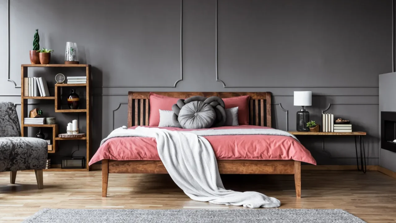
Make Texture the Star
Texture can totally change how a pastel feels. Mix materials like velvet, linen, knits, or leather to create a cozy, lived-in vibe. Because let’s face it, flat pastels can feel kind of blah.
Think a pale yellow velvet couch with chunky knit pillows or a soft blue linen duvet with leather accents. The color stays subtle, but the touchable textures keep things interesting. It’s a great way to add depth without piling on more color.
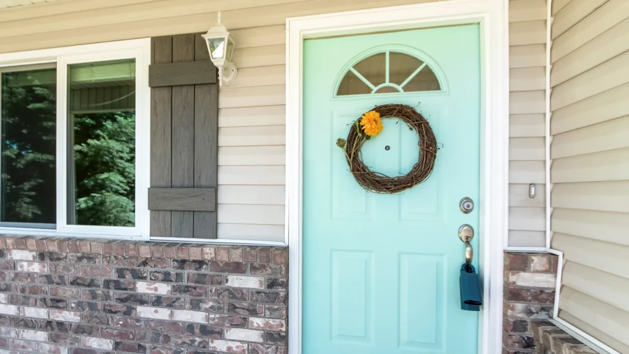
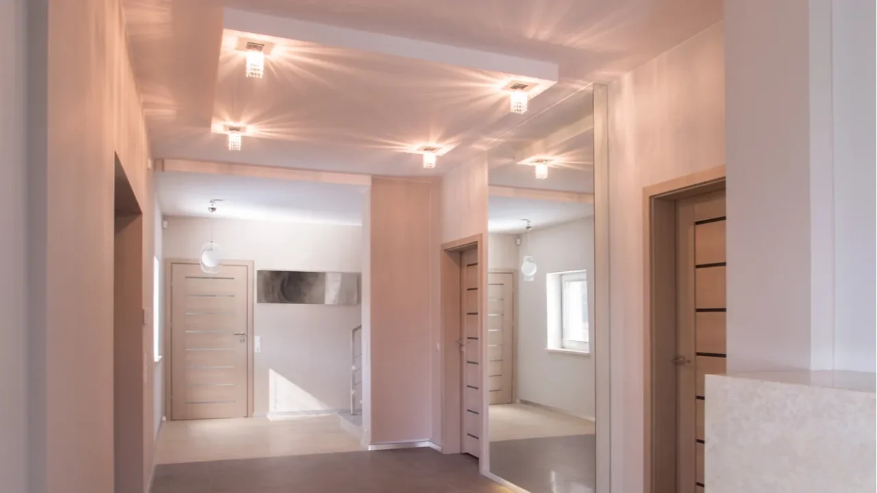
Pastels in Unexpected Places
Forget the obvious, why not pastel your ceiling? Or try a soft green on your doors instead of your walls. Adding pastels in surprising spots keeps the look fresh and far from predictable, as it’s all about those little “whoa, I didn’t expect that!” moments.
You could even try a pale blue closet interior or lavender pantry shelves. These mini surprises give your space personality without overloading it. Guests will notice, but it won’t feel in your face.
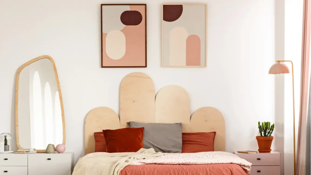
Soft Colors with Bold Shapes
Even the gentlest colors can feel bold when paired with fun shapes. Try pastel furniture in unexpected silhouettes such as a round lilac armchair, a curvy mint coffee table, or geometric pastel artwork. Soft hues plus standout forms equal chef’s kiss.
This mix keeps your room from looking too dainty. Pastels become playful instead of precious, which is exactly what you want. Big shapes keep it grown-up.
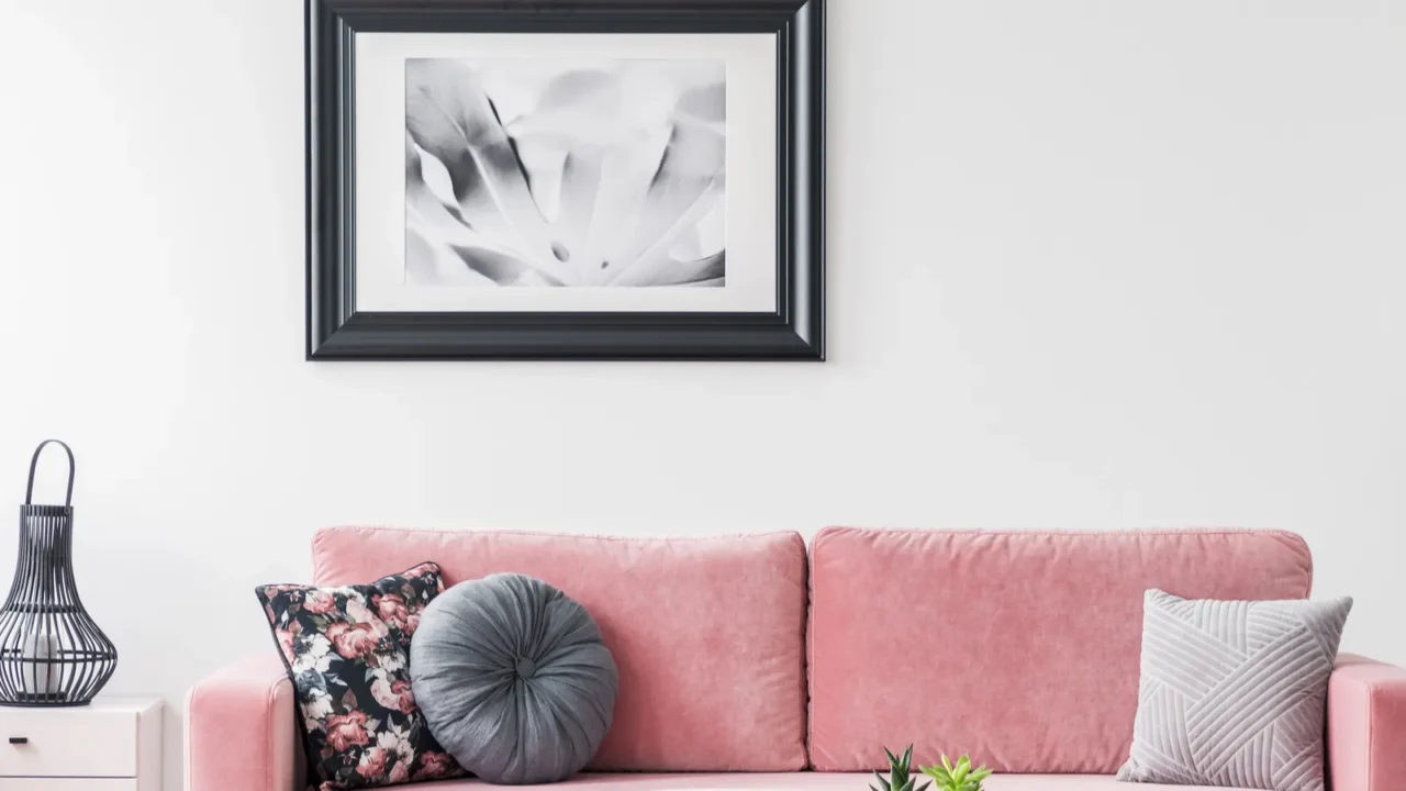
Black and White
Want an easy way to cut the sweetness? Toss in some black and white. It’s the ultimate neutral duo, and it plays super well with pastels.
Try a pale pink rug under a black-and-white art print or powder blue pillows on a black sofa. The contrast brings clarity and edge to soft tones. It’s crisp, clean, and never too cute.
Make It Moody with Lighting
The right lighting can totally shift how your pastels look. Skip bright white bulbs and go for a warm, soft glow that make pastel tones feel cozy, not cold or cartoonish.
Think globe sconces, linen shades, or even a pastel-colored lamp base with a vintage vibe. Lighting helps tone down any sugar overload and adds a chill, lived-in feeling. Your space looks totally different from day to night, and that layered lighting is the secret sauce.
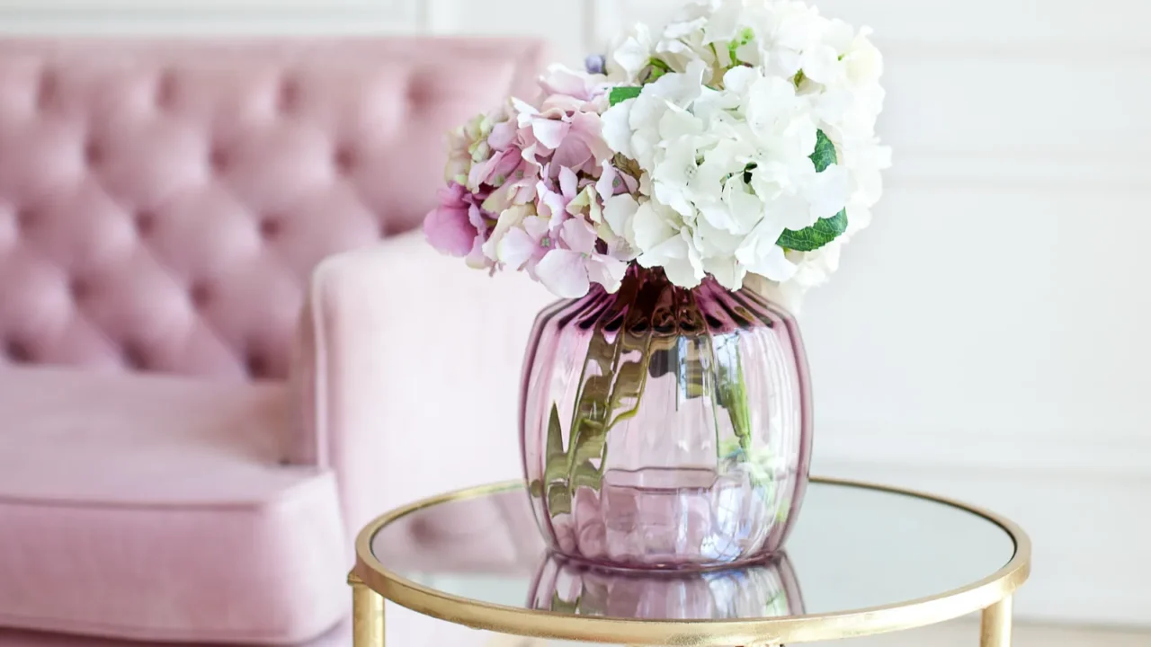
Candy in the Details
If you’re a pastel-lover but don’t want to go full cupcake, sprinkle it in small doses. Use it in vases, trays, or a stack of books. Little hits of color go a long way and feel polished, not juvenile.
A peach vase here, a light blue candle there, maybe a pastel planter on the window sill, it’s just enough to keep things soft without getting sticky-sweet. Think of it like frosting, a little is delightful, and too much is a mess.
Curate, Don’t Crowd
Pastels need breathing room to work their magic. If you crowd the space with too much stuff, everything blends together and loses impact. Instead, let each pastel piece shine with smart spacing.
Display fewer items, go bigger with scale, and allow negative space to play its part. A pastel pink chair feels way more intentional when it’s not surrounded by 20 other things. Want to give your living room a fresh new vibe without changing everything? Browse these 15 accent chairs to refresh your living room and find the perfect piece to steal the spotlight.
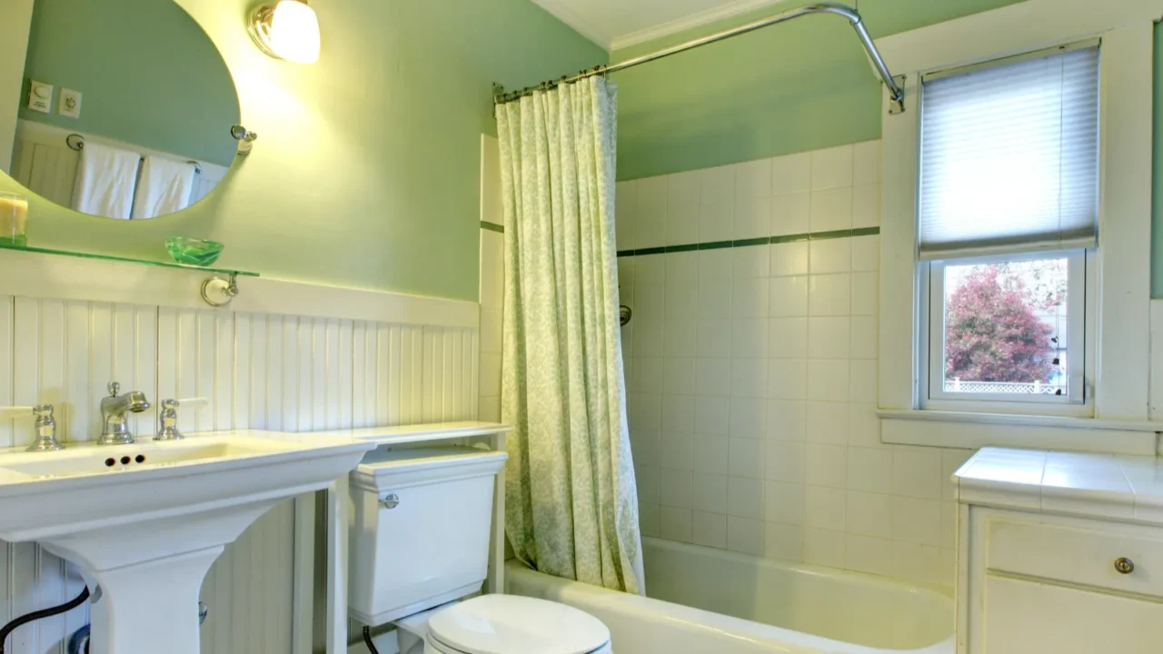
Soften Your Bathroom
Pastels in the bathroom? Yes, please but keep it cool, not candy-coated. Try soft-colored tiles in just one spot, like behind the vanity or in the shower nook.
Balance it out with sleek hardware, natural stone, or even a warm wood vanity to keep things feeling fresh and not frosted. Want an easy touch? Swap in pastel towels or a fun striped bathmat. Looking to give your bathroom a stylish refresh without a full remodel?
Check out these designer picks for stunning bathroom upgrades that bring big impact with simple changes.
So, which of these pastel ideas do you fancy? Let us know in the comments!
Read More From This Brand:
- How I Gave My Bedroom a Pastel Makeover
- Pastel Makeover for a Cool Summer Study Room
- Mixing Soft and Rich Tones Like Sabrina Carpenter
Don’t forget to follow us for more exclusive content right here on MSN.