Social media sites are becoming more and more popular each year and now we have come to the point where every photographer and artist must have a Facebook page of their own. Your Facebook page is as important as your website so it must look professional and one of the steps in having a professional looking Facebook page is a great looking Facebook page cover photo because that’s the first thing people see when visiting your page.
Facebook page cover photos should not just fill up space. If used right this area can work as your sales pitch or as your business card even! Create a cover that shows the visitor who you are and what you do.
There are a lot more options than to just upload one image and in this article, we will look at exactly 7 different cover image styles. Form image collages to abstract layouts and Facebook video covers we hope that this compilation will inspire you to do something different.
After you’re inspired and ready to create your own Facebook page cover, we suggest using the following Facebook cover sizes:
- 1640×720 pixels for image covers
- 820 x 462 pixels for video covers
OK, so without further adieu, let’s see what we got!
Collage Style Facebook Page Cover Examples
Apart from single image Facebook page covers, the second most popular choice is collage style cover photo and there’s a reason for it. Combining multiple images in one lets the visitors see that you have a specific photography style and covers such as these are much more memorable than a single image.
1. Four Image Collage 
“Jennifer Van Elk Photographers” combined four beautiful wedding shots in one. Each image has a slightly different background. Notice how they go from dark background to light, to dark, and to light again so there is no need for any gaps or gutters between them.
Visit Jennifer Van Elk Wedding Photographers Facebook page.
2. Four Image Collage with Tiny Gutters 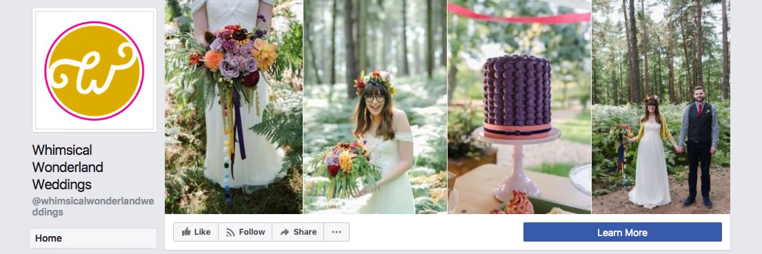
Just like in the previous example “Whimsical Wonderland Weddings” also uses four images for their cover, but since they are obviously from the same location, tiny 1-pixel gutters are placed in between each image to separate them.
Visit Whimsical Wonderland Weddings Facebook page.
3. Four Image Collage with Small Gutters

“Life is Life Photography” separates their images with about 3-pixels wide gutters. Because the gutters are wider than in the previous examples, the white gaps serve as stops and the visitor’s eye pauses on each image for a split second.
Visit Life is Life Photography Facebook page.
3. Four Image Collage with Large Gutters 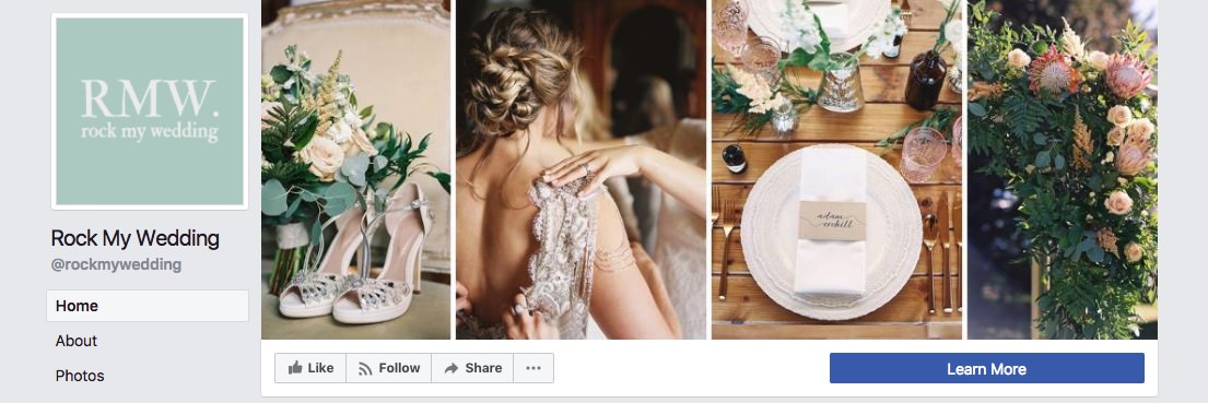
“Rock My Weddings” Facebook page cover also shows four beautiful images on their cover but they chose to separate them with 5 pixels wide gutters. In this case, the specific gutter width was no accident because if you look at the page profile image, you’ll see that the default Facebook profile image frame is exactly the same width as those gutters. Attention to little details like these makes the whole page look professional, elegant and trustworthy.
Visit Rock My Wedding Facebook page.
4. Collage with Three Images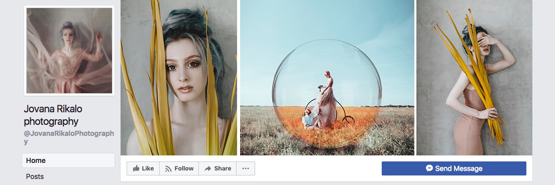
Three image cover photos are much more uncommon from my experience, but they look wonderful. Especially in Jovana Rikalo’s case because she chose to use images from the same shoot on the sides and an almost square, interesting image in the middle.
Visit Jovana Rikalo Photography Facebook page.
5. Collage with Seven Images 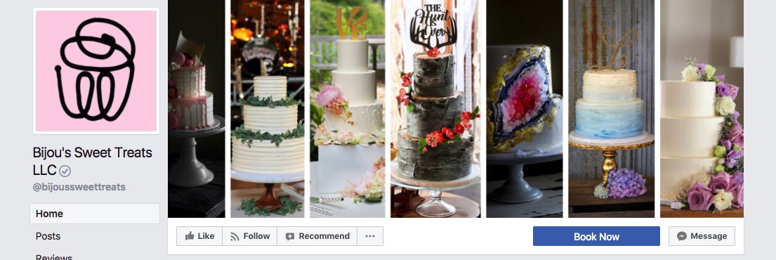
If you have a specific style or product that you offer – show it! “Bijou’s Sweet Treats” create amazing cakes and they managed to show seven designs in the cover photo so no matter who visits their Facebook page, they will spot at least one cake design that they’ll love without even scrolling down to the newsfeed.
Visit Bijou’s Sweet Treats LLC Facebook page.
6. Mixed Image Collage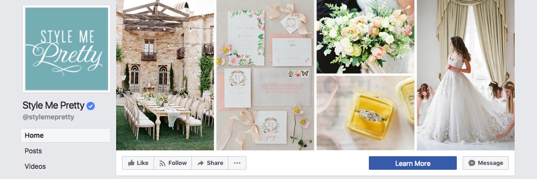
Here’s a different take on the classic collage layout – divide the cover into four equal parts and split one of them into two making room for five images.
Visit Style Me Pretty Facebook page.
7. Mixed Collage with Text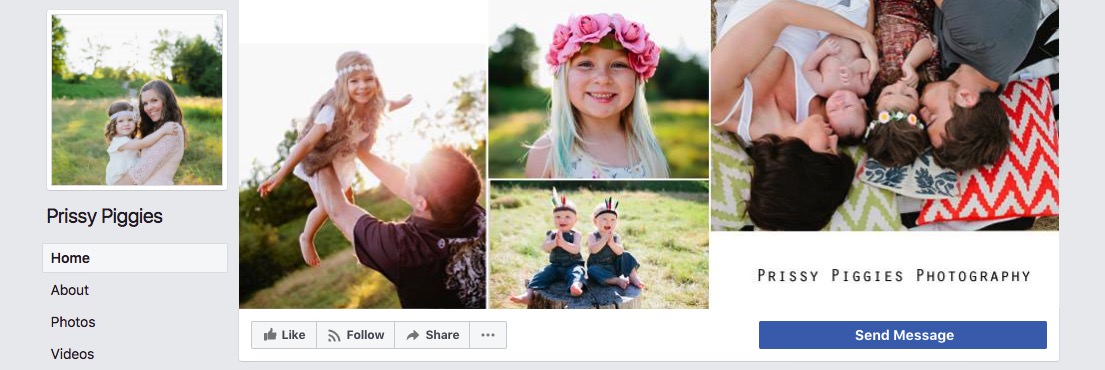
“Prissy Piggies” Facebook page cover made room not only for four sunny, cute images but also for her brand name – Prissy Piggies Photography. We really like this cover because with a seconds glance you can see her target audience – families with kids.
Visit Prissy Piggies Photography Facebook page.
8. Collage with Square Images
Mandi Nelson’s cover photo is different. It features 10 little square images, almost like Instagram feed. Large gaps between them show that they are different from one another and that this photographer works in various genre photography.
Visit Mandi Nelson Photography Facebook page.
Single Image Covers
Like we mentioned before, the most common Facebook cover photo type is a single image. But that does not mean that you shouldn’t choose to use a single image in your cover, you just should do it right.
While looking for Facebook page cover examples for this article I went through about 400 Facebook pages and a huge chunk of them featured a close-up with an almost kissing couple. These images were beautifully executed but not particularly memorable. If you want to use a single image for your cover choose one that is different for other photographer images.
9. Raw Emotion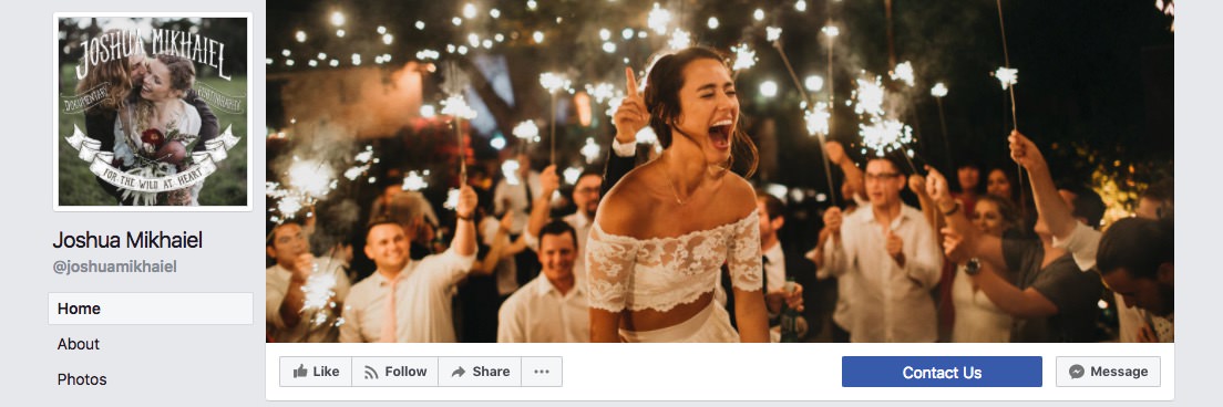
Joshua Mikhaiel uses an image that captured real, pure emotion.
Visit Joshua Mikhaiel’s Facebook page.
10. Images That Make You Look Twice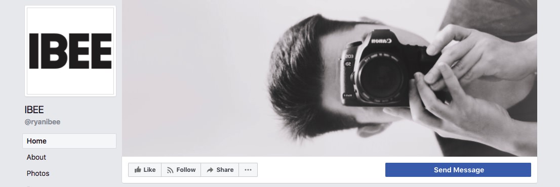
“IBEE” has a creative, odd image that makes you stop, look twice and think to yourself: “Why didn’t I think of that! I should make an image like this!” And these thoughts make this image and page memorable.
Visit IBEE Facebook page.
Covers with Logos or Brand Names
Most photographers have a logo. This logo is seen on your website, maybe on your business card, if you have one. Then why not on your Facebook page as well? Use your Facebook page cover to help people relate your brand name with your work.
Don’t have a nice looking logo? Then get one – we make 100 free photography logo templates for photographers, so while you’re in the creative designer mindset, make a shiny new logo for yourself as well.
11. Cover Image with Logo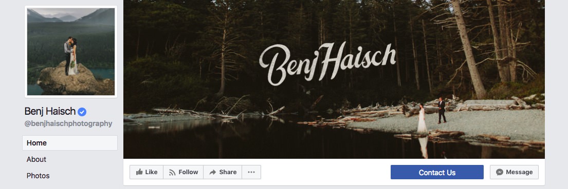
Benj Haisch has a beautiful logo on top of his image. Notice how he chose an image that has plenty dark areas so that the logo graphic looks sharp and can be easily seen and read.
Visit Benj Haisch Facebook page.
12. Cover Image with Logo Off Center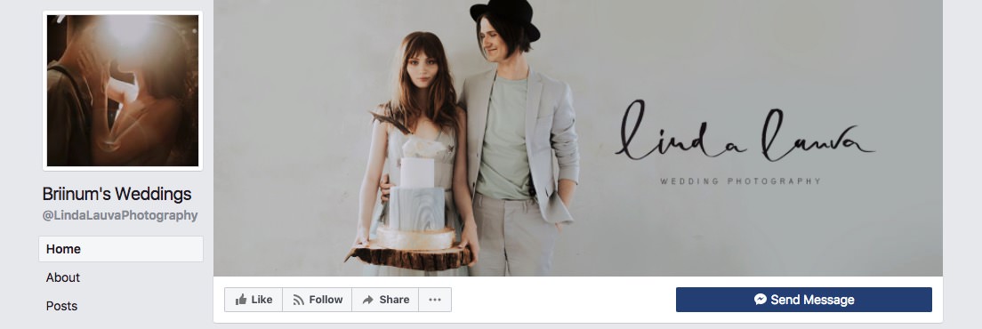
Linda Lauva Photography chose to use her name brand logo and one of her images as well. We love how her logo is not in the center of the image but as a part of the image itself. This layout creates a well-balanced graphic that is pleasing to look at.
Visit Briinum’s Weddings Facebook page.
13. Another Cover Image with Logo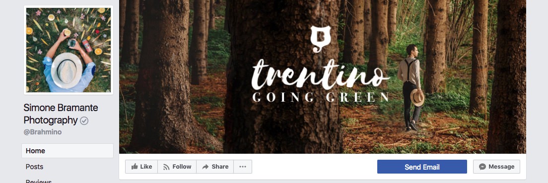
A page cover can represent more than just you as a photographer or artist. Simone Bramante uses his cover photo as an advertisement for one of his projects. It features his logo mark and the project name. When you click on the cover photo, there is a link in the description area that leads to Simone’s blog article about “Trentino- Going Green”.
Visit Simone Bramante Photography Facebook page.
14. Cover Image with Logo & Subtitle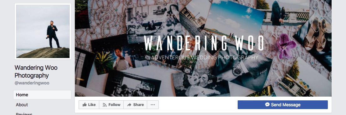
“Wandering Woo” not only shows his brand name on the cover image but also says that he’s an adventurous wedding photographer. Little details like this help the visitor understand exactly what he’s about to see.
Visit Wandering Woo Photography Facebook page.
15. Image with Delicate Text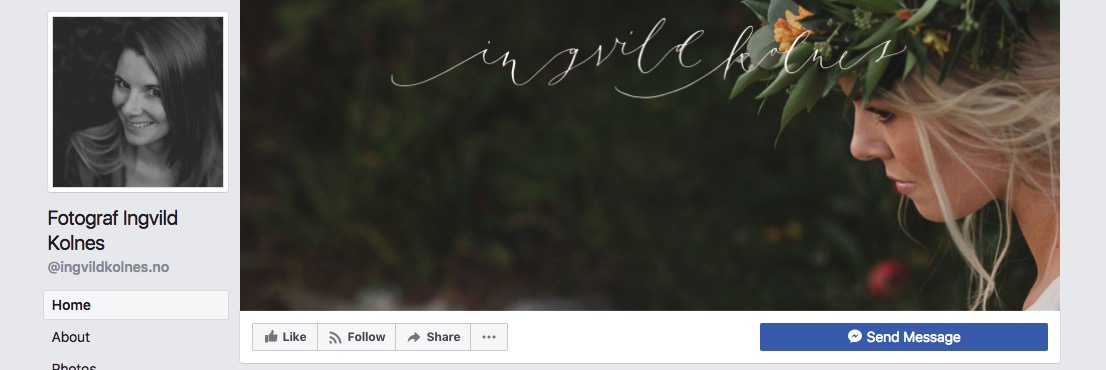
Although in this case, it’s hard to understand what’s written on the cover photo due to the font style. The white, delicate text grabs the viewers attention and makes him look twice and that is what’s important here.
Visit Fotograf Ingvild Kolnes Facebook page.
16. Just Your Logo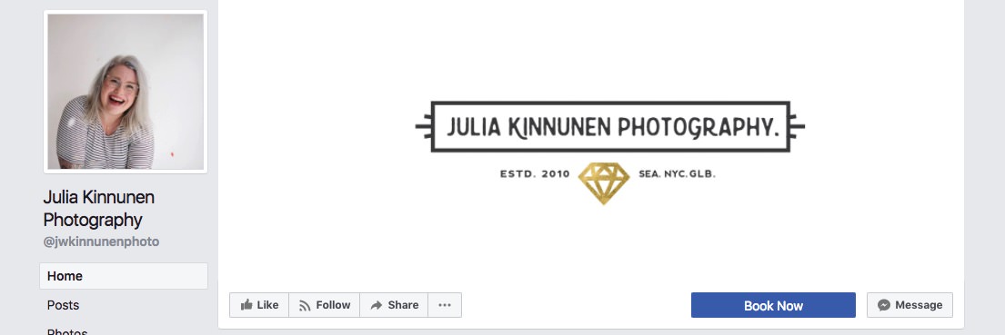
Previous examples had both a logo graphic and an image in the Facebook cover photo but if you have a great logo, why not keep it clean like in Julia’s example. The page title says that she’s a photographer and the timeline has her pictures so sometimes keeping things clean and well organized is the best choice.
Visit Julia Kinnunen Photography Facebook page.
17. Large Brand Name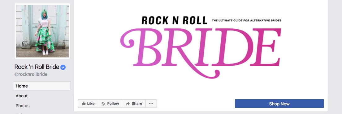
“Rock ‘n Roll Bride” goes bold, bright and clean on their Facebook cover image plus it answers the “What am I looking at?” question because it clearly states that this page is all about ultimate guides for alternative brides.
Visit Rock ‘n Roll Bride Facebook page.
Page Covers with Text
Another option is to use a bit of text on your cover image, but be careful with is because you can easily go from a good cover to an awful one by adding to much text on top of it.
18. Cover Image with Bold Text
Jennifer Sosa’s cover image manages to state three things with her cover: 1) she specializes in a photojournalistic photography style, 2) she’s a wedding photographer 3) she’s fun and witty.
Visit Jennifer Sosa Facebook page.
19. Cover Image with Logo & Short Description
“Kevin Fotografie” elegantly combines his logo with a beautiful image and tells the page visitors what his does – documents weddings and raw emotions.
Visit KEVIN / Fotografie Facebook page.
Abstract Facebook Page Cover Ideas
If you have a bit of know how in the graphic design area, you might want to try and create a Facebook page cover that is creative, interesting and unique. Such covers are quite rare from our experience but that’s exactly why they are so memorable.
20. Three Images Inside Rectangles 
Instead of using the classic layouts we saw in the image collage section of this post, UNiDAYS split their cover image into triangles – it’s simple to do and looks great! Although you have to pay special attention to the images you place in layouts such as this. Notice how the first image is a closeup of two people, the middle one is further away and the last one is another close up with two people again. This creates balance and guides the eye nicely.
Visit UNiDAYS Facebook page.
21. Four Images, Logo & Graphic Accents 
Iurie’s cover image is very artistic and someone has spent a lot of time on it. It consists of the classic four image layout but takes it all a step further by adding interesting, nicely aligned separator lines and a signature style logo in the middle.
Visit Iurie Belegurschi Photography Facebook page.
22. Abstract & Attention Grabbing 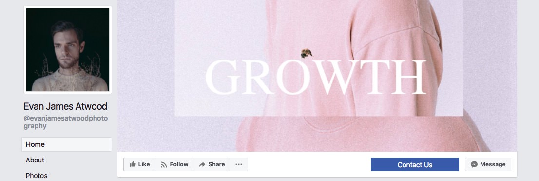
Evan James Facebook cover is modern, abstract and is a part of a larger image that is revealed when you click on the cover image.
Visit Evan James Atwood Facebook page.
Show Them What You Got
Since we work mainly with photographers, we have visited loads of photography portfolio websites over the years. Some of the more successful photographers have participated in photography contests, been featured in magazines or on popular websites they have been nominated for awards. Almost all of these photographers show their award badges on their websites, but when it comes to their Facebook pages, suddenly they become bashful.
Awards make you look more professional, trustworthy and boosts your credibility – if you have any of them, don’t be afraid to show them.
23. Bright Image & Your Award 
Igor Demba got featured in the “30 Rising Stars” list and proudly shows the badge on his cover photo. Don’t know about you, but I’m impressed!
Visit Igor Demba Photography Facebook page.
24. Nomination 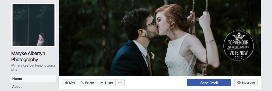
Maryke has a “Vote Now” badge on her cover photo. It draws attention, shows that she’s active and mentions the word “Wedding” therefore we know what she specializes in!
Visit Maryke Albertyn Photography Facebook page.
Facebook Video Covers
Since August 1, 2017, all Facebook business pages have the option to upload a Facebook cover video instead of an image. And if this doesn’t grab the viewers attention then I don’t know what will! Cover videos are unique, attention grabbing and offer an array of new possibilities.
25. Fast Slide with Center Point
Momo’s uses a fast image slide with Momo in the center. See how the eyes are in the same spot in every image. This tells a story and looks amazing.
Visit Momo’s Facebook page.
26. Fast Slide
While in image collages you can place only that many images, videos can hold a lot more. We love this “fast slider” trend. Each image shows up for a split second but it’s enough to get the feel for the photographer’s style.
Visit Marcos Sanchez Photography Facebook page.
27. Actual Video to Set the Mood
If you’re a videographer, video covers are a godsend! “KLassey Productions” uploaded a short video reel on their Facebook cover and it looks super cool. Even if you’re not a videographer, you could get someone to film how you’re working. It would make for an intimate, welcoming, and very interesting cover.
Visit KLassey Productions Facebook page.
28. Video Ad Reel
Since now you can upload video covers for your Facebook page, why not use it to display an actual ad if you have one! “The Rural Wordshop” does just that. Imagine how well this would work for festival and event organizers!
Visit The Rural Workshop Facebook page.
We truly hope that this Facebook page cover compilation gave you inspiration and ideas for your own cover! If you don’t quite know where to start yet, we made 3 free Facebook page cover templates that you can download and use so feel free to try them out! Even if you have a design idea of your own, our templates are sized for the best image resolution so you can use it as a blank canvas as well.
When creating your own cover, its dimensions should be 1640×720 pixels for image covers and 820×462 pixels for Facebook video covers.
We would love to see what you came up with, so share your Facebook page in the comments!
