Welcome to Sabrina’s Color World
Ever looked at Sabrina Carpenter’s style and thought, how does she make pastels and moody hues work so effortlessly? She blends soft, dreamy tones with deep, rich shades to create a space that feels both cozy and sophisticated.
This slideshow will show you how to bring that same color magic into your home. Whether you love muted blush tones or bold navy blues, we’ll break down how to mix them in a way that’s totally Sabrina-approved. Let’s get started!
Blending Pastels and Moody Hues
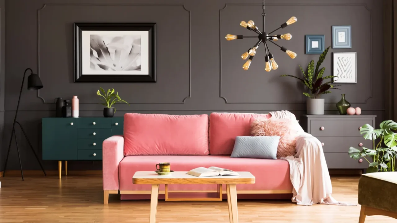
Too much pastel can make a room feel like a nursery. Too much darkness? A little too dramatic. But put them together and boom, you’ve got balance. The secret is letting them play off each other instead of competing.
Try a soft pink couch with deep blue throw pillows or a sage green rug against charcoal walls. The contrast keeps pastels from looking too sweet and moody colors from feeling too heavy. It’s all about mixing light and dark to get that just right look.
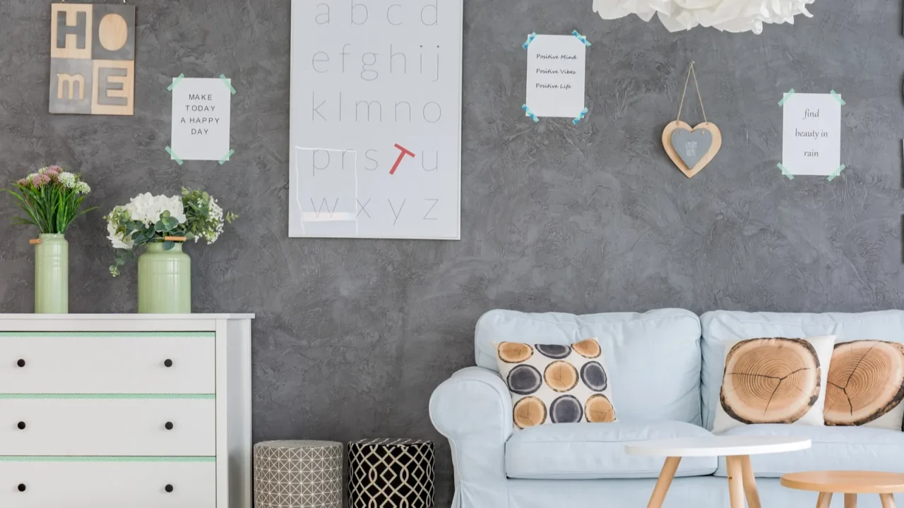
Prettiest Pastel Picks
Not all pastels belong in a kid’s bedroom. Sabrina’s style leans toward warm, muted tones that feel chic and grown-up. Think dusty rose, soft sage, buttery yellow, and vintage lavender, colors that feel soft but not overly bright.
Use these shades on walls, rugs, or even small decor like vases and pillows. Want a bolder move? A pale blush accent wall with rich, jewel-toned furniture is the chef’s kiss of color combos.
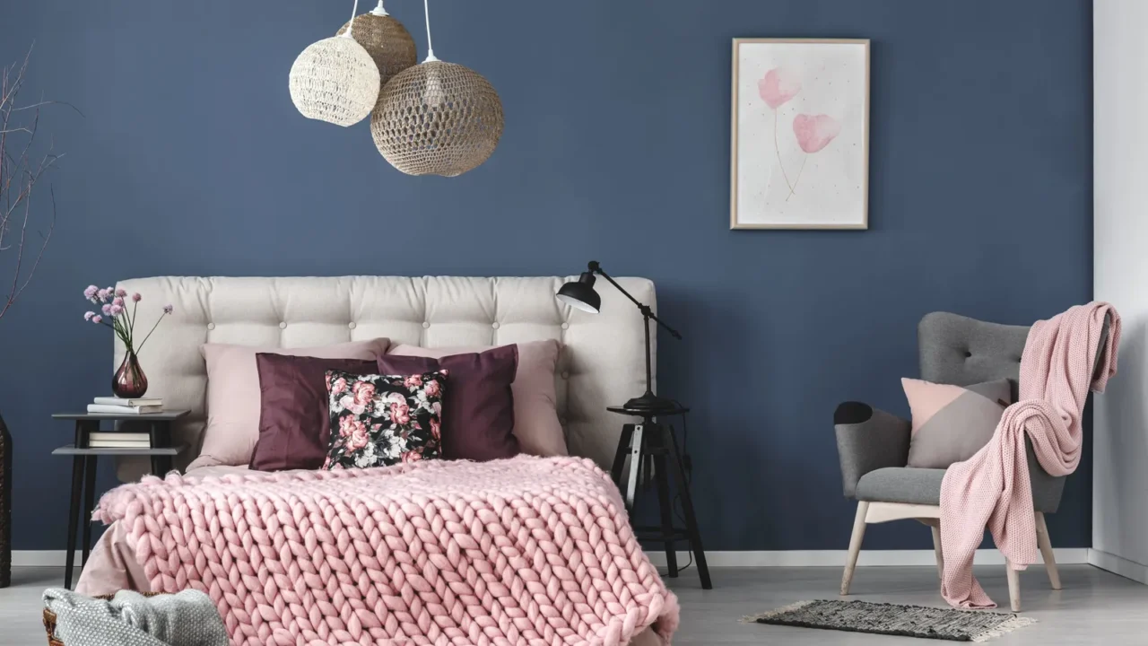
Moody Colors That Wow
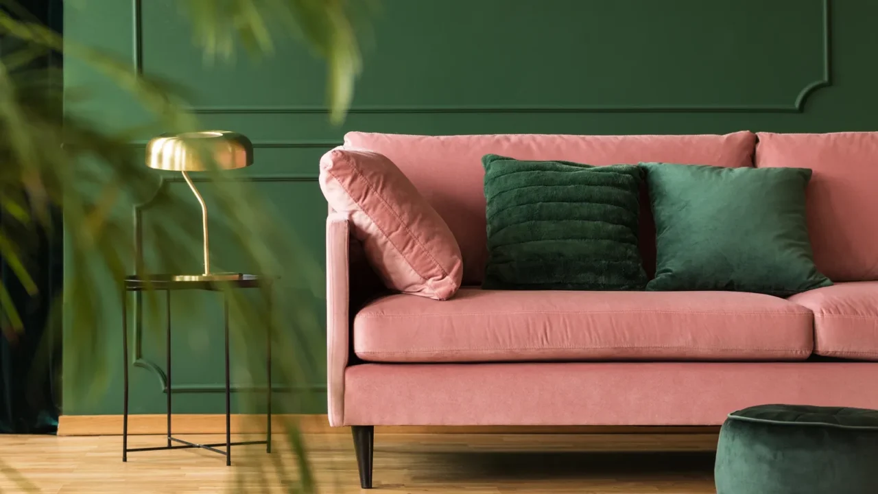
If pastels are the sunlight in a room, moody hues are the shadows that give it depth. Deep navy, emerald green, charcoal gray, and rich burgundy add a cozy, sophisticated edge to any space.
Try a dark green velvet headboard against a soft cream wall, or navy blue cabinets with warm peach accents. Dark colors don’t have to feel heavy, use them where they’ll make an impact, like statement furniture, accent walls, or dramatic drapes.
Textures Make It Work
Colors are important, but the feel of your space matters too. Mixing different textures keeps your color palette looking layered and effortless instead of one-note.
Picture a soft pink velvet couch next to a sleek black coffee table. Or a cozy linen bedspread against a deep blue wall. Throw in a vintage rug or some woven baskets, and suddenly your room looks like it belongs in a design magazine.
Statement Walls That Pop
Not ready to commit to a full pastel or moody room? No problem and start with an accent wall. A deep navy or emerald green wall instantly makes soft pastels pop, while a blush or muted lavender backdrop keeps dark furniture from looking too intense.
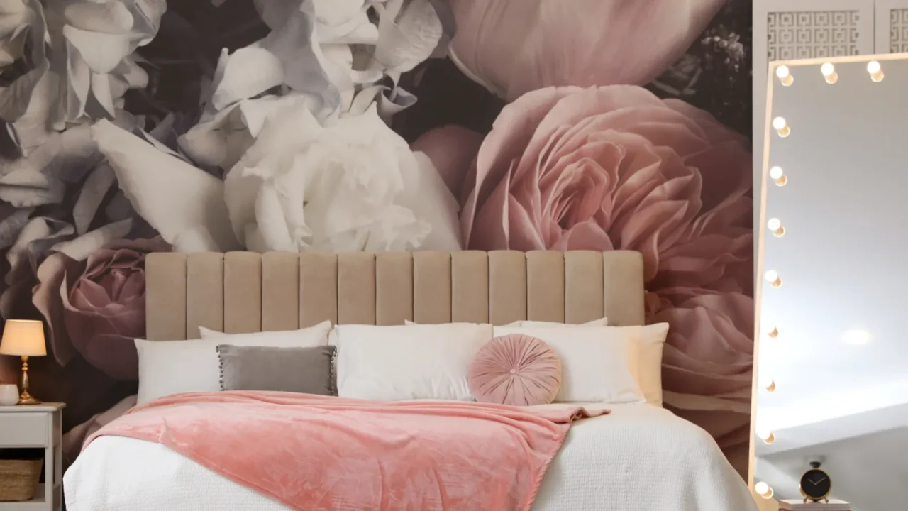
If you’re feeling creative, go for wallpaper such as floral prints, soft ombré, or geometric pastels can turn a blank wall into an art piece. One bold wall can change the whole feel of a room without going overboard.
The Power of Two-Tone Walls
Why settle for one color when you can have two? Two-tone walls let you mix pastels and moody hues in a super stylish way. The trick is to pick colors that balance each other, think soft blush on top with deep navy on the bottom.
For a crisp, modern look, add a chair rail or molding between the colors. Want a softer vibe? Try a faded ombré effect where one shade blends into the next. It’s an easy way to make your walls feel more dynamic without going full wallpaper.
Pastel Ceilings
Most people stick to white ceilings, but why not bring color all the way up? A pastel ceiling adds a dreamy, unexpected element to any room. It’s a great way to add interest without overpowering the space.
Soft mint, muted lavender, or powder blue on the ceiling keeps a room feeling airy while adding personality. Pair it with darker furniture and warm lighting, and suddenly, your space feels designer-level chic without a full remodel.
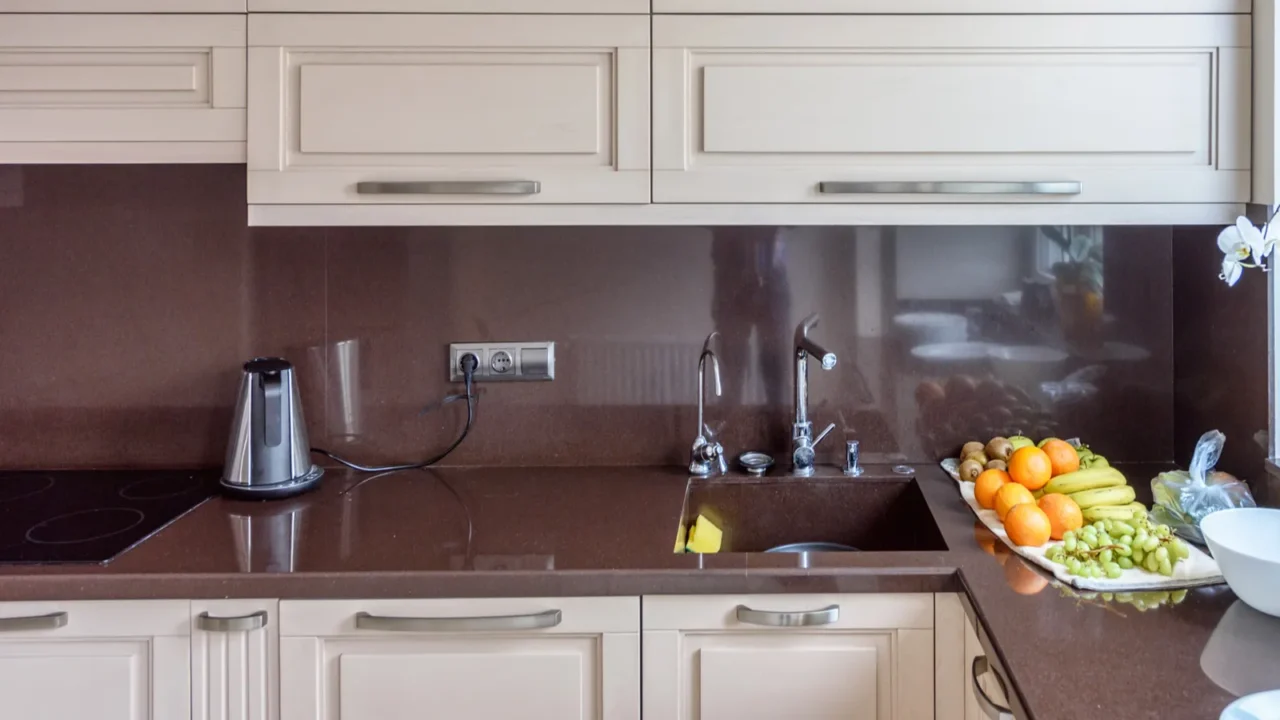
Pastel Kitchens
Pastels in the kitchen? Absolutely! The trick is to pair soft colors with structured elements like sleek cabinets, stone countertops, or bold metal fixtures.
Try sage green lower cabinets with brass handles or pale cabinets against dark backsplash. Even small touches, like pastel barstools or muted ceramic dinnerware, can add charm without making the space feel childish. Pastels don’t have to be sweet, they can be seriously stylish.
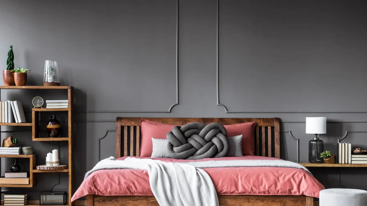
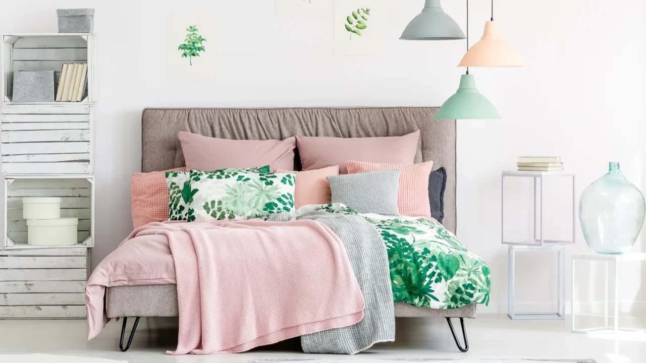
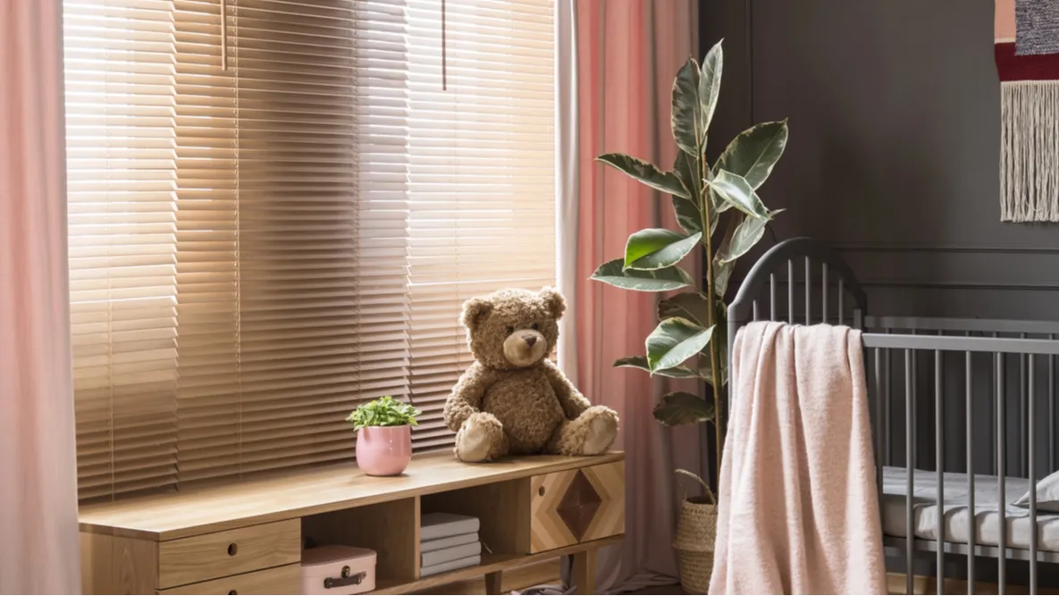
Moody Bedrooms That Feel Cozy
Dark bedrooms are trending, but they don’t have to feel like caves. The key is layering in pastels to keep things soft and inviting.
A charcoal gray wall with a pale blue duvet makes a bedroom feel warm without being too heavy. Or try deep green curtains with peachy-pink bedding for a cool contrast. Add gold lighting and plush textures to keep the space from feeling too dark.
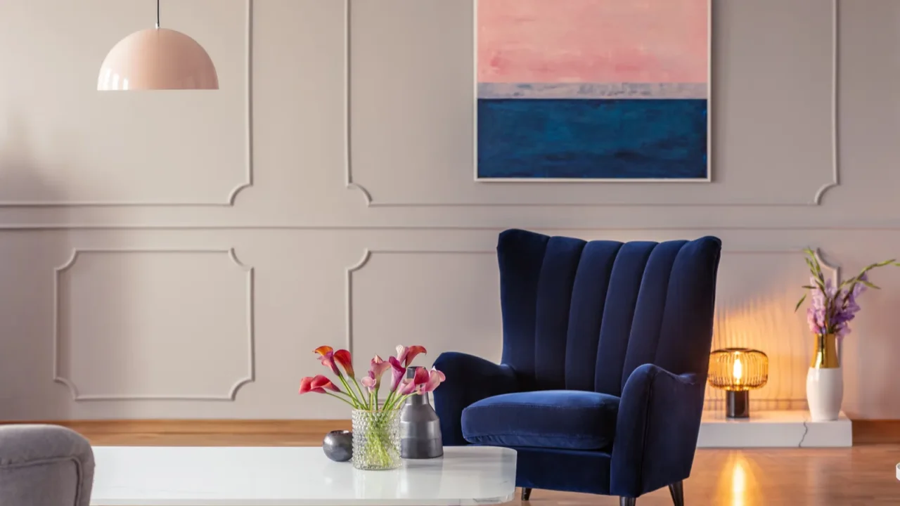
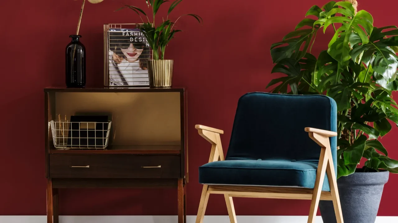
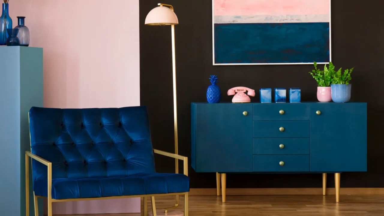
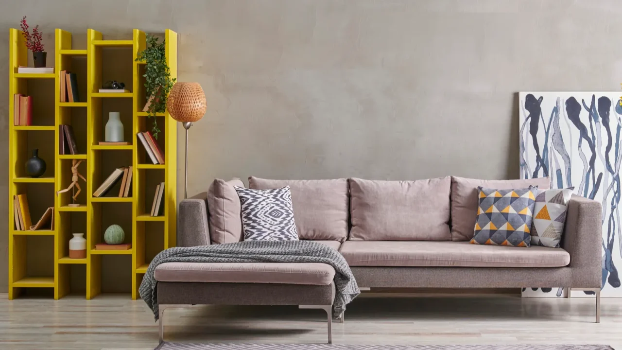
Statement Furniture in Bold Colors
If painting walls isn’t an option, let your furniture do the talking. A deep blue velvet couch, a blush pink armchair, or an emerald green headboard instantly makes a space feel intentional.
Pair moody furniture with pastel accents or vice versa. A rich plum chair next to a pale yellow coffee table? A total statement. Don’t be afraid to go bold with one or two pieces, these colors want to be noticed.
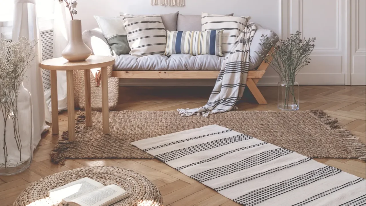
Layering Rugs for Extra Depth
Rugs are the easiest way to bring both pastels and moody hues into a space without committing to a full-color overhaul. But why stop at one? Layering rugs is a designer trick that adds instant depth and texture.
Try a neutral jute rug as a base with a pastel-hued vintage-style rug on top. Want something bolder? A deep navy or emerald green rug under a muted blush runner adds contrast without overpowering the room. It’s all about mixing patterns, colors, and materials to keep things interesting.
Unexpected Color Pops
You don’t need to drench a room in color, accents do the work for you. Sabrina Carpenter’s style mixes pastels and moody hues through small yet bold details like a blush vase on a navy shelf or gold accents against sage walls.
The trick? Layer textures and finishes like matte ceramics, velvet cushions, or metallic details keep pastels from feeling too soft and moody tones from feeling too heavy. Whether it’s artwork, a sculptural piece, or colored glassware, accents add just the right pop without commitment.
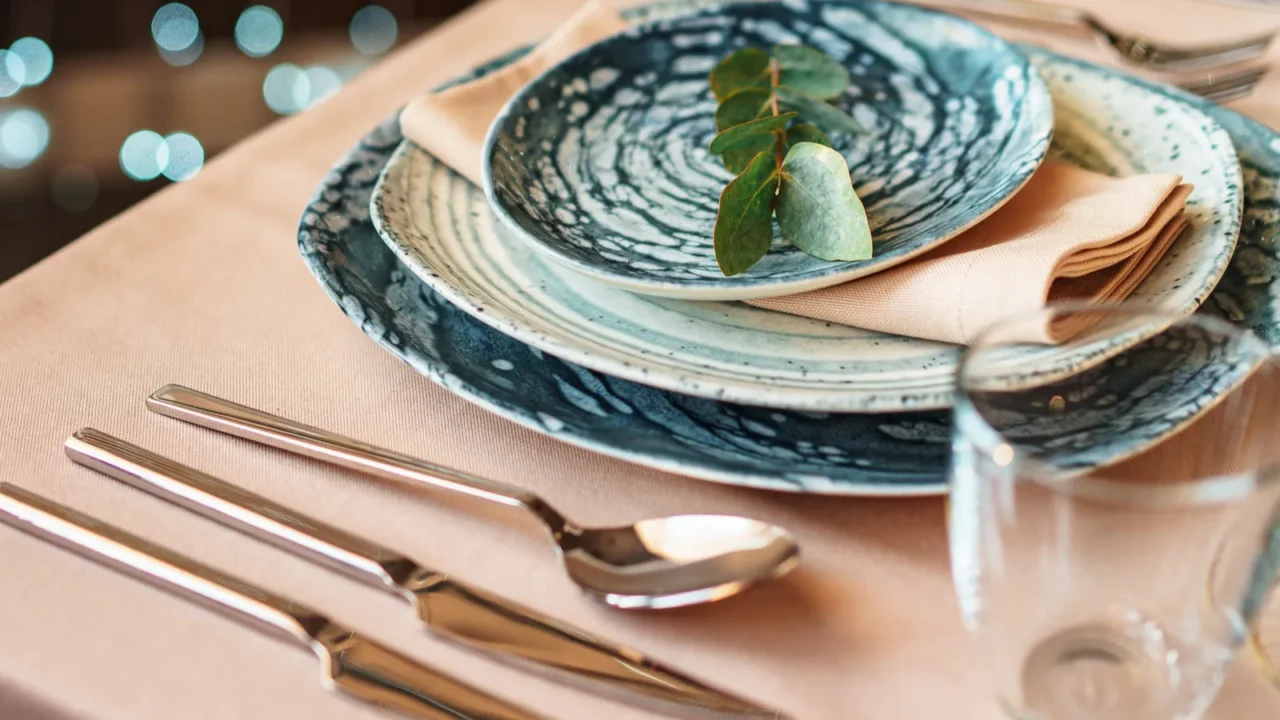
Pastel and Moody Table Setting
Want to make every meal feel like a stylish event? A well-set table is the perfect way to experiment with pastels and moody hues without committing to a full room makeover.
Try dusty rose or soft mint plates paired with deep navy napkins or a dark table runner. Gold flatware adds warmth, while textured glassware in smoky gray or pale blue gives a layered, elegant touch. Whether it’s a cozy brunch or an intimate dinner, mixing light and dark tones makes every setting feel effortlessly chic.
Statement Curtains
Curtains do more than block light, they set the entire mood of a space. Instead of sticking with neutrals, try deep emerald green or rich burgundy drapes against pastel walls for a bold contrast.
For a softer look, sheer pastel curtains in blush or powder blue add an airy, dreamy feel when paired with dark wood or black furniture. Want to add a fresh touch to your home? Create Cozy Spaces with Pantone’s 2025 Color Pick and make every room feel inviting.
Bookshelves That Double as Art
Your bookshelf isn’t just for storage, it’s the perfect backdrop for a stylish color mix. Paint the inside of shelves in a moody shade like charcoal or navy to make pastel-colored books and decor pop.
If painting isn’t an option, stack pastel and deep-colored books together for a curated, layered look. Mix in decorative vases, metallic accents, and greenery to break up the color blocks. Is extra paint lying around? Put it to good use with Genius Ways to Use Spare Paint at Home.
Did any of the above ideas resonate with your creativity? Tell us all about it in the comments below!
Read More:
- Pinterest’s Favorite Colors for 2025 Playrooms
- Mocha Mousse and Its Best Color Partners
- Color Trends That Instantly Modernize Any Room
Don’t forget to follow us for more exclusive content right here on MSN.