As a designer, I would argue that good font pairing is one of the hardest things to master. When combining two or more typefaces together, it’s important to find fonts that compliment each other, don’t conflict, and harmonize nicely with the overall design. It took me years of practice, observation, and many, many “How to typography” books until I could say that choosing a proper font for a design isn’t that hard (although it still takes time).
For someone whose profession doesn’t include regular work with typography, choosing a proper font for a website (or any other graphic with words on it) can be a frustrating and utterly confusing ordeal.
Currently, there are hundreds of thousands of fonts to choose from and more are created every day. In the world of typography, you will often hear words like Sans-Serif, Serif, Script ... If you’re not in the “graphic designer” industry, these words might get you even more lost.
In this article, I hope to help you get a bit more familiar with the world of typography. We will look at some basic terminology that’s used when referring to typography in order to help you better understand how to choose a font that works for you.
After familiarizing ourselves with some basic typography terms, we will look at 30 font pairing examples that look professional, pleasing to the eye, easy to read, and are 100% free to use.
Let’s get started, shall we!?
Common typography terms explained
There are a lot of specific terms in the language of typography but in this article, I want to focus on the most common words without diving into specifics. If you’ re not a designer I think there’s no use in knowing what’s an x-hight or the difference between an ascender and a descender. Of course, if you’re up for a more in-depth exploration, feel free to check out these 20 Must-Know Typography Terms for Beginners after you’re done with this article.
Right now we will be focusing on more common terms that you might have heard when browsing the web.
Serif Font
Serif fonts are the most traditional typefaces out there. Serif typefaces can be identified by little lines (serifs) attached to the main stroke of the letter.
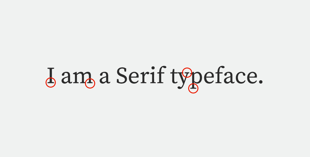
Serif fonts are most commonly used in books and magazines from the time of typesetting.
Serif type styles can be grouped into subcategories based on the time period in which the specific style was created:
- Old style
- Traditional
- Neoclassic
- Slab
- Clarendon
- Glyphic
For a while, using a font with serifs online was a “no-no” because the little lines at the ends of the letterforms would look blurry on screen. Today it is no longer true, thanks to high-resolution monitors and mobile devices. More serif typography is seen in web design but an old habit is hard to break so serif fonts are not as common – especially in longer pieces of content (like a blog post). It is much more common to see a serif headline in combination with a sans-serif body, which we will look at next.
Sans Serif Font
Sans-serif fonts or simply Sans are typefaces without the little embellishments at the ends of strokes. Sans means “without” in French.
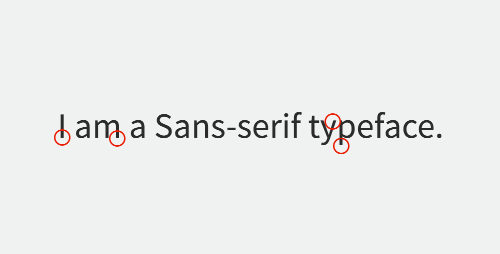
Just like serifs, sans-serifs have their categories as well:
- Grotesque
- Square
- Humanistic
- Geometric
As mentioned before sans-serif typefaces are the most common choice for web typography. As you can see, this blog is using a sans serif font as well! Sans-serif typography is amazingly versatile. It can be thick or thin, tall or short, fat or condensed – depending on the font family you choose. Thanks to this, sans-serifs can embody almost any design feeling or text subject.
Script Font
Script typefaces somewhat resemble a cursive handwriting style. Script font strokes will be connected to one another.
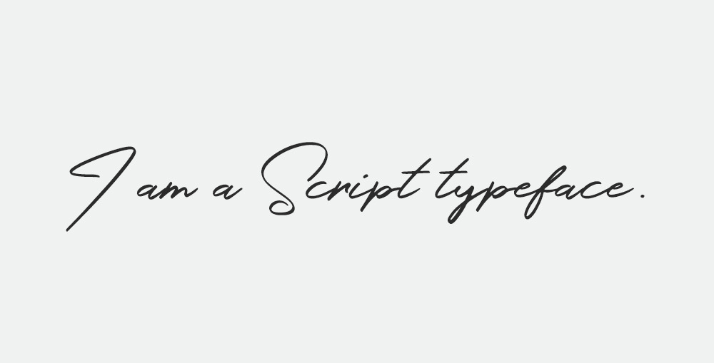
Scripts are very trendy this year (2018) and I bet you’ve seen them in all kinds of places – posters, logos, clothing and recently even websites.
That being said, script fonts should still be used with caution, and only in headlines or for short, large format slogans because script tends to be difficult to read.
Based on script font characteristics, they can be grouped in the following subcategories:
- Formal
- Casual
- Calligraphic
- Blackletter
If you’re really into script fonts (I know I am) and want to have some on your website, I’d suggest that you create a signature style logo for yourself using a signature style font.
Font pairing examples for web use
Now that you have a bit more familiar with common typography styles, it’s time to look at some font pairing examples that look great for websites and other digital designs.
I’ve created 30 font pairing examples for you to explore. All of them consist of two typefaces that compliment each other nicely.
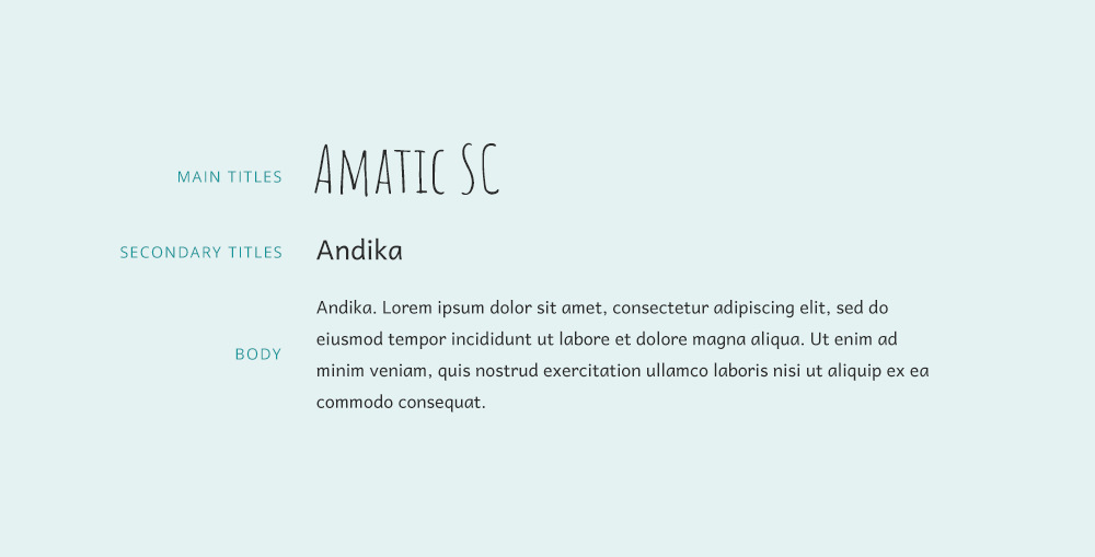
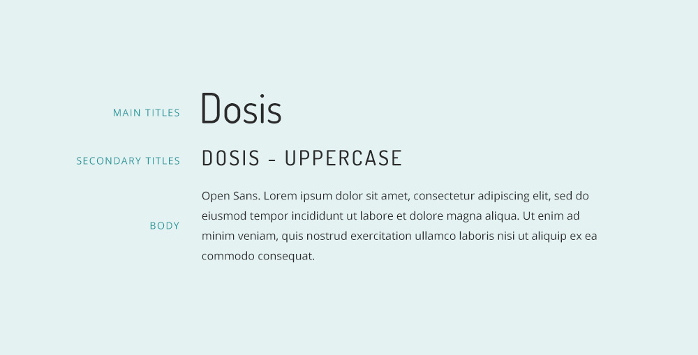
To make things more interesting I not only added a “main title font” and a “body/content” font but also a “secondary title” example that can be used for smaller headlines, quotes, extra info (like category names, author name, date written) or any other creative use-case scenario.
Below each visual example you will find a download link that will lead you straight to the free download page on Google Fonts for Font Squirrel.
1. Abril Fatface + Raleway
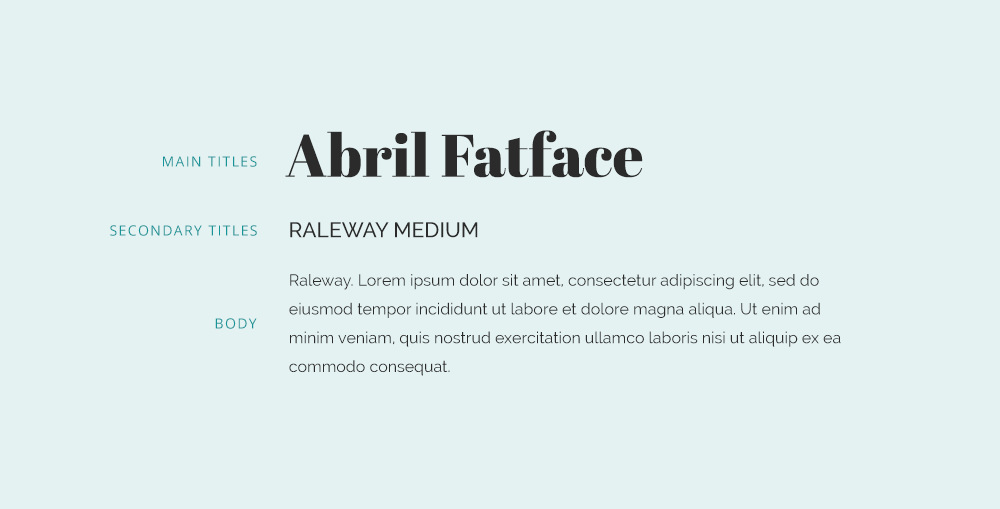
Download: Abril Fatface / Raleway
2. Amatic SC + Andika
3. Bebas Neue + Montserrat
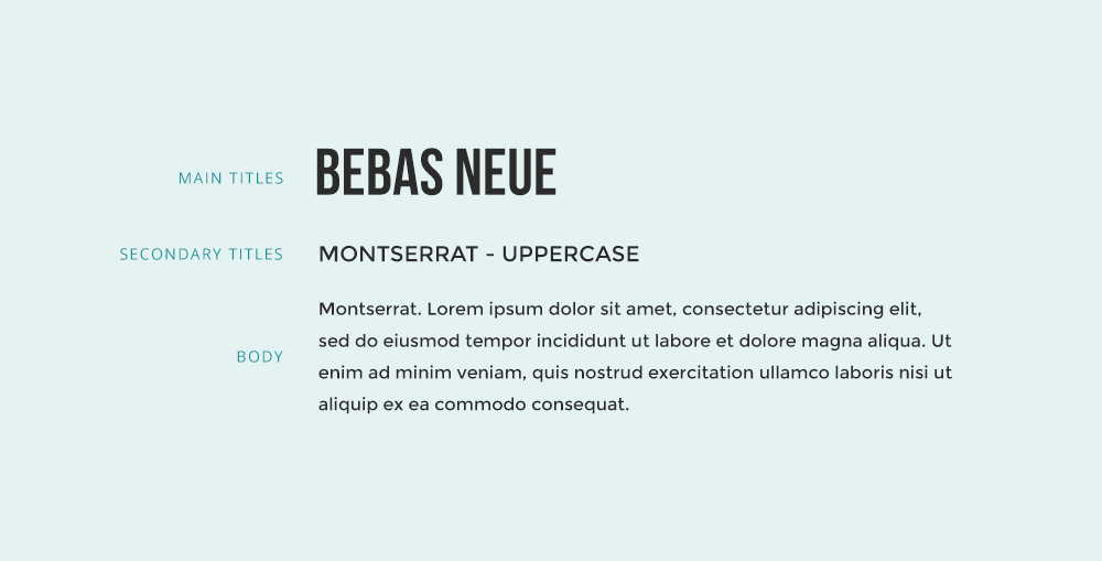
Download: Bebas Neue / Montserrat
4. BioRhyme + Montserrat
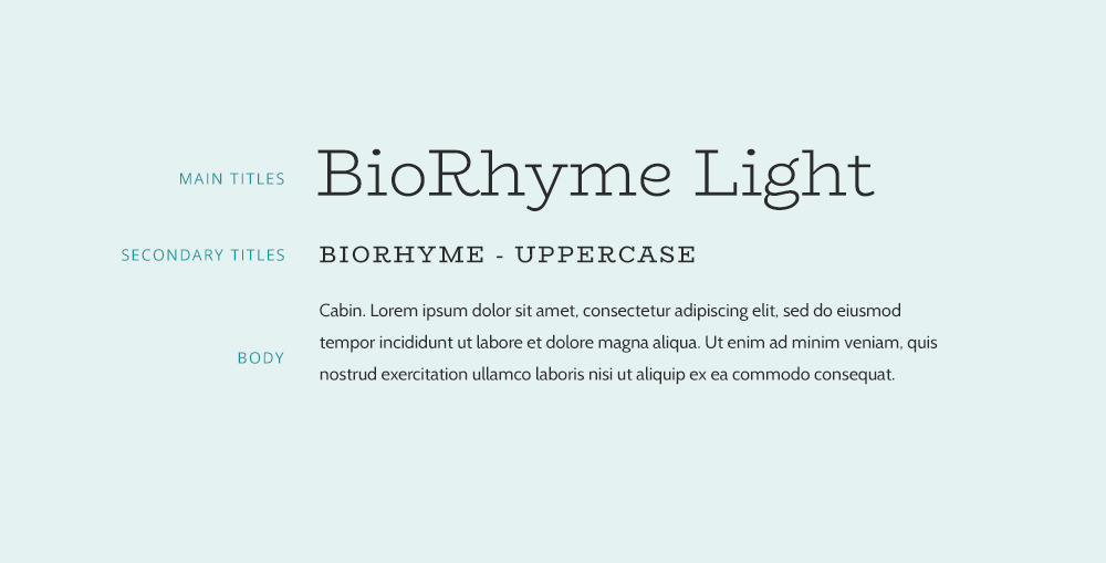
Download: BioRhyme / Montserrat
5. Bree Serif + Lora
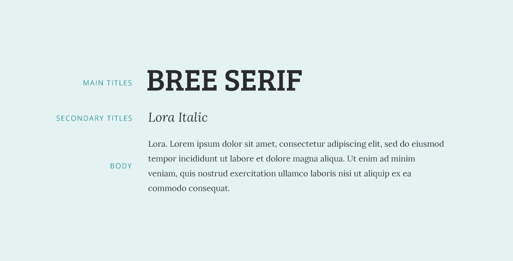
Download: Bree Serif / Lora
6. Merriweather + Cabin
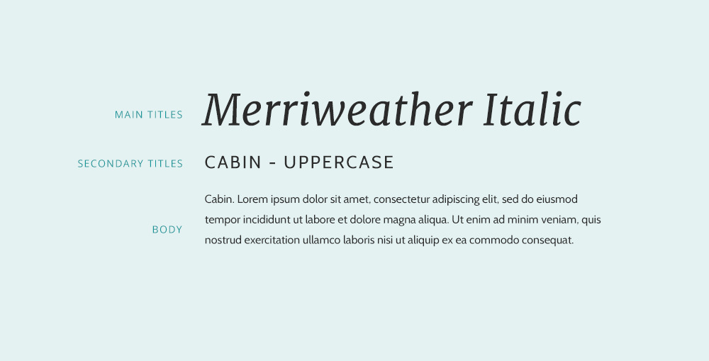
Download: Merriweather / Cabin
7. Cormorant Garamond + Open Sans
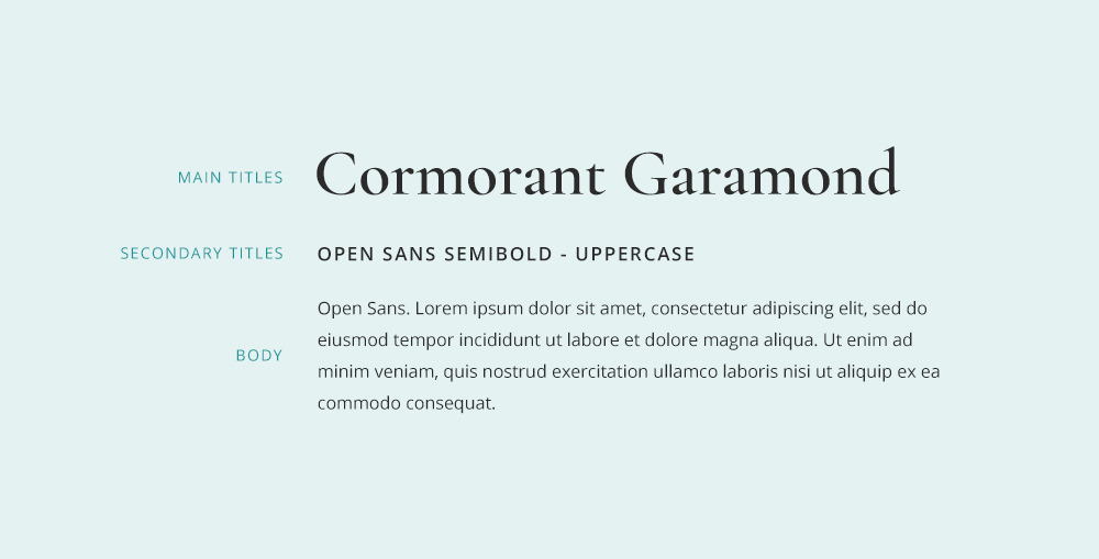
Download: Cormorant Garamond / Open Sans
8. Julius Sans One + Crimson Text
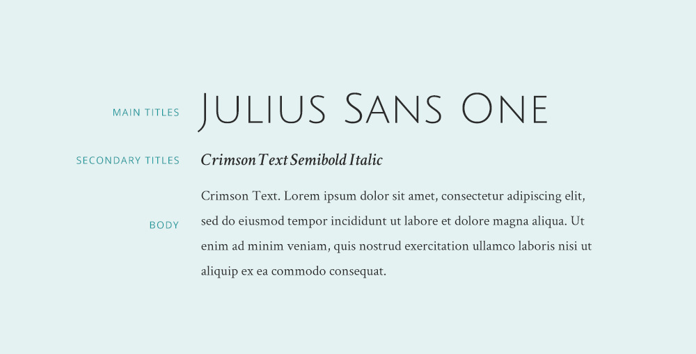
Download: Julius Sans One / Crimson Text
9. Dancing Script + Ledger
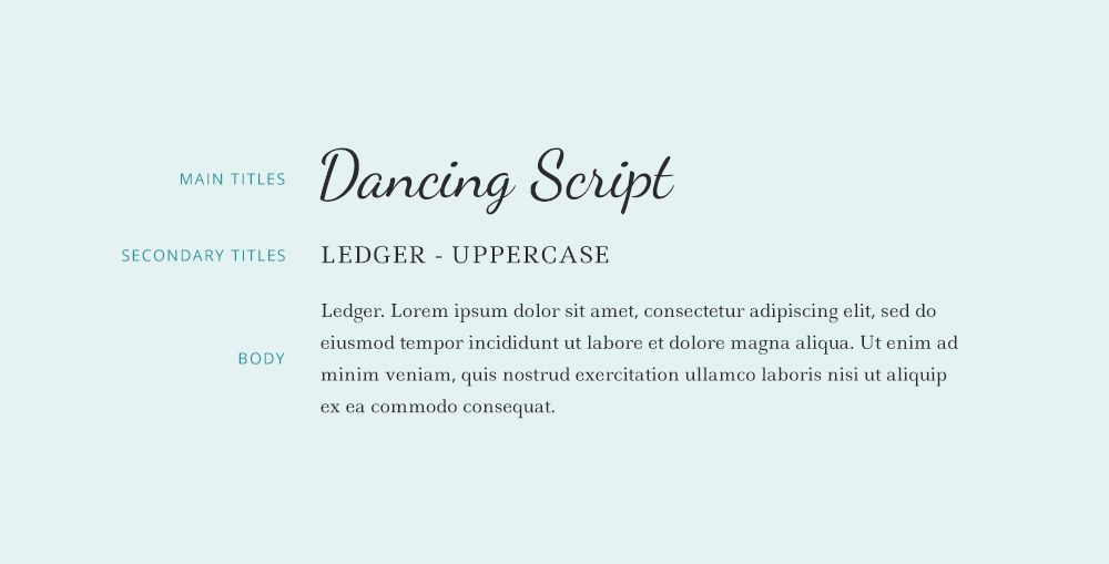
Download: Dancing Script / Ledger
10. Dosis + Open Sans
11. Oswald + Droid Serif
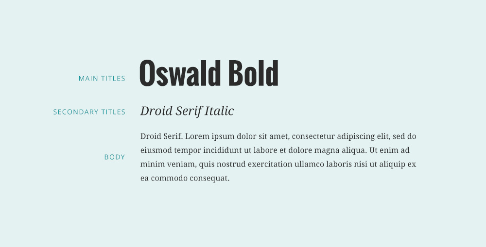
Download: Oswald / Droid Serif
12. Playfair Display + Fauna One
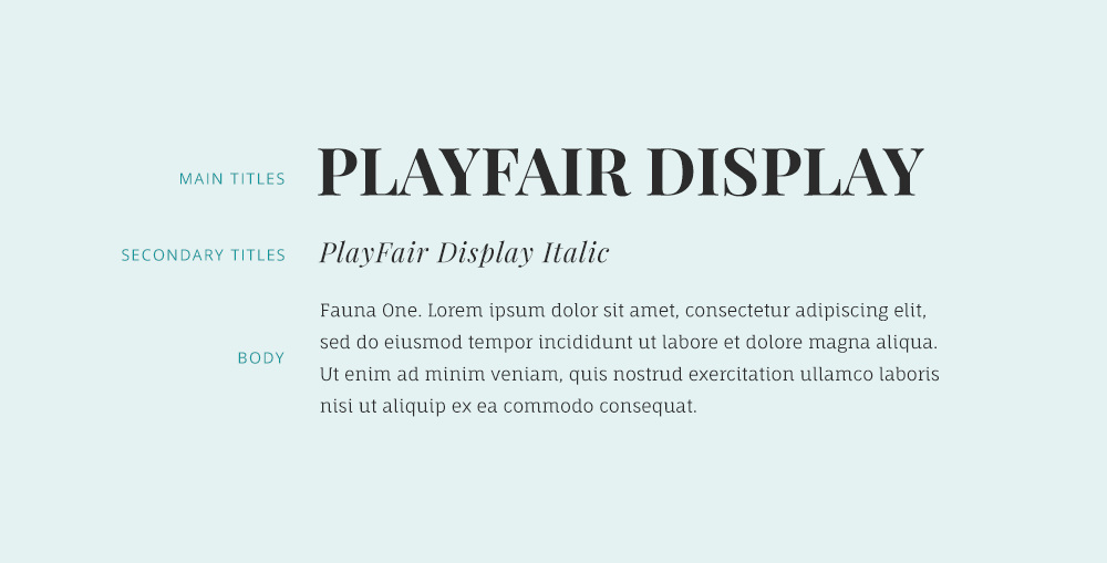
Download: Playfair Display / Fauna One
13. Karla + Montserrat
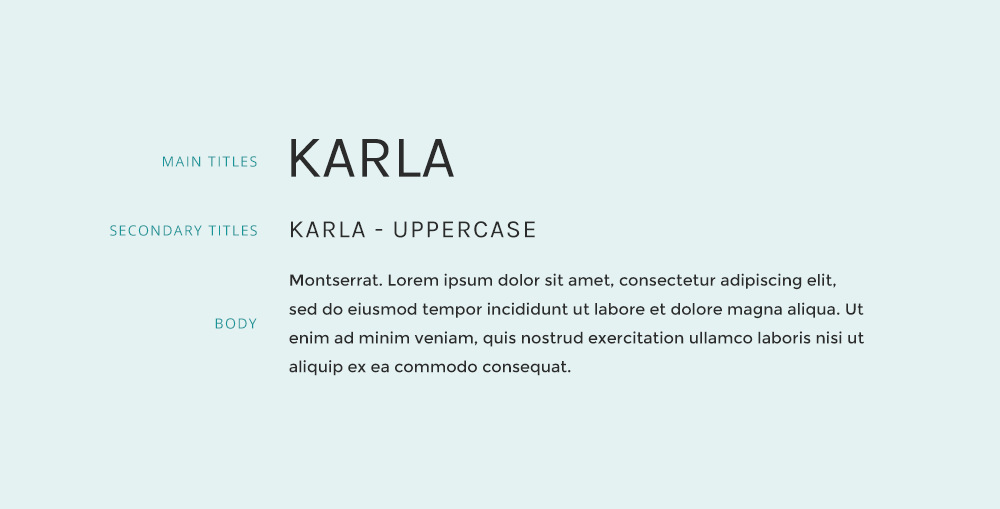
Download: Karla / Montserrat
14. League Spartan + Libre Baskerville
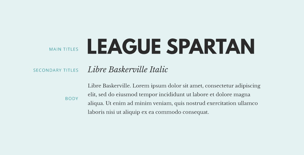
Download: League Spartan / Libre Baskerville
15. Libre Baskerville + Open Sans
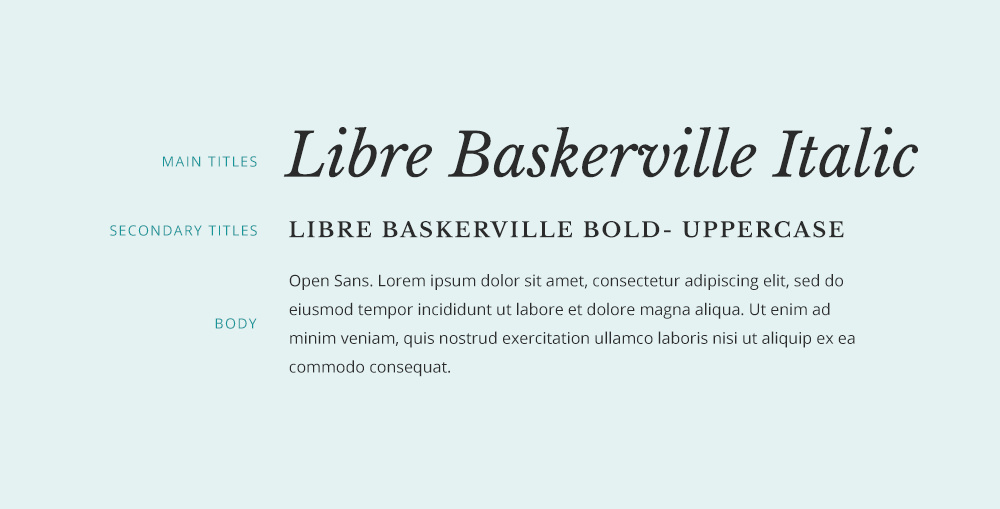
Download: Libre Baskerville / Open Sans
16. Lora + Source Sans Pro
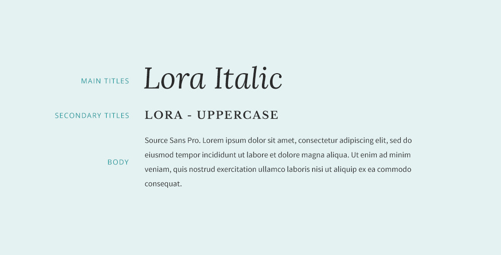
Download: Lora / Source Sans Pro
17. Merriweather + Open Sans
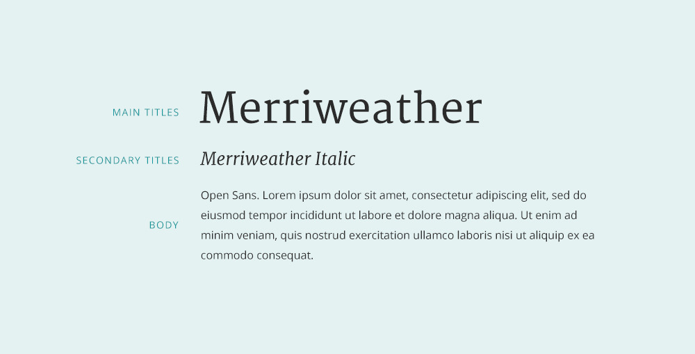
Download: Merriweather / Open Sans
18. Philosopher + Muli
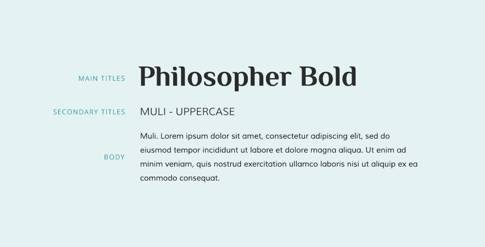
Download: Philosopher / Muli
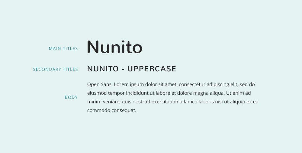
19. Nunito + Open Sans
20. Oswald + Montserrat
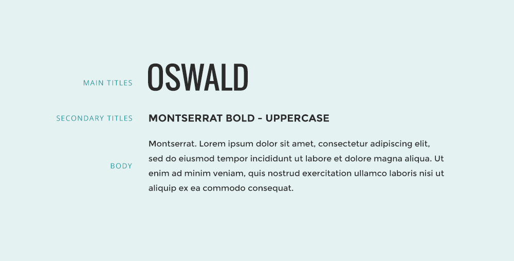
Download: Oswald / Montserrat
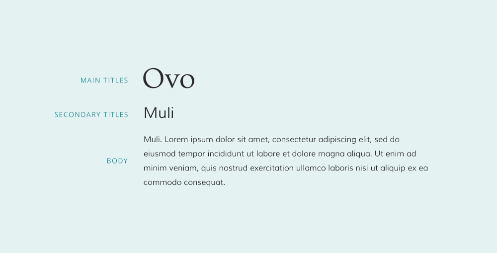
21. Ovo + Muli
22. Oxygen + Source Sans Pro
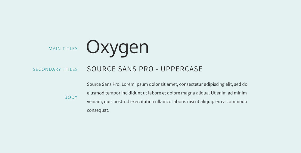
Download: Oxygen / Source Sans Pro
23. Playfair Display +Museo Sans
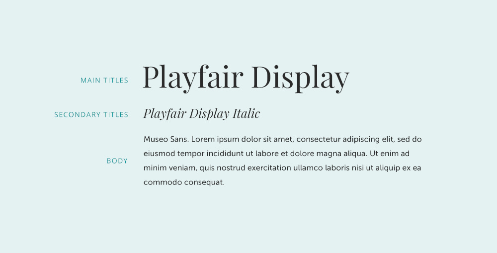
Download: Playfair Display / Museo Sans
24. Poppins + Open Sans
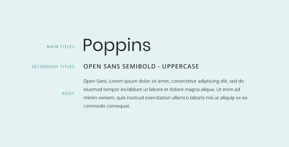
25. Quattrocento + Quattrocento Sans
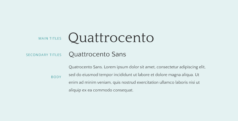
Download: Quattrocento / Quattrocento Sans
26. Sacramento + Alice
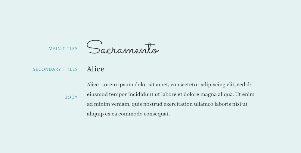
Download: Sacramento / Alice
27. Source Serif Pro + Source Sans Pro
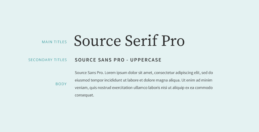
Download: Source Serif Pro / Source Sans Pro
28. Vollkorn + Exo
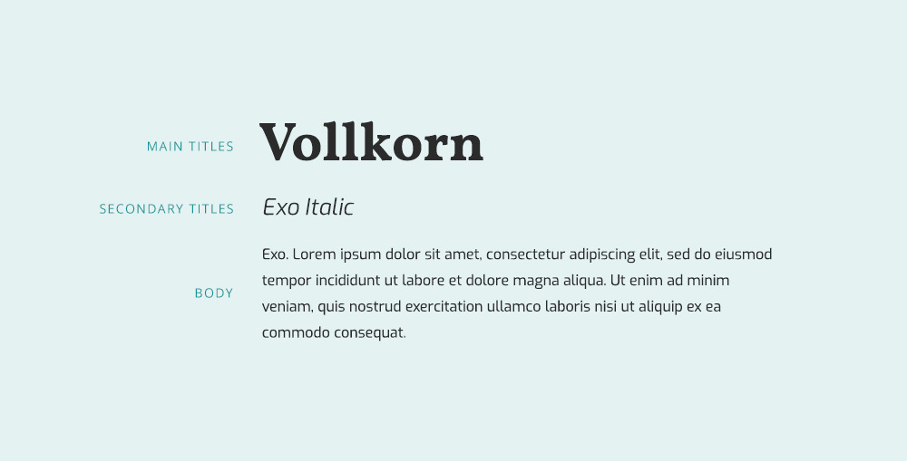
29. Woodford Bourne + Lato
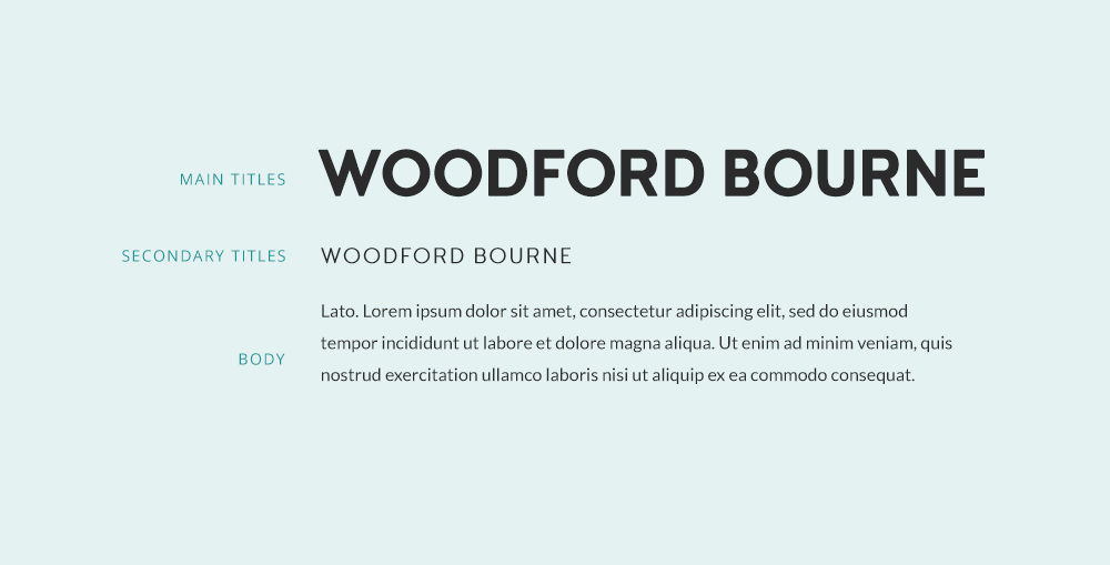
Download: Woodford Bourne / Lato
30. Yeseva One + Merriweather
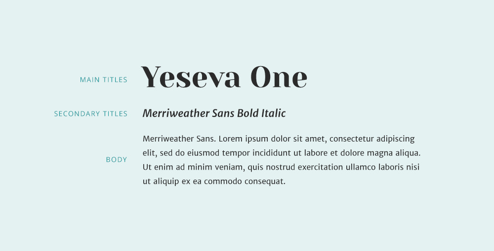
Download: Yeseva One / Merriweather
What’s your favorite font combo?
Whenever you’re choosing a font for a design or your website, you must not only think whether it’s pretty or not but also is it appropriate for the content you’re showing. Just like an image or a color, a typeface has a mood or a vibe and it’s your job to find a font whose vibe is not competing with the story it’s telling.
It’s tough, I know, but try and experiment. Test out different variations, add content to it and see what works. And most importantly – have fun!
Hope this piece of knowledge was useful to you 🙂