Color Trends to Inspire Your Home Makeover
Each year, top paint and design brands select a Color of the Year, predicting shades that will define interiors based on trends, psychology, and cultural shifts.
Brands like Pantone, Benjamin Moore, Sherwin-Williams, and Behr analyze consumer preferences, fashion influences, and lifestyle shifts to choose colors that reflect the mood of the year. These colors help homeowners create stylish, inviting spaces with tones that feel fresh yet timeless.
In this slideshow, I’ll talk about the standout 2025 Colors of the Year, why they were chosen, and how you can use them to transform your home. Let’s get started.
Pantone’s Pick
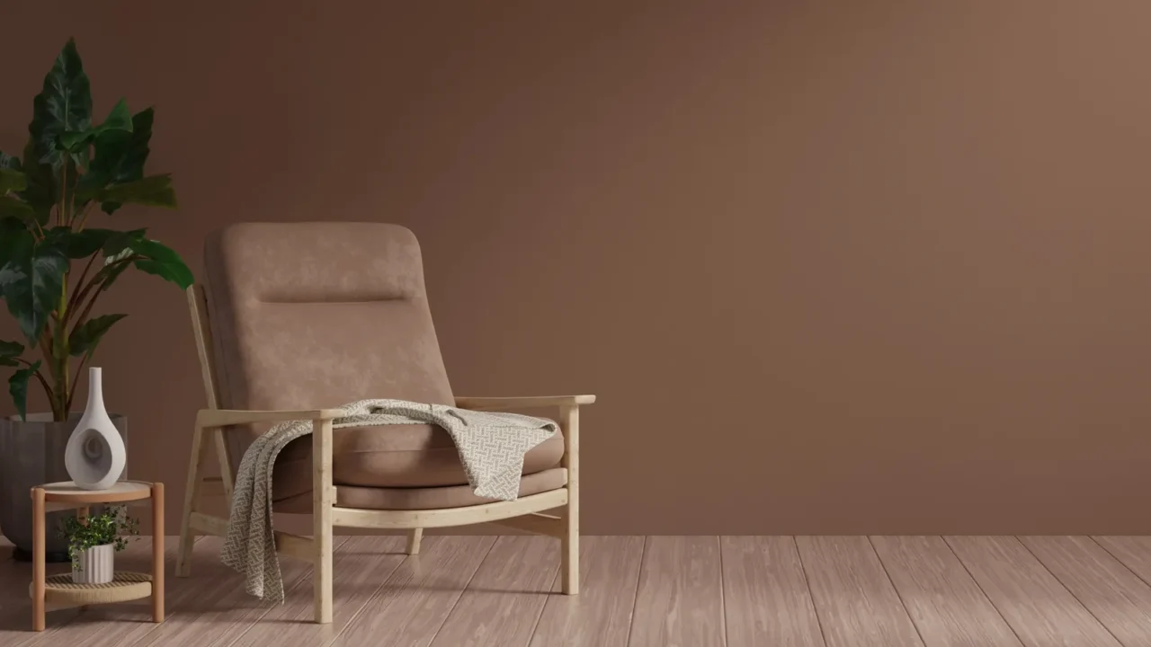
Pantone (global color authority) selected Mocha Mousse, a warm, rich brown with a cozy and inviting feel. It’s perfect for living rooms and bedrooms, where you want to create a sense of comfort and relaxation.
Pair it with soft beige or cream furniture to keep the space balanced, or add metallic accents like gold or brass for an elevated look. This shade also works well in home offices, promoting a grounded, focused atmosphere.
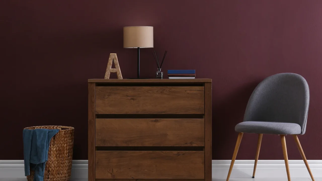
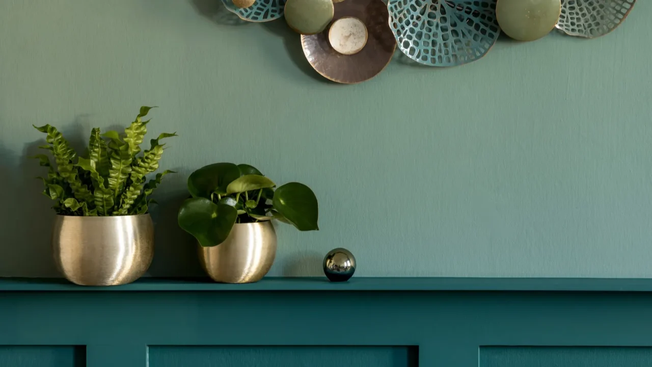
Benjamin Moore’s Pick
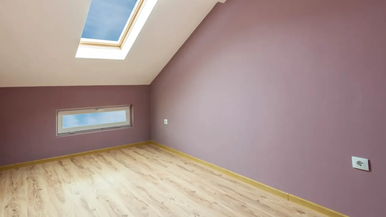
Benjamin Moore (premium paint brand) chose Cinnamon Slate, a unique blend of heathered plum and velvety brown, offering a sophisticated yet moody vibe.
This color is ideal for dining rooms and libraries. Pair it with warm wood tones and deep neutrals for a timeless aesthetic. For a modern twist, combine it with soft pinks or muted oranges to enhance its depth.
Behr’s Pick
Behr (innovative paint company) introduced Rumors, a bold, deep ruby red that instantly adds warmth and drama.
This color is best used in accent walls, entryways, or powder rooms where you want a striking statement. It pairs beautifully with neutral furnishings and gold or brass finishes for a glamorous effect. It is also an excellent choice for entertaining spaces like dining rooms.
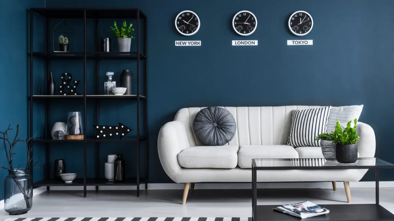
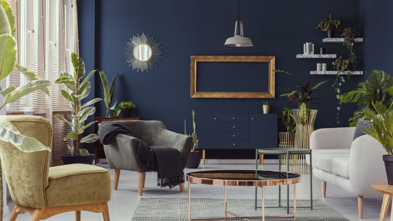
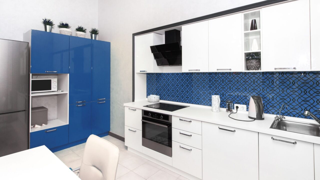
IKEA – Electric Blue
In 2025, IKEA also jumped in for the color of the year game and has selected Electric Blue, aiming to infuse homes with energy and vibrancy. This bold hue draws inspiration from the seas and skies. It’s versatile enough to serve as a statement color or an accent.
Pairing Electric Blue with pops of orange, sunny yellows, lavender, or hot pink can create a dynamic and inviting atmosphere. IKEA offers a range of products in this striking shade which makes it easy to incorporate this trend into your home decor.
Little Greene’s Pick
Little Greene (heritage paint brand) chose Mochi, a soft brown with a historical touch. Ideal for cozy bedrooms and libraries, this color blends beautifully with warm creams, dusty pinks, and muted blues.
Use it in a reading nook with soft lighting and layered textiles for a restful atmosphere. It also works well in traditional or vintage-inspired spaces with classic wood furniture.
Glidden’s Pick
Glidden (affordable paint brand) selected Purple Basil, a stunning mix of red and blue undertones that brings richness and warmth.
It’s perfect for bedrooms or reading nooks, adding a sense of coziness without feeling too dark. Pair it with soft cream or taupe for a sophisticated balance. This color also works beautifully in kitchens, especially when paired with natural wood cabinetry or black marble countertops.
Valspar’s Pick
Valspar (a trusted home paint brand) introduced Encore, a deep, jewel-toned blue that adds a bold, cool contrast to any space.
This shade is best suited for home offices, media rooms, or entryways where you want a refined yet dramatic feel. Pair it with crisp whites and soft grays for a balanced look, or embrace its richness with velvet textures and brass finishes.
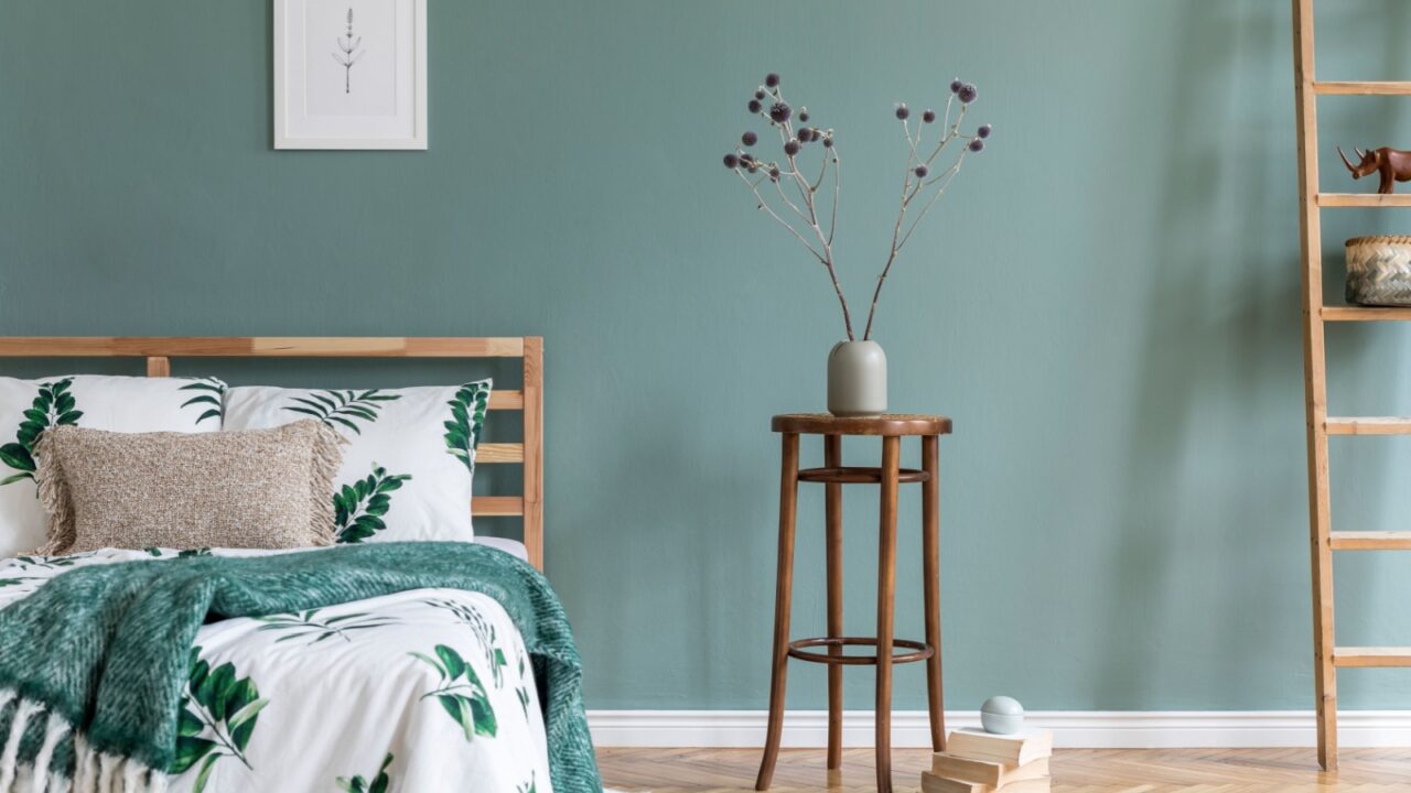
Sherwin-Williams’ Pick
Sherwin-Williams (leading paint manufacturer) unveiled Quietude, a serene blend of sage green and soft blue, perfect for bathrooms, bedrooms, and meditation spaces.
This color brings a sense of calm and tranquility, ideal for winding down after a long day. Pair it with warm neutrals, natural woods, and soft linens for an airy, spa-like ambiance. You can mix it with matte black fixtures and woven textures for a chic, minimalist appeal.
Graham & Brown’s Pick
Graham & Brown (a British wallpaper and paint brand) unveiled Elderton. It’s a medium, sophisticated brown perfect for living rooms and offices. This works great if you want an elegant, grounded feel.
It pairs well with deep blues, olive greens, and soft taupes. Use it on walls for a classic look, or incorporate it in furniture for a subtle warmth. Pair it with velvet textures and antique gold details for a luxurious aesthetic.
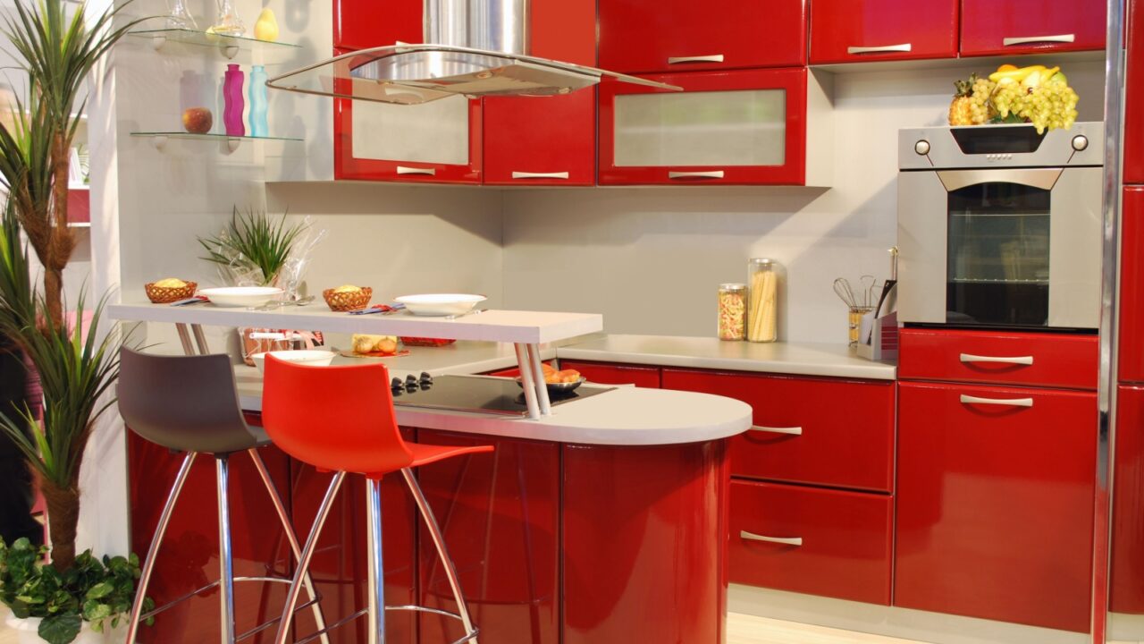
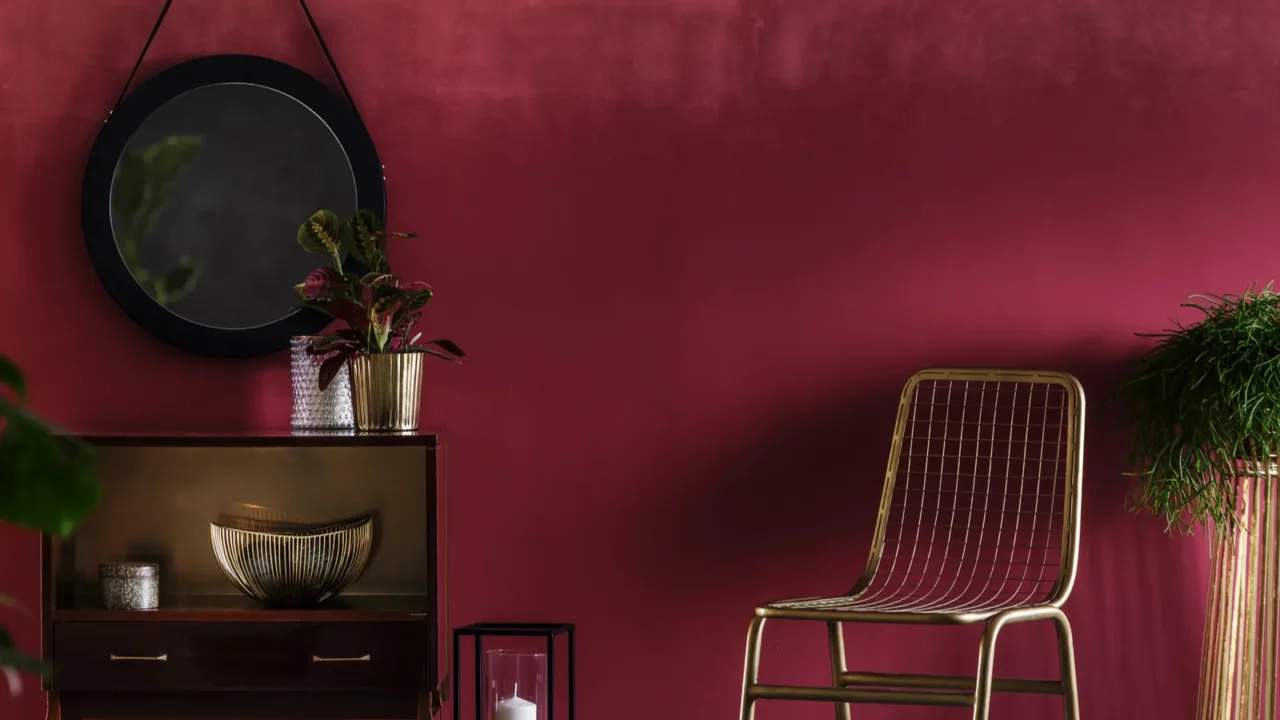
Pinterest’s Pick
Pinterest has crowned Cherry Red as a top color for 2025, the confident hues that make a statement. This energetic shade injects vibrancy into interiors, whether used as an accent or a dominant color. It’s perfect for modern, eclectic, and retro-inspired spaces.
Pair Cherry Red with soft neutrals like beige or cream for balance, or go bold by combining it with navy blue or deep forest green for a dramatic contrast. This shade also works beautifully in kitchens. Think lacquered red cabinets or a striking backsplash.
With its fiery appeal, Cherry Red is set to dominate the design world, bringing warmth, passion, and personality into homes.
Dunn-Edwards’ Pick
Dunn-Edwards (eco-conscious paint brand) chose Caramelized, a warm, sunbaked terracotta brown that’s great for kitchens and dining areas. This color exudes warmth and pairs beautifully with soft beige, cream, and muted oranges for a layered earthy palette.
Use it in a living room with textured rugs and natural materials like rattan and linen for a cozy, inviting space. Also, go well with bold hues like deep green or navy blue accents.

2 Paint’s Pick
C2 Paint (boutique paint company) introduced Raku, a deep, burnt brownish-red with oxidized undertones that creates a moody atmosphere.
This color is perfect for statement walls in bedrooms or home offices. Pair it with dark wood furniture and gold or bronze accents for a vintage-inspired look. If you want to lighten it up, use soft creams and blush tones to create contrast.
Dutch Boy’s Pick
Dutch Boy (historic American paint brand) revealed Mapped Blue, a cool, medium blue that feels both fresh and versatile. It’s ideal for kitchens, laundry rooms, and bathrooms where you want a clean look.
Pair it with white cabinetry, light wood accents, and silver hardware for a coastal-inspired feel. If using it in a bedroom, complement it with soft gray textiles and light beige tones for a soothing effect.
Krylon’s Pick
Krylon (spray paint innovator) introduced Hammered Black, a bold and moody black with a textured finish, perfect for doors, trims, and accent furniture.
Use it in modern or industrial-style interiors for a sleek look. Pair it with warm wood tones and metallics like brushed brass for a striking contrast.
You can also use it on walls, but make sure to keep the decor minimal with lighter furniture. You can also paint it in your cabinets to make a bold statement.
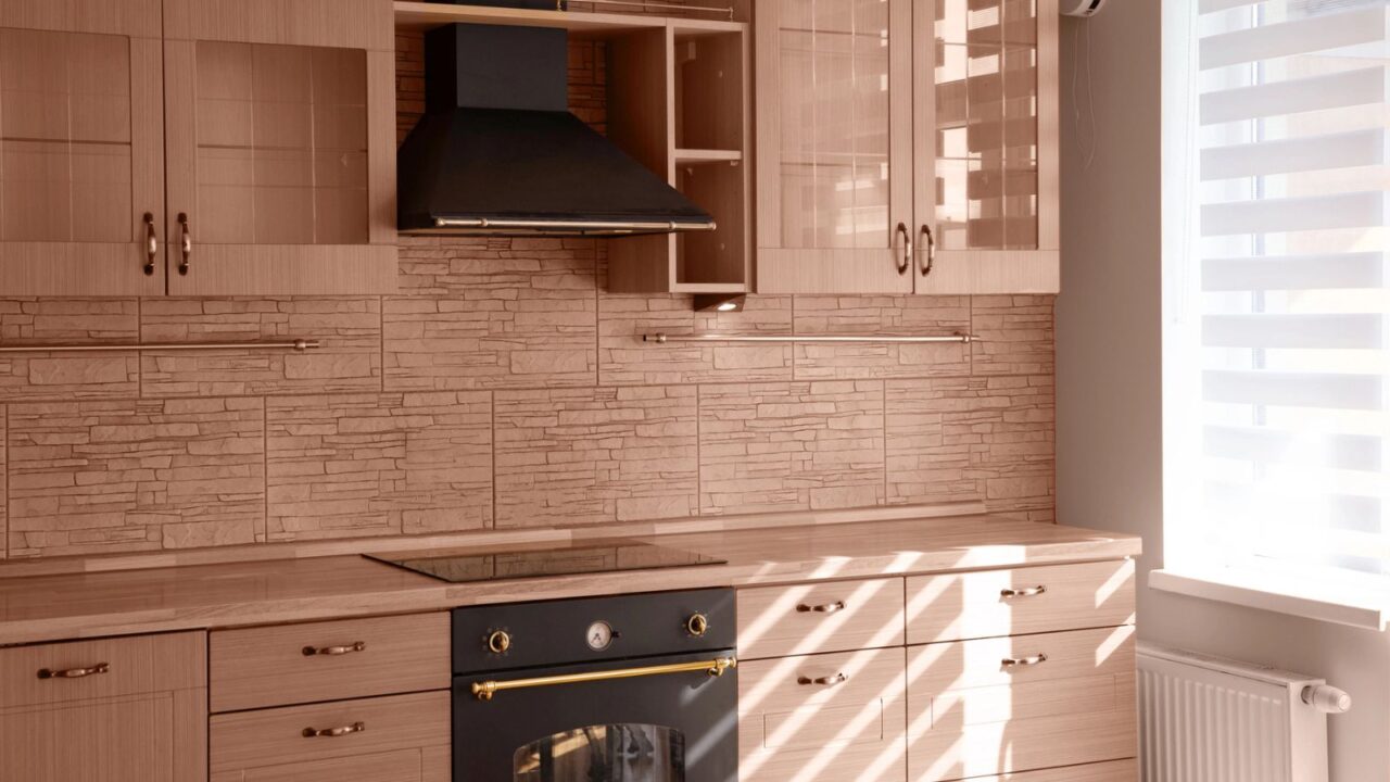
Explore the latest kitchen cabinet color trends for 2025 and coordinate them with your wall’s Color of the Year to create a stylish, on-trend look that is perfect for modern homes.
Sherwin-Williams’ Capsule
Sherwin-Williams (a leading paint manufacturer) did something different. They introduced a Color Capsule of the Year instead of a single shade. This palette features nine complementary tones from earthy browns to bright greens.
This versatile selection allows you to create cohesive color stories throughout your home. Use warm tones in living spaces, blues in bedrooms, and bright hues in creative areas.
With these trending colors, you can refresh your home and create an atmosphere that reflects your style. Check out more trending wall colors to watch for In 2025.
Read Next:
What Are the Top Color Trends for 2025?
2025’s Hottest Bedroom Decor Trends You Can’t Miss
Home Designers Love Natural Stone for 2025
Don’t forget to follow us for more exclusive content right here on MSN.