Choosing the Right Paint Color
Many people think tiny apartments are doomed to feel cramped. But that’s not the case if you use the right paint color. An ideal color can create the illusion of space which makes even the smallest rooms feel open and airy.
In this guide, I’ll share 15 wall paint colors that visually expand your space. From classic whites to unexpected blues, these colors will help your apartment think it’s bigger than it actually is.
Crisp White
White is the go-to choice for small spaces, and for good reason. A crisp, bright white reflects light, making walls seem to disappear, while ceilings appear higher.
The trick is choosing the right white. You can opt for cool undertones to enhance brightness. Benjamin Moore’s Chantilly Lace or Sherwin-Williams’ Extra White is perfect for an open feel. Pair it with minimalistic decor and mirrors to double the airy effect.
Soft Gray
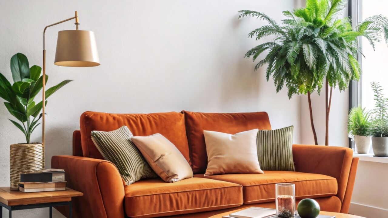
If stark white feels too clinical, light gray is the perfect alternative. A gentle, cool gray like Repose Gray (Sherwin-Williams) or Classic Gray (Benjamin Moore) keeps things airy while adding dimension. Gray works well with both warm and cool color palettes.
You can even add dark-colored furniture with it and your space will still feel open. For instance, you can see in this picture the rust sofa complements the gray wall behind, while the greenery adds liveliness to the small living room.
Warm Beige
Beige isn’t boring if used in the right way. A warm beige with soft yellow or peach undertones, like Accessible Beige (Sherwin-Williams) or Natural Linen (Benjamin Moore), provides warmth without closing in the room.
Unlike stark whites, beige adds subtle depth while keeping things airy. It works particularly well in apartments with low light. Pair it with off-white trim for a seamless transition or add hints of soft blues and greens for an earthy ambiance.
Greige
Can’t decide between gray and beige? Go with greige (a harmonious blend of gray’s coolness and beige’s warmth).
Agreeable Gray (Sherwin-Williams) and Edgecomb Gray (Benjamin Moore) are top choices that make rooms feel larger without looking too cold or too warm. It reflects light well while adding subtle depth.
Adding black accents through furniture or light fixtures can give you a luxe finish overall.
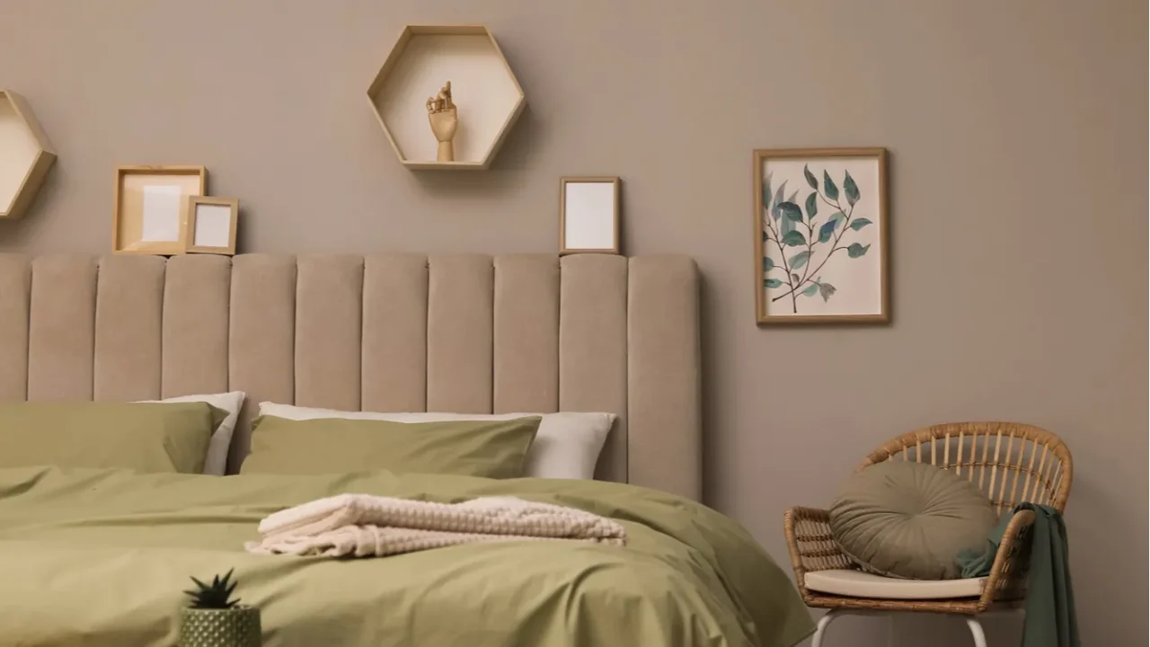
Taupe
If beige feels too warm and gray too cool, another option is taupe, which is the perfect middle ground. A light taupe shade creates depth while keeping a room feeling modern. The best shades you can get are Shiitake (Sherwin-Williams), Pashmina (Benjamin Moore), and Mushroom Bisque (Behr).
Taupe works exceptionally well in living rooms and bedrooms, pairing beautifully with white trim and metallic accents. Choose a light taupe with subtle gray undertones rather than darker, brown-based versions for the perfectly enhanced look of the space.
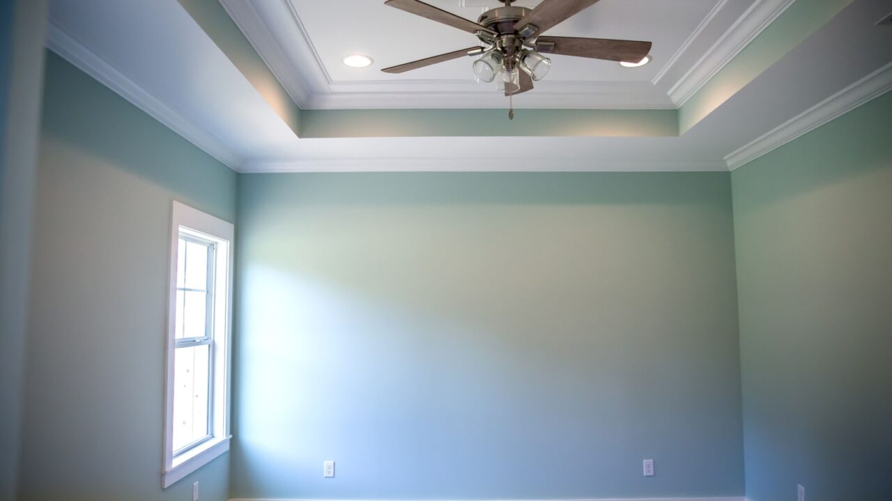
Pale Blue
Want your walls to mimic the sky? Pale blue is the answer. Soft blues, like Breath of Fresh Air (Benjamin Moore) or Sleepy Blue (Sherwin-Williams), create a calming atmosphere while pushing walls outward visually.
The cool undertones trick the eye into seeing more depth and make rooms feel breezy. This shade creates a serene vibe and pairs beautifully with white furniture and light wood.
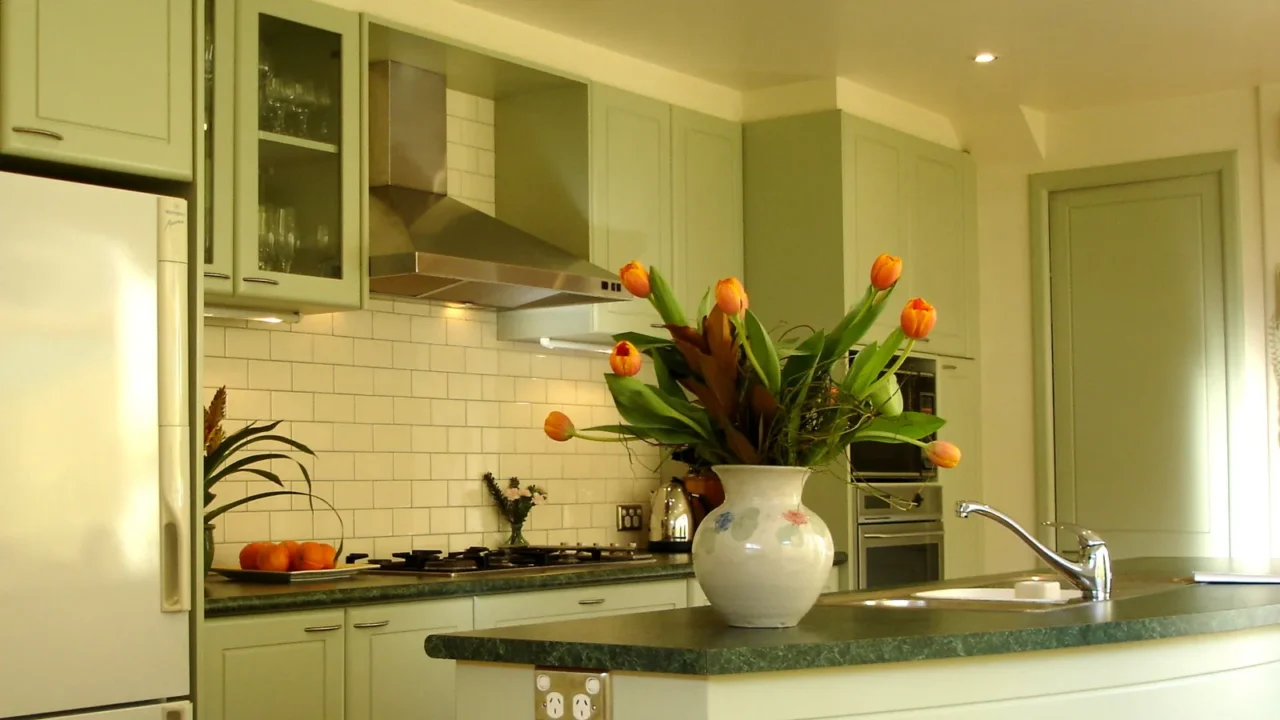
Soft Green
A hint of green can make a space feel both expansive and refreshing. Light, muted greens like Pale Avocado (Behr) or Sea Salt (Sherwin-Williams) create a sense of calm while enhancing the illusion of space. These shades work wonders in small bedrooms or living areas.
Pair them with white or natural wood furniture to maximize the effect. Green’s connection to nature tricks the eye into feeling less confined.
Muted Lavender
A pale lavender with gray undertones creates a dreamy, open atmosphere. Unlike deep purples, soft lavenders reflect light without feeling overwhelming.
This color works well in bedrooms, home offices, or reading nooks. It pairs beautifully with white, light gray, and soft metallics for an elegant and spacious feel. Muted lavender adds just enough personality without making a small space feel busy.
Some of the best color picks are Silver Peony (Benjamin Moore), Sensitive Tint (Sherwin-Williams), and Lavender Mist (Behr).
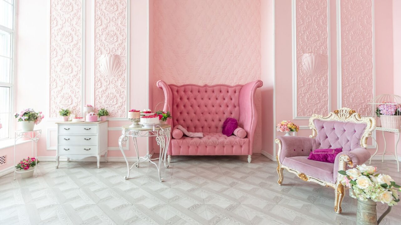
Blush Pink
Blush pink is another trendy shade that adds warmth without making the space overwhelming. A muted, dusty pink reflects light and keeps a space feeling fresh. The best options I will recommend are: First Light (Benjamin Moore), Innocence (Behr), and Intimate White (Sherwin-Williams).
Unlike bold or overly saturated pinks, blush works almost like a neutral, complementing whites, taupes, and even soft grays. To prevent a sugary-sweet look, pair it with natural textures like linen, rattan, and light wood.
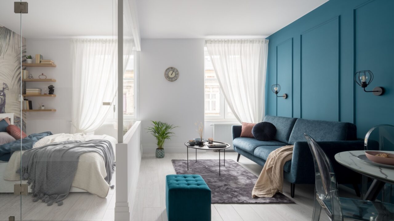
Bold Accent Wall
If light colors make your apartment feel too bland, you can paint one accent wall in bold color. This will give your space a pop of color without making it feel cramped.
Try painting one bold accent wall while keeping the rest light with gray or crisp white color.
A deep navy, forest green, or even a rich terracotta as an accent shade can create a focal point, while the surrounding white walls keep things bright and airy. The contrast tricks the eye into perceiving more space.
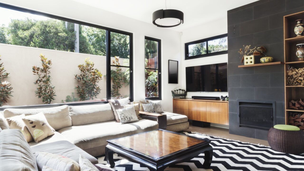
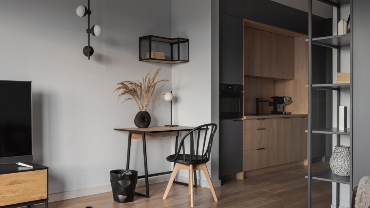
Charcoal Accent Walls
Another accent color that is worth a separate mention is charcoal. Use it in an accent wall or furniture to create depth and make the rest of the space feel more expansive.
You can pick Peppercorn (Sherwin-Williams), Wrought Iron (Benjamin Moore), and Cracked Pepper (Behr). Match it strategically with soft white furniture and hints of greenery around the space.
Light Terracotta
A soft, muted terracotta is another best choice to bring warmth while maintaining an open, airy atmosphere. Unlike deep oranges, light terracotta adds an earthy, organic feel without making a space feel smaller.
This color works beautifully in apartments with natural elements like rattan, linen, or wooden accents. The recommended shades are Canyon Dust (Behr), Persimmon (Benjamin Moore), and Fading Twilight (Sherwin-Williams).
Pale Yellow
Soft, buttery yellow also reflects light beautifully, It’s perfect for rooms with little natural light, adding a sunny ambiance that mimics daylight. My best picks are Buttercream (Behr), Lemon Meringue (Benjamin Moore), and Honied White (Sherwin-Williams).
Pale yellow pairs well with white, light wood, and soft pastels to maintain a breezy effect. Choose a yellow with a neutral base rather than a golden undertone. Opt for a creamy, soft shade. Bright or neon yellows are big no, as they can overpower a small space.
Two-Tone Walls
A clever trick for making ceilings appear higher is using two-tone walls. For instance, use a lighter shade on top and a slightly darker shade below. Some great combos are Pale Oak + White Dove (Benjamin Moore), Agreeable Gray + Pure White (Sherwin-Williams), and Seaside Sand + Ultra Pure White (Behr).
The contrast draws the eye upward which gives the illusion of height. Pair with vertical decor elements like tall bookshelves or floor-length curtains to further emphasize the room’s height.
The right paint color is important to set the tone for the rest of the home decor. They can either make your space feel basic or best. Check out 15 Unusual Color Pairings That Just Work.
The Right Paint
Choosing the right paint color isn’t just about aesthetics, it’s a strategic move to make your small apartment feel larger.
Whether you go for a classic white, a soft blue, or a nature-inspired green, these shades reflect light, blur boundaries, and create an illusion of openness.
The key? Stick to light, muted shades with reflective qualities and pair them with thoughtful decor choices. The right paint choice can work magic, check out Simple Ways to Transform Your Home with Paint.
Read More:
Exciting Kitchen Cabinet Color Trends for 2025
Creating a Serene Bedroom Atmosphere with Colors
Color Blocking In The Living Room (Tips)
Don’t forget to follow us for more exclusive content right here on MSN.